Live data from Hacker News

Is Dark Mode Such a Good Idea?

kevq.uk

371–380 of 552 posts

Re: Is Dark Mode Such a Good Idea?

#371
post #347
post #342

Earlier quoted context omitted.

iOS is pure black in dark mode.

it is absolutely not. 90% of visible UI is dark grey painted over a black background. a lot of apps also use dark tones too, like dark blue or green.

90% is a gross exaggeration. The Mail app is pure black[0]. Apps that have grey on black like Messages have styles carried over from the light version of apps — they weren’t specifically optimized for dark mode to improve readability. Other apps that I’ve checked: Music, Phone, Photos, Files, Calendar, even Twitter.

[0] https://www.litmus.com/wp-content/uploads/2020/04/bildschirm...
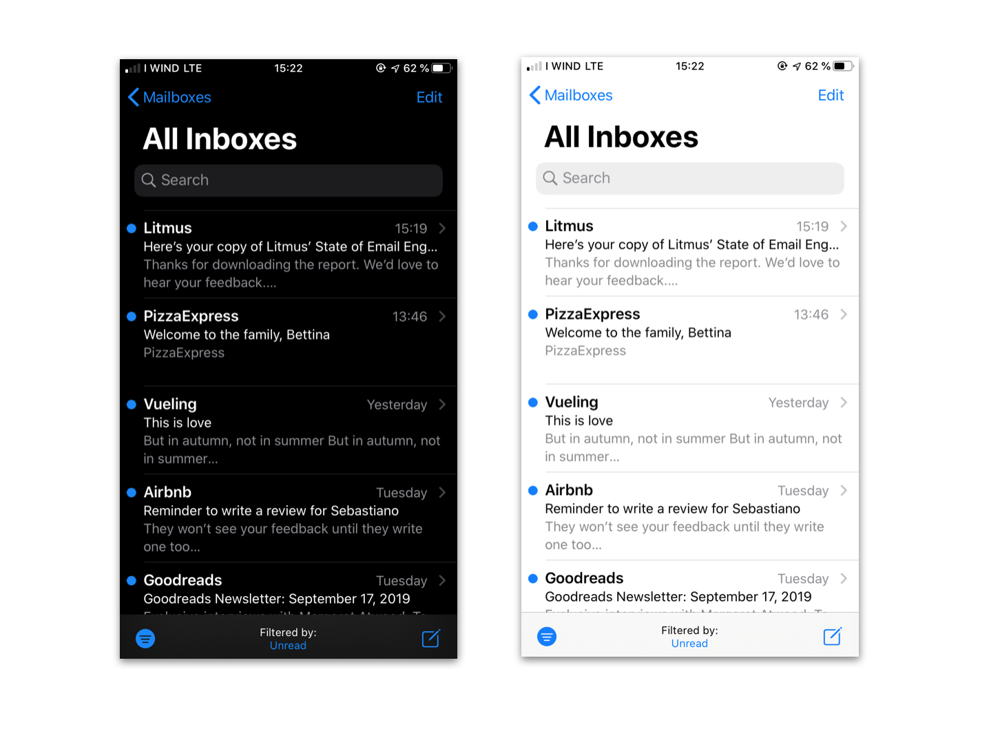
Re: Is Dark Mode Such a Good Idea?

#372
The article talks about eye strain, and states that using the OS's blue light filter is a better way to reduce eye strain. The blue light filter significantly reduces the amount of contrast, which makes the screen harder to use, especially with something like an IDE/Text Editor with many colors of syntax highlighting. I'd personally like to know if dark mode has less eye strain than default mode instead of knowing what the absolute best way to avoid eye strain is.

Re: Is Dark Mode Such a Good Idea?

#373
post #283

Earlier quoted context omitted.

That's because you're used to them, that's fine. Many of those actions can be done via key combos or other keys (esp on a Mac), like C+R to refresh, C+Sh+I for browser console or Enter to rename a file. Function keys at this point are certainly old school and could even be considered an atavism, like the Print Screen button or the numeric keypad.

Some functions have replacements, others don't. Just one example: both F5 and CTRL-R in browsers do a refresh; CTRL-F5 does a hard refresh (also renews the cache); I don't think there's a non-function-key alternative for that. Losing the function keys would be a major nuisance. The numeric keypad is useful to me too. A bit less than the function keys, perhaps, but when entering a list of numbers it works so much bett…

In the meaning of outdated artifacts, like those turbo buttons on old PC boxes or three button mice. Fn + arrow keys or fn+bksp for del easily replace the specific navigation keys and are for me easier to find by touch with less movement of the wrist.

Re: Is Dark Mode Such a Good Idea?

#374
post #371
post #347

Earlier quoted context omitted.

it is absolutely not. 90% of visible UI is dark grey painted over a black background. a lot of apps also use dark tones too, like dark blue or green.

90% is a gross exaggeration. The Mail app is pure black[0]. Apps that have grey on black like Messages have styles carried over from the light version of apps — they weren’t specifically optimized for dark mode to improve readability. Other apps that I’ve checked: Music, Phone, Photos, Files, Calendar, even Twitter. [0] https://www.litmus.com/wp-content/uploads/2020/04/bildschirm...

I don't see any blacks in that screenshot?

Re: Is Dark Mode Such a Good Idea?

#375
post #254

Earlier quoted context omitted.

Science is not a faith based system. If you doubt about the rigor of some study, by all means point the errors you find. In the meantime, I will trust those scientific studies more than subjective opinions in hackernews comments.

Why not conduct your own experiment, using Science? 1. Start with a hypothesis, that "dark mode is less comfortable for me than light mode". 2. Design an experiment: find the sites that you use most. Use them for 10 minutes each in light mode and dark mode. Write down your impressions. 3. Build a conclusion: was your hypothesis correct? Was it partially correct for some sites? Then you can adapt your behaviour accord…

In my experience, that kind of design would be bad. I prefer light themes, but whenever I've used some app in dark mode and switch to a light one, the experience is inevitably jarring, and completely faithful to all the sun-burns-my-eyes jokes made about light themes. But it's fine the next day.

One of the more important parts of the studies referenced in the NNGroup article the blog post in the OP is referring to is that they did experiments between people rather than subjecting people to different conditions consecutively. When the initial light-dark contrast isn't present, people's fatigue ratings were about equal for both modes.

Moreover, people perceived both modes equally hard to read, but were actually more efficient in reading lightmode text.

That advantage is driven largely by the sheer amount of light - some researchers did an experiment where they cranked up the brightness on a dark theme so the experienced brightness was the same and it was just as readable as a light theme. But then you're using a crapton of electricity since you're turning dark-hued pixels to be super bright.

Re: Is Dark Mode Such a Good Idea?

#376
post #371

Earlier quoted context omitted.

90% is a gross exaggeration. The Mail app is pure black[0]. Apps that have grey on black like Messages have styles carried over from the light version of apps — they weren’t specifically optimized for dark mode to improve readability. Other apps that I’ve checked: Music, Phone, Photos, Files, Calendar, even Twitter. [0] https://www.litmus.com/wp-content/uploads/2020/04/bildschirm...

I don't see any blacks in that screenshot?

If you bring the image into a photo editor you'll find that the background of Mail's dark mode is RGB #000000, the purest digital black there is.

Re: Is Dark Mode Such a Good Idea?

#377
post #347

Earlier quoted context omitted.

it is absolutely not. 90% of visible UI is dark grey painted over a black background. a lot of apps also use dark tones too, like dark blue or green.

Blue on black/dark gray is horrible for visual acuity.

Blues exist along a range of brightness values and blues work great in dark terminals and editors all day every day for many many people. I'm typing into a browser window surrounded by probably about 4 or 5 terminal and editor windows peeking out of the background with somewhere between 5 and 10 different shades of blue on dark grey backgrounds and they look clear, bright, and amazing. The dark background makes the blues pop.

Re: Is Dark Mode Such a Good Idea?

#378
post #293

Earlier quoted context omitted.

I wouldn't be surprised if the e-ink display market exploded in the near future with Dasung getting the refresh rate into usable territory and the availability of color e-ink. I been trying a couple of things to help with eye fatigue and the following helped me quite a bit: setting up "Breaks For Eyes" for osx to remind about taking breaks, switching to the light "Brutalist" theme for emacs and moving most of my long…

> getting the refresh rate into usable territory Doesn't unnecessary refresh deterioration the e-ink display and diminish its power efficiency? I really see no reason for the display to refresh until the actual information you need to view changes. What do you need a higher refresh rate for? Wobbly window effects, smooth scrolling, verbose build output and intense action games? I really don't want the screens to adap…

You're right, I really meant latency here.

Re: Is Dark Mode Such a Good Idea?

#379
post #371

Earlier quoted context omitted.

90% is a gross exaggeration. The Mail app is pure black[0]. Apps that have grey on black like Messages have styles carried over from the light version of apps — they weren’t specifically optimized for dark mode to improve readability. Other apps that I’ve checked: Music, Phone, Photos, Files, Calendar, even Twitter. [0] https://www.litmus.com/wp-content/uploads/2020/04/bildschirm...

I don't see any blacks in that screenshot?

It’s hard to have a discussion when you act in bad faith. The background is #000000.

Re: Is Dark Mode Such a Good Idea?

#380
post #165

These articles are so bizarre to me: he's writing about dark mode and light mode as if you can just... _choose_ one or the other and be roughly equally happy either way? I would never even think to look at "studies" when it's blindingly obvious: light mode makes my eyes hurt a lot, dark mode is very comfortable. The only time I can even consider using light mode is mid-day with plenty of natural light around. At nigh…

Crank down the brightness on your monitor a good bit (more than you think you should), switch to light mode and stay there for the day. The initial dark-light switch is super jarring, I find, but light mode proper is actually fine.

And it's far easier to tolerate an instance of dark mode in a lighter-themed environment than the reverse because the initial switch is so much more jarring than light->dark (which can also be jarring, but it's not as jarring)

Post reply on HN