Earlier quoted context omitted.
iOS is pure black in dark mode.
it is absolutely not. 90% of visible UI is dark grey painted over a black background. a lot of apps also use dark tones too, like dark blue or green.
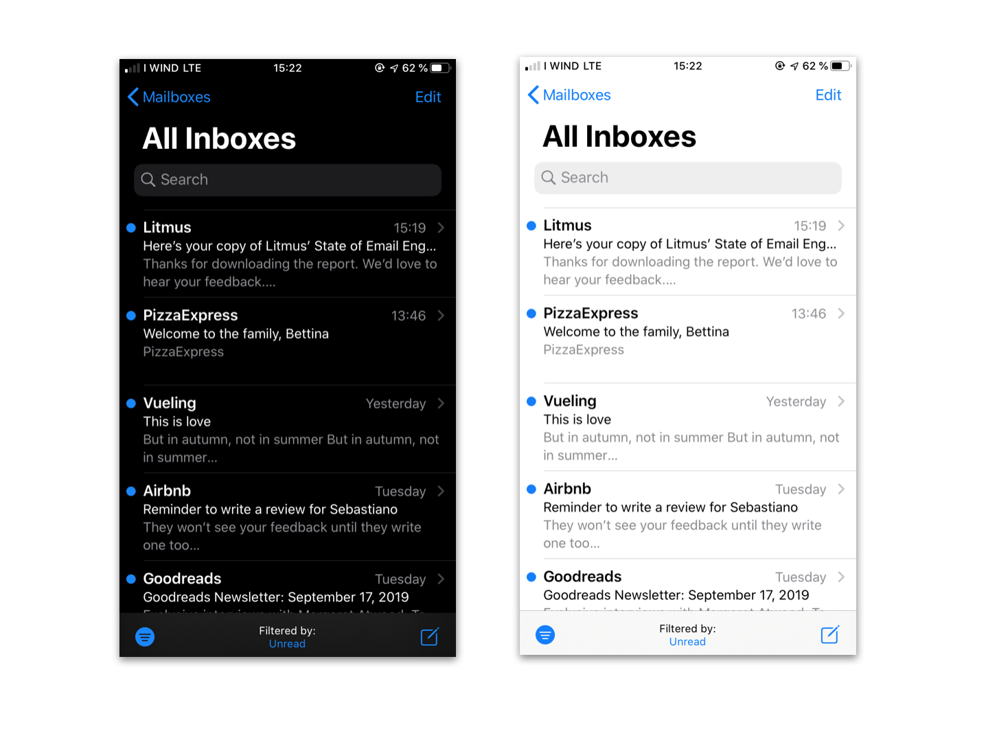
90% is a gross exaggeration. The Mail app is pure black[0]. Apps that have grey on black like Messages have styles carried over from the light version of apps — they weren’t specifically optimized for dark mode to improve readability. Other apps that I’ve checked: Music, Phone, Photos, Files, Calendar, even Twitter.
[0] https://www.litmus.com/wp-content/uploads/2020/04/bildschirm...