Apple's watch UI document is there, too. That's interesting. Apple has very tight control on the watch interface. Apple owns the knob and the button; you can't use those. You must use white text on a black background. You can use only one font other than Apple's "San Francisco". Voice input is not a watch UI component; voice input appears to be reserved for talking to Apple's Siri.
UI Design Dos and Don'ts
61–70 of 121 posts
Re: UI Design Dos and Don'ts
#62Agree with these, but in my opinion, the date selector wheels in iOS are a terrible design. Three rolling wheels just doesn't map to most people's concept of a calendar
Do you have a better example? I don't find the select diag's like in Desktop Chrome easier to use especially on a mobile. I think what they've done is better than anything else I've seen. With enough following it'd become the norm like anything else.
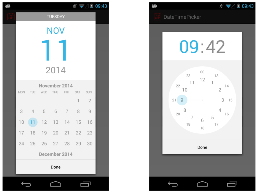
Android has a simple calendar which you can swipe to change the month. Click on the year and a year selection is shown.
The time is a clock where you're able to select the hour first and minutes thereafter. This is the most intuitive mobile touch interface I have seen so far, any other is really small, awkward or not mentally easy to comprehend.
Image: https://raw.githubusercontent.com/CiTuX/datetimepicker/maste...
Re: UI Design Dos and Don'ts
#63Apple has been a driving force for better UI in a number of areas, but some of their choices are baffling. Even in this page, the "Contrast" section uses a large black header, but a small grey font on a white background for the content. Who chose Shift-Command-] for switching tabs in Safari? Why include the power switch in the keyboard, which makes it challenging to clean? Could their glossy displays be any more refl…
OS 10.9 and iOS 7 have taken contrast and thrown it out the window. They are both following current designer trends of less contrast overall while claiming better readability. The low contrast trend started around 2011 to 2012 with web sites. It typically takes Apple one year to catch up with the trends on their operating system releases.
Both their recent releases result in more eye strain for me looking for a way to fix their messed up ideas of contrast.
Re: UI Design Dos and Don'ts
#64Earlier quoted context omitted.
Cultured Code's date picker for Things has been my favorite: http://culturedcode.cachefly.net/things/videos/things-iphone...
How do I choose a date that's 30 odd years ago - a birthdate for example.
You wouldn't want to do that in Things (it's a todo app) - you're most likely not going past next month, at the most. You're right though - this wouldn't be a good replacement calendar picker for every app.
Re: UI Design Dos and Don'ts
#65Apple has been a driving force for better UI in a number of areas, but some of their choices are baffling. Even in this page, the "Contrast" section uses a large black header, but a small grey font on a white background for the content. Who chose Shift-Command-] for switching tabs in Safari? Why include the power switch in the keyboard, which makes it challenging to clean? Could their glossy displays be any more refl…
You can switch tabs in Safari using Ctrl + Tab (and Ctrl + Shift + Tab to go backwards).
Re: UI Design Dos and Don'ts
#66Earlier quoted context omitted.
Most of the stupidly bad design decisions I have seen come from somebody high in the hierarchy (product manager, CEO or founder) demanding a change, even if both designers and developers rally on how awful it would be. I have not yet found a solution to this problem.
would A/B testing, in some capacity, the decision in some form or another, help with this?
It could make it worse. Just look at Amazon's homepage.
Re: UI Design Dos and Don'ts
#67Apple's watch UI document is there, too. That's interesting. Apple has very tight control on the watch interface. Apple owns the knob and the button; you can't use those. You must use white text on a black background. You can use only one font other than Apple's "San Francisco". Voice input is not a watch UI component; voice input appears to be reserved for talking to Apple's Siri.
With the launch of watchOS 2, developers are able to use voice input and the digital crown. Don't think they have access to the button.
Re: UI Design Dos and Don'ts
#68Their "contrast" section belies their determination, since the text there is grey on a white background, and true black on white would unquestionably be more readable. (looking at UI designers more generally:) I'm so sick of UIs that have repetitive, huge, contrasty, readable headings... only to have the core useful text be grey-on-something, tiny, possibly italic, and so on. Idiots, and they are legion. More subtle…
Black on white is actually bad combination, it strains the eyes.
Re: UI Design Dos and Don'ts
#69A page about mobile design dos and don'ts and it's not even mobile optimized!
I build my apps in Xcode, and it does not even run on my phone!
Re: UI Design Dos and Don'ts
#70Apple has been a driving force for better UI in a number of areas, but some of their choices are baffling. Even in this page, the "Contrast" section uses a large black header, but a small grey font on a white background for the content. Who chose Shift-Command-] for switching tabs in Safari? Why include the power switch in the keyboard, which makes it challenging to clean? Could their glossy displays be any more refl…
OS 10.9 and iOS 7 have taken contrast and thrown it out the window. They are both following current designer trends of less contrast overall while claiming better readability. The low contrast trend started around 2011 to 2012 with web sites. It typically takes Apple one year to catch up with the trends on their operating system releases. Both their recent releases result in more eye strain for me looking for a way t…
Do you suppose that this might be related to the oft-discussed-on-HN ageism that the Silicon Valley-based industry is accused of?
Low contrast may be pleasing to twenty-something year old eyes, but unreadable to fifty-something year old eyes, and, if I consider my own attitudes and thinking at a younger age, I would almost certainly not have been considering how UI design choices would impact people with less-than optimal vision but for a mother-in-law with severe vision limitations.