Live data from Hacker News

Forstall Out; Ive Up

daringfireball.net

51–60 of 132 posts

Re: Forstall Out; Ive Up

#51
post #35
post #27

Earlier quoted context omitted.

I suppose, iOS hit a higher quality product much earlier than Android. But to me it feels like an evolutionary dead-end. Sure they aren't fixing any problems, but they sure aren't really adding anything to make my life better. Or another evolutionary analogy: crocodiles have more or less been around forever -- they don't have to trumpet about solving calorie intake problems, or overheating in the summer, but it took…

It'd help me if you gave examples what you think iOS could be doing that's it not. The big ticket feature that iOS didn't have 60 days ago was built in turn by turn maps. Since they added that with 6.0 I guess I'm wondering what else you're pining for? A weather widget? NFC? Fjords?

In a world of apps, who gives a rat's ass about whether turn by turn directions are built-in (pretending Apple incorporated them into the OS rather than just branding an app developed in house)?

What matters is the quality of the directions, not that they are marketed with a lower case "i".

Re: Forstall Out; Ive Up

#52
post #43
post #3

"That makes it all the more telling that Apple’s press release contains no quote from Tim Cook offering kind words or thanks to Forstall." Indeed, this has been expected since Jony Ive was observed standing immediately to Tim Cook's right at the last Red Square May Day parade.

That comment didn't add anything to the discussion. The comparison you made is not helpful to anyone's understanding of the situation. Please don't do that. Hold yourself to a higher standard in the future.

The comment is non-offensive and draws an analogy between two organizations which used propaganda effectively. Comparing Mr. Gruber's writings to those of fellow travelers is a legitimate comment on the possibility of editorial bias in the original article. I

It is useful because it places the article within a larger historical context. It extends the content, and on HN, that is appropriate.

Re: Forstall Out; Ive Up

#53
post #42

Earlier quoted context omitted.

I'm principally talking about look and feel. iOS looks and operates great, let's get that out of the way. But it's essentially the same core design that was laid out in 2007 + Androidish notifications + multitasking-lite. At a glance can the average user tell the difference between iOS 2 or 3 and 6? I acknowledge that that's not necessarily an entirely worthy goal in and of itself, but keeping a design focused produc…

All of what you've listed is just repeating the same point: iOS hasn't changed much since its inception. But you're still not answering the question: what needs to change? Don't get me wrong, it's not that I think it can't be improved, because I can think of a few needed improvements myself. But I hear people continue to say this about Apple -- "They aren't innovating lately." -- without saying what needs to change.…

I'd like to see Intents or Contracts or something so that apps can reasonably an reliably communicate. The walled gardens that iOS has is fairly obnoxious.

I have both an iPhone and Nexus 7, and I keep forgetting on N7 that sharing to Evernote doesn't require laborious app switching and cut and pasting. It's a very real, important piece of the puzzle that Apple hasn't even bothered trying to attempt.

Re: Forstall Out; Ive Up

#54
post #42
post #35

Earlier quoted context omitted.

It'd help me if you gave examples what you think iOS could be doing that's it not. The big ticket feature that iOS didn't have 60 days ago was built in turn by turn maps. Since they added that with 6.0 I guess I'm wondering what else you're pining for? A weather widget? NFC? Fjords?

I'm principally talking about look and feel. iOS looks and operates great, let's get that out of the way. But it's essentially the same core design that was laid out in 2007 + Androidish notifications + multitasking-lite. At a glance can the average user tell the difference between iOS 2 or 3 and 6? I acknowledge that that's not necessarily an entirely worthy goal in and of itself, but keeping a design focused produc…

"At a glance can the average user tell the difference between iOS 2 or 3 and 6?"

(A) Probably can't tell because iOS 6 is on all the phones, zing!

(B) If he's trying to cut and paste he can tell. iOS 2 won't let him do it, iOS 3+ will force him to copy the entire body text randomly, iOS 5+ will randomly offer a handful of options that generally do not include the one the user is looking for.

(C) Ok, so it's visually stagnant. I guess I'll agree here. Turns out, there's usually less to disagreements than first glance might indicate.

"any fundamental work on improving the user interaction and look & feel of the thing in 5 years."

There are certainly new gestures and there's voice. There's new functionality in the buttons and from the lock screen. I would not say this is totally accurate.

"I find it unbelievable that there's nothing that could be done better and that iOS was launched with perfect interaction design, fully formed from the heads of the designers, or perfect visual design, reverently propagated to the modern day and on into the future."

I don't see anyone claiming it's perfect but there's a good argument to be made that Good Enough + Consistent > Better. Which is to say that Apple users, who do get updated to the latest patch, might be jarred if Apple constantly yanked the UI here and there for the sake of slight benefits or "keeping the look fresh".

Re: Forstall Out; Ive Up

#55
post #42

Earlier quoted context omitted.

I'm principally talking about look and feel. iOS looks and operates great, let's get that out of the way. But it's essentially the same core design that was laid out in 2007 + Androidish notifications + multitasking-lite. At a glance can the average user tell the difference between iOS 2 or 3 and 6? I acknowledge that that's not necessarily an entirely worthy goal in and of itself, but keeping a design focused produc…

All of what you've listed is just repeating the same point: iOS hasn't changed much since its inception. But you're still not answering the question: what needs to change? Don't get me wrong, it's not that I think it can't be improved, because I can think of a few needed improvements myself. But I hear people continue to say this about Apple -- "They aren't innovating lately." -- without saying what needs to change.…

I want widgets on the desktop and/or on the lock screen (as a developer api), sideloading applications, some way to store data accessable to any app, a phone number black or whitelist, and a way for users to allow an app to do arbitrary tasks in the background or refuse any app from doing the Apple-allowed tasks in the background. Oh, and keyboards, developers should be allowed to make keyboards.

Then there are a ton of stupid UI issues they have, like when I open a new tab in mobile Safari, I don't want it to gain focus.

I'd like to be able to update the software on it without needing to rearrange apps into the order I want them yet again, I don't have any idea if that is possible or not.

Re: Forstall Out; Ive Up

#56
post #35
post #27

Earlier quoted context omitted.

I suppose, iOS hit a higher quality product much earlier than Android. But to me it feels like an evolutionary dead-end. Sure they aren't fixing any problems, but they sure aren't really adding anything to make my life better. Or another evolutionary analogy: crocodiles have more or less been around forever -- they don't have to trumpet about solving calorie intake problems, or overheating in the summer, but it took…

It'd help me if you gave examples what you think iOS could be doing that's it not. The big ticket feature that iOS didn't have 60 days ago was built in turn by turn maps. Since they added that with 6.0 I guess I'm wondering what else you're pining for? A weather widget? NFC? Fjords?

The biggest feature would be adding OS X/NeXT services/Android intents: currently it's impossible to have two apps interact without the developers explicitly baking in support. Allowing applications to establish some conventions for services ("Open web page", "View PDF", "Retrieve login information", "Subscribe to feed", "Post to {network}", etc.) would make the massive improvements from the integrated Twitter/Facebook support available for to all apps and services.

This would also be a smart move for Apple as de-privileging Twitter & Facebook would mean that they wouldn't be helping support the lockin for those services – if Google Plus came back from the dead and started eating Facebook's marketshare, Apple would benefit without changing a line of code.

Re: Forstall Out; Ive Up

#57
post #34
post #28

Earlier quoted context omitted.

I don't see much stagnation: (1) Maps is probably the biggest thing they've done since the original phone's launch; (2) they are moving more and more of the interaction to voice every year; (3) they are moving more and more of the users' data to the cloud every year.

It was pretty clear that he was talking about visual design and interaction. None of the things you list here are in that domain. One is a new app, one is a voice UI and one is an Internet-based storage service.

You think voice integration isn't interaction? That's literally a form of interaction with the device that was not there in iOS 1.

Re: Forstall Out; Ive Up

#58

Earlier quoted context omitted.

> Can someone please tell me why this is worthy of HN front page? Sure! I'd be happy to. The way Hacker News works is, people submit content. If people like the content, they vote it up. Sufficiently high-voted content reaches the front page. 55 people have voted this up at the time of this comment, feeling the content was worth their attention. Given the recency of the content relative to the votes it has received,…

him: why did people elect Hitler? you: Explaining how votes are tallied. Technically correct but totally useless.

Reductio Ad Hitlerum - For when you have nothing to go on but a cheap appeal to emotion.

Re: Forstall Out; Ive Up

#59
post #6

May be the second time I've found a genuinely insightful piece by Gruber. Skeuomorphic design was a nod to my non-computer using father in the 90s. It no more represents useful metaphors for interfaces than steam engines represent a good way to build cars. iOS is stagnant, reviews of recent Apple designed skeuo-heavy apps bemone the lack of functionality -- while noting what must be hundreds of hours of graphics work…

>Skeuomorphic design was a nod to my non-computer using father in the 90s. It no more represents useful metaphors for interfaces than steam engines represent a good way to build cars.

This is wrong. It's just a cycle that we're going through with design fads.

Less than ten years ago everybody was all for "lickable interfaces" with 3D buttons, drop shadows and the like. There was even a whole movement of indie developers for the Mac doing skeuomorphic UIs in the wave of Delicious Library, budded by the Mac press "the Delicious generation".

Now designers are tired of that look and want something more subtle and flat, inspired by the whole Metro thing (and modern Web style plus the whole movement towards minimal design).

The same transitions have happened dozens of times in the history of art and design, from ornamental to utilitarian and back again.

One is not inherently better than the other: there can be good and bad skeuomorphic UIs. And, no, the Calendar app, with it's faux leather, is not an example of a bad skeuomorphic UI. If it's bad, it's just because of bad UI, period. The leather part is just decoration, i.e the inconsequential part of skeuomorphism, and doesn't affect behavior.

For bad skeuomorphism consider any media app that resembles a physical dvd player, or the turning of the pages in iBooks. I.e behavior that impedes use, not just decorative choices.

For the same reason, it also has nothing to do with appealing to "older users". If anything, skeuomorphism and references to old physical objects is extremely popular with younger people, from "steam punk", to hipsters loving vinyl, letter-pressed cards, pocket watches and everything that has "patina", to software like Instagram and Hipstamatic, that digitally applies the image distortions and color artifacts of 30 and 50 year old analog cameras and films.

Sorry for the long rant, but I take offense in how everybody is throwing words like "skeuomorphic" around, like they always knew what the term meant, instead of just having in drilled into their head that "skeuomorphic == bad" from tens of me-too online articles this past year.
Re: Forstall Out; Ive Up

#60
post #42

Earlier quoted context omitted.

I'm principally talking about look and feel. iOS looks and operates great, let's get that out of the way. But it's essentially the same core design that was laid out in 2007 + Androidish notifications + multitasking-lite. At a glance can the average user tell the difference between iOS 2 or 3 and 6? I acknowledge that that's not necessarily an entirely worthy goal in and of itself, but keeping a design focused produc…

All of what you've listed is just repeating the same point: iOS hasn't changed much since its inception. But you're still not answering the question: what needs to change? Don't get me wrong, it's not that I think it can't be improved, because I can think of a few needed improvements myself. But I hear people continue to say this about Apple -- "They aren't innovating lately." -- without saying what needs to change.…

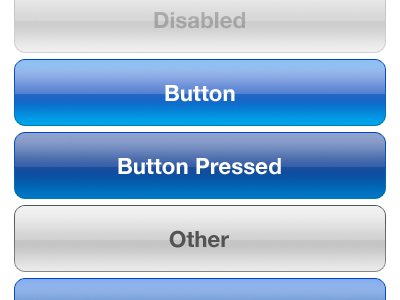
Look and feel-wise...the iOS look is getting dated. I don't think they should parrot the flat square look Microsoft is going for nor the Tron look in Android. But this

http://dribbble.s3.amazonaws.com/users/3331/screenshots/1108...

is getting old (OS X is even worse)

I'm not a visual designer so I'm not sure I'm entirely qualified to offer suggestions, but there are other button styles, even completely new ones that would work.

Some ideas:

How about some variation on the one in the upper right here?

http://www.colourbox.com/preview/2584456-712013-exit-beautif...

VST interfaces are usually choking with ideas

https://www.google.com/search?q=beautiful+buttons&hl=en&...

Or why buttons at all? I should just be able to interact with the direct metaphor of what I want.

Or a pop-up circular button system like in Palantir? http://www.palantir.com/wp-content/static/techblog/2007/08/s...

The interface looks like candy, instead of trying to outshiny the competition, maybe it should be matte? Then use shiny bits sparingly.

http://remodelista.com/img/sub/uimg/Janet_Images/suga-black-...

etc. etc. etc.

Let's not go for shiny kitsch, let's go for expensive sports car with a matte paint job.

Other than that, cross app communications (intents) and resolution independent layouts as an option would be nice and get Apple out of this weird resolution multiplier lock it seems to be trying to bust out of (with the exception of the iPhone 5).

How about other interface bits? There's a button and the screen, how about capacitive edges that can be used for interface sliders or other things? I love capacitive buttons on Android phones (when they had them).

Or let's get crazy, a completely disappearing product all together. Jam the guts into a watch, and a small wireless earpiece, or maybe ear/eyepiece and voice controls and a capacitive touch panel on the watch, don't make it look gaudy like Google Glass, get top eyewear designers to pump out different headpieces (lots of upsale potential there) etc. etc. and top watch designers to design the handpiece and turn computing into ubiquitous wearable fashion driven computing (with sales cycles as fast as the fashion industry -- seasons) and people will buy 4 sets of devices a year instead of one every two years.

Post reply on HN