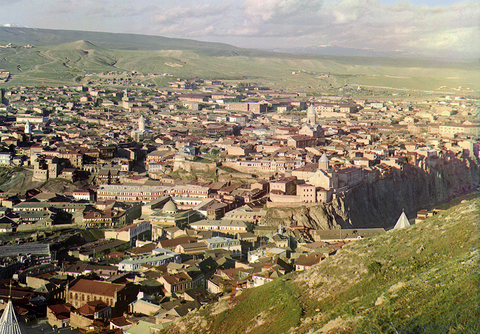
here is what I would call an uneditorialized composition of the image you linked
http://www.loc.gov/pictures/resource/prokc.21676/?co=prok
As anyone can tell, this one has undergone a transformation, colors are corrected, blemishes have been cloned out, and there's some gradient masking at the top to knock down the difference in brightness at the top of the scene.
http://inapcache.boston.com/universal/site_graphics/blogs/bi...
If anything, the version on loc.gov has more vibrant color, tending a little toward the blue. The shadows are open, and as you'd expect from three color plates on monochrome stock, the dynamic range is enormous, sunlight sky and clouds at the top and deep shadows rendered in detail.
Have a look at the original scans here:
There's plenty of shadow detail present in the original.
Really, you should download the 16-bit 69.1MB TIFF image, and
not rely on the JPG for details, I'm just linking it for convenience.
Here's where you can download hi-res version.
http://www.loc.gov/pictures/collection/prok/item/prk20000011...
I took the time to download and produce my own take on this image. Linked here: http://imgur.com/wHWmu
Here's the thing, had I remembered how to paste into a color channel this whole process would have taken 15 minutes. Instead it took me 30 after I had downloaded the image. With no scripts or otherwise head start, I pasted each image into its own layer, auto-aligned the layers, and pasted them into a new image on the respective color layers. I then used an adjustment layer with a gradient mask to add some contrast to the sky. Saved as a second 16-bit TIFF and pulled that into Camera Raw. Here I added a little sharpness (accutance), pulled the noise reduction slider over a bit. I brought up the brightness about 1 stop and used highlight recovery to bring in the highlights. I did not pull up the shadows. I did not enhance the clarity, or add additional contrast. I did not pull up the blacks. I did not color balance at all. I did not touch the color sliders. So no, I'm not a Photoshop genius, I don't do this work professionally. This is amateur stuff, which accords with my statement of the level of manipulation done on these photos under discussion. This isn't gross, wholesale changes to the image in the way we're all familiar happens in fashion photography. I wouldn't even go the other way, to say this is subtle image manipulation. It's as intellectually honest as cropping without altering content, printing on contrasty paper, dodging and burning. So, please tell me how my image differs significantly from the one linked on the Big Picture, and which you'll find linked
also from the loc.gov page.
Finally, a response to your "points" 1 through 9.
1) "overall tone, color, and contrast nearly the same" Are we even looking at the same two images? One image taken on a
completely overcast day, there's fog on the far right too. The other, bright full sunlight, within 2 hours either side of local noon.
2) grass and rock have a distinct tendency to look the same
3) How can you possibly say the shadows aren't present the Prokudin-Gorsky image? It's a sunny day, the sun is high in the sky, the buildings are shrouded in shadow. It's only due to the extreme latitude of three monochrome images combined that we're able to see this in a color slide. An of course, how in the world can there be shadows on an overcast day, in the mountains? What can one expect with a huge horizon-to-horizon dome of diffuse light overhead? I'm not entirely certain the photographer didn't use a strobe in this photo, but the shadows are completely plugged up, and I'd expect to see some catchlights in the people's eyes and the dark cloth to have a bit of a sheen to it. No these two images aren't even remotely the same.
4) You say they look identical, but how? Yes, I suppose on an occluded dark hillside, they can walk out from under the cloud and down into the sunny valley below.
5) Like I may have mentioned, histograms prove nothing about the local contrast situation you're pointing out. But whatever the case, your response is filled with subjectives. I should have been more specific. I would have liked your ideas on objective ways of quantifying this modern photographic look you feel is the key to our visceral reaction
to Prokudin-Gorksy's work. Because if digital tools have put it there, there is a way to extract that information.
6) sounds like an interesting article
7) this is good info, it made finding the source image much easier
7 1/2) no, they aren't interchangeable at all. In fact, much of what they have in common is the fact they were photographed on earth, and that human beings with their particular sensitivity to light are viewing them.
8) I don't have any sense of nostalgia with either of these photos, so perhaps that's just you. If there's a color cast in the Prokudin-Gorsky photos, I wouldn't be surprised. Who knows how balanced his color filters were, how accurate his shutter timing was, or how must the exposure compensation differed between the color filters. Any of these factors can shift the color balance. In the more recent photo. I assume the murkiness comes from the scene, the deepness of the blacks, and the lack of the warmth of sunlight. But again, so what if the photographer had stuck a cooling filter in front of the lens, or done the digital equivalent. Is altering the
mood of the scene with light allowed?
9) That's a real party trick. two images in monochrome, more alike because their color differences have been discarded. But they are still different enough. I can't help but notice how soft the portrait is, but maybe it's just the JPG image and its size, the people seem flat against the background. There's not a lot of contrast in the scene, but like I pointed out before, it's a trend to enhance local contrast. You can see this distinctly in the faces where the cheeks and foreheads seem to pop out. What pops out in Prokudin-Gorksy which shouldn't?
re: footnote #1, when a restoration takes a long time, we cannot assume it because layers of dishonesty are being heaped on. I can easily see spending hours on each photo. There are plenty of blemishes, and some of the emulsion has come off the plates, which would require reconstruction from scratch. It is painstaking work for the sake of accuracy. As far as I know the Library of Congress mission is the archival of historic artifacts and not the production of emotionally manipulative imagery. They may even err on the side of cold hard facts. You can see the bottom left corner in my image. Notice how one of the color channels is missing. My guess is that was reconstructed from the imagination. That's why you see it in the other images. How long does that take, to pull in the image from the other channel and colorize it appropriately?
Ultimately, the restoration of the Prokudin-Gorksy images is not a tour-de-force of Photoshop. It is not the implantation of faddish notions of color and contrast on a historic process. No subtle tricks to fool the unwary gazer were employed.
I think you may have overstated your case. Instead of letting it drop, you have dug in deeper and deeper, as if you could
convince without evidence.
*Edit: typos, addition of a sentence or two, and fixed the ugliness caused by pasting from notepad.