Live data from Hacker News

Russia in color, a century ago

archive.boston.com

161–170 of 196 posts

Re: Russia in color, a century ago

#161
post #159

Earlier quoted context omitted.

I gave this discussion some thought this morning. Basically the argument boils down to "it's not an old picture, it's modern, it's been post-processed in Photoshop, recently. What you're reacting to is a modern photograph" Correct me if I'm mistaken. If that is the case, I still disagree. I'll bring the old saw from Ansel Adams that the negative is the score, and the print is the performance. He reprinted some of his…

I think its worth backing up a bit. "What puzzles me is this purism." "Not all viewers are equally naive." "the original intent of the artist" "Where is the original artwork" "What I really want to know, is a suggest for fixing this alleged problem" "There is no way for us to experience these images in the original" "What you're reacting to is a modern photograph." Nobody thinks like this anymore. These were debates…

What you've said about Gurksy is fascinating, especially with regard to N-dimensional spaces. I think it would greatly help to see it in person to appreciate the details. I can see now why the Gurksy photograph has sold for more than any other, or at least why it is appreciated, because at first glance, it looks incredibly ordinary.

As far as Prokudin-Gorsky goes, you're saying these reconstructions of his photographs exhibit a lot of local contrast, is that correct? How can one quantify these effects? I don't think a histogram will do it, since that's global. How can I use digital tools to determine whether these procedures have been used on an image? My guess is that these images weren't tone mapped and the local contrast isn't boosted, but how can one say for certain definitively. Here's an example of the type of post-production I'm referring to. http://face2face.si.edu/my_weblog/2009/10/in-the-gallery-mar...

I can't remember the name of the photographer who started this fad in portraiture, but you see it everywhere now. An artist I know calls this kind of look "crunchy". I like this terminology. It does seem like the photographer is giving you more to chew on. There seems to be more detail, and I see this employed a lot when the face has some character.

This is not what I see in these photographs by Prokudin-Gorsky. What I see is the most direct interpretation and insubstantial modification of the source material. Could you direct me to what I'm missing?

Re: Russia in color, a century ago

#162

Earlier quoted context omitted.

Which is so funny because when music is produced digitally (99% of the recordings in the past decade) a CD can be a bit-perfect copy of the original mastering. A vinyl record is a stamp of a stamp of a stamp of a scraping of the original master. Better than a CD? Evidence of complete mental breakdown, more like.

This always makes me wonder whether there isn't something about the imperfections from these analog copies (not to mention various analog playback mechanisms) that 'adds' to the richness/perceived value of the music... Perhaps on some level some percentage of us prefer to know that we have a copy of a copy, or some level of imperfection, in our version that we play, vs a straight up 100% clone

That's completely fine.

What I object to is the unqualified use of 'better'. You can't claim that vinyl is somehow 'better' when what you mean is that vinyl is perhaps more 'satisfying' on a personal level.

I personally disagree; vinyl's imperfections irritate me just as much as a low bitrate MP3 does.

To me vinyl's upsides are the large cover artwork, and the lack of an easy 'skip' button. Less exiting is the knowledge that every subsequent play will sound worse than the last, even if by a tiny bit.

Re: Russia in color, a century ago

#163
post #159

Earlier quoted context omitted.

I think its worth backing up a bit. "What puzzles me is this purism." "Not all viewers are equally naive." "the original intent of the artist" "Where is the original artwork" "What I really want to know, is a suggest for fixing this alleged problem" "There is no way for us to experience these images in the original" "What you're reacting to is a modern photograph." Nobody thinks like this anymore. These were debates…

What you've said about Gurksy is fascinating, especially with regard to N-dimensional spaces. I think it would greatly help to see it in person to appreciate the details. I can see now why the Gurksy photograph has sold for more than any other, or at least why it is appreciated, because at first glance, it looks incredibly ordinary. As far as Prokudin-Gorsky goes, you're saying these reconstructions of his photograph…

How can one quantify these effects? I don't think a histogram will do it, since that's global. How can I use digital tools to determine whether these procedures have been used on an image?...What I see is the most direct interpretation and insubstantial modification of the source material. Could you direct me to what I'm missing?

Again, we need to rethink this and set up the problem to one we can solve. Lets work backwards. Here is an image to start with.

http://www.worldpressphoto.org/sites/default/files/styles/ga...

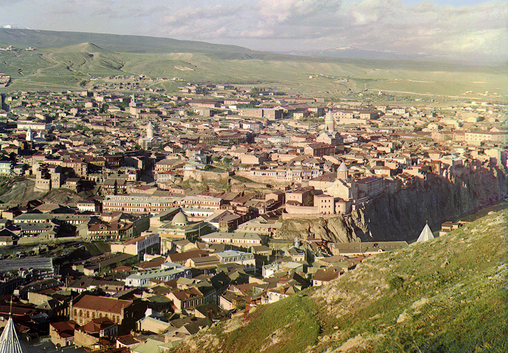
Now, take a look at this image from Prokudin-Gorsky

http://inapcache.boston.com/universal/site_graphics/blogs/bi...

Now, put the first two images in Lightroom. [we're using LR for simplicity] Highlight them both. Hit>G>C>Tab>L

This will let you compare them side by side. llights out. [Make sure the portrait is on the right, landscape on left.]

Analysis:

1) Overall tone, color, contast nearly the same. The portrait is a touch darker, a little more color, but primarily due to the subject matter. more detail in the city, likely due to open aperture of portrait.

2) Grass to rock transitions. Nearly identical color of grass, color of stone, relative contrast of grass to stone.

3) Shadows. Barely present in either image. Some visible in the architecture. I can see into every shadow fine.

4) The weather. One image is a "bright sunny day". The other is cloudy/overcast. But they nearly look identical in overal effect. The familiy portrait looks like they could walk down the hill into town for lunch.

5) Check this histograms, just for fun. Oops. Nearly identical. Slightly left, on one but overall incredibly similar. Masterful control of exposure. [Note: Just fun, and a sanity check.]

6) Reality check A: Image #1 2012, Contemporary Issues, 1st prize stories, Stephanie Sinclair World press photo international. Child Brides, 10 June 2011 Hajjah, Yemen

7) Reality check B:Image #2 is Prokudin-Gorsky, set image #6: View of Tiflis (Tblisi), Georgia from the grounds of Saint David Church, ca. 1910.

So, we have two images on completely different countries, completely different camereas, formats, etc. One from 2011 one from 1910. One on a sunny day. One on a cloudy day. One a portrait, one a landscape. one stopped down, one wide open. But the information resolution, detail, colour, contrast are pretty interchangible.

By pure coincidence?

8) For a real party trick, hit W and click on the clouds on the landscape, and the white tunic on the portrait. This removes the color filters that are giving both of these images that sense of nostalgia and a similar look.

This should raise a few eyebrows, I would think.[1]

9) Higlight the landscape Image and click V, to put thiis to monochrome. Repeat on the right.

What do you think? ___________________

Footnote #1: "Each photograph takes days of painstaking Photoshop work, adjusting the color levels, removing the blemishes, adding contrast, etc" (from original post, quoted by Brown University).

Re: Russia in color, a century ago

#164
post #8

No one is smiling. Not even the kids. Maybe the woman in #20 is, who knows? I know in general 'old time' photos didn't have people smiling much - very posed pictures and stoic expressions. I wonder if they had any idea how much this would color our impression of them 100+ years later?

I think smiling for a photograph must be some sort of social training that humans either take to or don't. I, for example, still find it very difficult and unnatural to smile for photographs unless I am already smiling about something else and the picture is just a candid moment caught at that time. I would imagine that this old picture taking process (3 separate pictures with different filters each time) took quite…

It's not so much social training as it is the exposure time (which you also mentioned). Exposure time was so long that it was nearly impossible to smile in pictures. See for example the picture of the photographer himself at the stream - the running water in the river is a blur. I'm surprised the exposure time isn't that high in these pictures though. The shot of the workmen in the woodshop is distinctly modern by showing 'action'.

Re: Russia in color, a century ago

#165
post #163

Earlier quoted context omitted.

What you've said about Gurksy is fascinating, especially with regard to N-dimensional spaces. I think it would greatly help to see it in person to appreciate the details. I can see now why the Gurksy photograph has sold for more than any other, or at least why it is appreciated, because at first glance, it looks incredibly ordinary. As far as Prokudin-Gorsky goes, you're saying these reconstructions of his photograph…

How can one quantify these effects? I don't think a histogram will do it, since that's global. How can I use digital tools to determine whether these procedures have been used on an image? ... What I see is the most direct interpretation and insubstantial modification of the source material. Could you direct me to what I'm missing? Again, we need to rethink this and set up the problem to one we can solve. Lets work b…

I guess the problem I have with everything you are saying is that you still seem to be implying that somehow the wool is being pulled over our eyes. That the restored Proudin-Gorsky images are more fabrication than an honest attempt to faithfully render the data contained in the original images in a way that is psycho-visually accurate.

But one can make the very same case that Technicolor and Kodachrome and every other photography technology that has ever existed, is as much fabrication as reality. What I'm not seeing here is any evidence to backup the assertion that these particular images are less psycho-visually accurate than if they had been rendered in a different common style. Sure, with Photoshop and/or other software, you have a much bigger toolbox for messing with reality than you used to have in a darkroom, and you can consequently do all sorts of things that I would consider to be more fabrication than representation, but I've seen no evidence yet presented that this is what has occurred here.

One thing that we seem to agree on is that the style that has been used for many of the renderings is an HD video style. One of the things that I was taught by film professors is that the reason that video looks "cheaper" than film is that video is actually more accurate in a lot of ways than film, and we've just been trained by our culture to view the less accurate rendering in film as more classy. I don't know if this claim about film being less accurate than video is true, but if it is, then this might explain why an attempt to render the Proudin-Gorsky images as accurately as possible would end up with them looking like HD video.

I wouldn't, however, be surprised to learn that the images were not rendered as accurately as possible, and the HD video style was specifically chosen, but that choice would also make sense, psycho-visually. If we're not used to seeing photographs rendered in a form as psycho-visually accurate as is possible, we might not experience them as accurate due to our cultural bias.

If, on the other hand, you are not implying that the wool is being pulled over our eyes and are only stating that the Proudin-Gorsky images have been rendered in a a modern style rather than in a Technicolor or Kodachrome style or in the style that you would have seen if you were to have seen Proudkin-Gorsky project them with his lanterns, then point taken. (It would certainly be interesting to see them rendered in a form a close as possible to how they would have been seen in the day.)

Re: Russia in color, a century ago

#166
post #78

These are so amazing. The world wasn't sepia toned a hundred years ago! As silly as that statement is, my brain is actually having a hard time really believing these photos are from 100 years ago. I'm in awe.

Same here except one thing is the same for me: the feeling of the photos or the "vibe" if you will. Because I've seen so many black and white or sepia photos of the past I have this weird image in my head that everything back before color photos was dark and dreary and even people living in that time, in color, saw everything as washed out and bleak. After seeing these in color, "true" color (as in not added after th…

The cameras of the time required longer exposure times, so peoples expressions are (most often) natural. (Try genuinly smiling for a minute.)

Re: Russia in color, a century ago

#167
post #70

I love the fact that these photos capture a landscape without cars. It is especially striking in the shots of cities. Imagine what it would look like if a photo of the same locations were taken now -- more pavement and cars, fewer trees.

Actually, you might be surprised about the tree part. Take a look at Tbilisi then and now, and you'll see more trees now.

Re: Russia in color, a century ago

#168
post #163

Earlier quoted context omitted.

What you've said about Gurksy is fascinating, especially with regard to N-dimensional spaces. I think it would greatly help to see it in person to appreciate the details. I can see now why the Gurksy photograph has sold for more than any other, or at least why it is appreciated, because at first glance, it looks incredibly ordinary. As far as Prokudin-Gorsky goes, you're saying these reconstructions of his photograph…

How can one quantify these effects? I don't think a histogram will do it, since that's global. How can I use digital tools to determine whether these procedures have been used on an image? ... What I see is the most direct interpretation and insubstantial modification of the source material. Could you direct me to what I'm missing? Again, we need to rethink this and set up the problem to one we can solve. Lets work b…

here is what I would call an uneditorialized composition of the image you linked

http://www.loc.gov/pictures/resource/prokc.21676/?co=prok

As anyone can tell, this one has undergone a transformation, colors are corrected, blemishes have been cloned out, and there's some gradient masking at the top to knock down the difference in brightness at the top of the scene.

http://inapcache.boston.com/universal/site_graphics/blogs/bi...

If anything, the version on loc.gov has more vibrant color, tending a little toward the blue. The shadows are open, and as you'd expect from three color plates on monochrome stock, the dynamic range is enormous, sunlight sky and clouds at the top and deep shadows rendered in detail.

Have a look at the original scans here: There's plenty of shadow detail present in the original.

Really, you should download the 16-bit 69.1MB TIFF image, and

not rely on the JPG for details, I'm just linking it for convenience.

Here's where you can download hi-res version. http://www.loc.gov/pictures/collection/prok/item/prk20000011...

I took the time to download and produce my own take on this image. Linked here: http://imgur.com/wHWmu

Here's the thing, had I remembered how to paste into a color channel this whole process would have taken 15 minutes. Instead it took me 30 after I had downloaded the image. With no scripts or otherwise head start, I pasted each image into its own layer, auto-aligned the layers, and pasted them into a new image on the respective color layers. I then used an adjustment layer with a gradient mask to add some contrast to the sky. Saved as a second 16-bit TIFF and pulled that into Camera Raw. Here I added a little sharpness (accutance), pulled the noise reduction slider over a bit. I brought up the brightness about 1 stop and used highlight recovery to bring in the highlights. I did not pull up the shadows. I did not enhance the clarity, or add additional contrast. I did not pull up the blacks. I did not color balance at all. I did not touch the color sliders. So no, I'm not a Photoshop genius, I don't do this work professionally. This is amateur stuff, which accords with my statement of the level of manipulation done on these photos under discussion. This isn't gross, wholesale changes to the image in the way we're all familiar happens in fashion photography. I wouldn't even go the other way, to say this is subtle image manipulation. It's as intellectually honest as cropping without altering content, printing on contrasty paper, dodging and burning. So, please tell me how my image differs significantly from the one linked on the Big Picture, and which you'll find linked

also from the loc.gov page.

Finally, a response to your "points" 1 through 9.

1) "overall tone, color, and contrast nearly the same" Are we even looking at the same two images? One image taken on a completely overcast day, there's fog on the far right too. The other, bright full sunlight, within 2 hours either side of local noon.

2) grass and rock have a distinct tendency to look the same

3) How can you possibly say the shadows aren't present the Prokudin-Gorsky image? It's a sunny day, the sun is high in the sky, the buildings are shrouded in shadow. It's only due to the extreme latitude of three monochrome images combined that we're able to see this in a color slide. An of course, how in the world can there be shadows on an overcast day, in the mountains? What can one expect with a huge horizon-to-horizon dome of diffuse light overhead? I'm not entirely certain the photographer didn't use a strobe in this photo, but the shadows are completely plugged up, and I'd expect to see some catchlights in the people's eyes and the dark cloth to have a bit of a sheen to it. No these two images aren't even remotely the same.

4) You say they look identical, but how? Yes, I suppose on an occluded dark hillside, they can walk out from under the cloud and down into the sunny valley below.

5) Like I may have mentioned, histograms prove nothing about the local contrast situation you're pointing out. But whatever the case, your response is filled with subjectives. I should have been more specific. I would have liked your ideas on objective ways of quantifying this modern photographic look you feel is the key to our visceral reaction to Prokudin-Gorksy's work. Because if digital tools have put it there, there is a way to extract that information.

6) sounds like an interesting article

7) this is good info, it made finding the source image much easier

7 1/2) no, they aren't interchangeable at all. In fact, much of what they have in common is the fact they were photographed on earth, and that human beings with their particular sensitivity to light are viewing them.

8) I don't have any sense of nostalgia with either of these photos, so perhaps that's just you. If there's a color cast in the Prokudin-Gorsky photos, I wouldn't be surprised. Who knows how balanced his color filters were, how accurate his shutter timing was, or how must the exposure compensation differed between the color filters. Any of these factors can shift the color balance. In the more recent photo. I assume the murkiness comes from the scene, the deepness of the blacks, and the lack of the warmth of sunlight. But again, so what if the photographer had stuck a cooling filter in front of the lens, or done the digital equivalent. Is altering the mood of the scene with light allowed?

9) That's a real party trick. two images in monochrome, more alike because their color differences have been discarded. But they are still different enough. I can't help but notice how soft the portrait is, but maybe it's just the JPG image and its size, the people seem flat against the background. There's not a lot of contrast in the scene, but like I pointed out before, it's a trend to enhance local contrast. You can see this distinctly in the faces where the cheeks and foreheads seem to pop out. What pops out in Prokudin-Gorksy which shouldn't?

re: footnote #1, when a restoration takes a long time, we cannot assume it because layers of dishonesty are being heaped on. I can easily see spending hours on each photo. There are plenty of blemishes, and some of the emulsion has come off the plates, which would require reconstruction from scratch. It is painstaking work for the sake of accuracy. As far as I know the Library of Congress mission is the archival of historic artifacts and not the production of emotionally manipulative imagery. They may even err on the side of cold hard facts. You can see the bottom left corner in my image. Notice how one of the color channels is missing. My guess is that was reconstructed from the imagination. That's why you see it in the other images. How long does that take, to pull in the image from the other channel and colorize it appropriately?

Ultimately, the restoration of the Prokudin-Gorksy images is not a tour-de-force of Photoshop. It is not the implantation of faddish notions of color and contrast on a historic process. No subtle tricks to fool the unwary gazer were employed.

I think you may have overstated your case. Instead of letting it drop, you have dug in deeper and deeper, as if you could convince without evidence.

*Edit: typos, addition of a sentence or two, and fixed the ugliness caused by pasting from notepad.

Re: Russia in color, a century ago

#169
post #163

Earlier quoted context omitted.

How can one quantify these effects? I don't think a histogram will do it, since that's global. How can I use digital tools to determine whether these procedures have been used on an image? ... What I see is the most direct interpretation and insubstantial modification of the source material. Could you direct me to what I'm missing? Again, we need to rethink this and set up the problem to one we can solve. Lets work b…

here is what I would call an uneditorialized composition of the image you linked http://www.loc.gov/pictures/resource/prokc.21676/?co=prok As anyone can tell, this one has undergone a transformation, colors are corrected, blemishes have been cloned out, and there's some gradient masking at the top to knock down the difference in brightness at the top of the scene. http://inapcache.boston.com/universal/site_graphics/b…

Whoa. Backup.

This whole thread commentary is off point.

You: I don't understand, therfore I'm right

What kind of logic is this?

Its a non-falsifiable hypothesis.

I cannot prove you understand, if you don't.

I'm not here to hypothesize on why thats the case.

I'm not here to lecture you on art history

I'm not here to demonstrate digital image editing

I'm not here to make you understand

I'm here to share information for those that can put it to use.

If you have no need for this, just find another topic.

At a basic level, you don't have a very good understanding of this subject matter. You can admit that, or you can argue. Nobody cares.

Its useful for HN, though, to answer some of the questions you pose. Because, whether or not you are worthy or capable of understanding things, other people might be.

So, don't flatter yourself too much. I don't have the time to explain or reply to all the stupid shit in these posts. I've tried to skip over most of it and make lemonade out of lemons.

Example 1: Quantify the use of XYZ digital editing technique

The fact that you (1) asked this in the first place; and (2) attempt to use it as a "gotcha" to prove how smart you are is truly a great example of Irony.

How can one quantify these effects? I don't think a histogram will do it, since that's global. How can I use digital tools to determine whether these procedures have been used on an image?...What I see is the most direct interpretation and insubstantial modification of the source material. Could you direct me to what I'm missing?

Again, we need to rethink this...

Translation: And when I say "we" I mean "you" and when I say "re-think" I mean "think" of something useful to say.

So, consider I am not trying to answer your question.

Instead, I put forth a simple way for someone with the right skillset, to make some progress. If you fail, you fail. In essence, my only job I'm taking on her is to put a framework in place that migh be useful to someone that has the potential to understand, and the need.

If you don't understand this, no worries.

I think you may have overstated your case. Instead of letting it drop, you have dug in deeper and deeper, as if you could convince without evidence.

I'm not making a case. The images are "photoshopped". You asked to tell how to see artifacts of this. The way to do that is to compare and do an A/B test. I set that up for you. In 30 minutes I found a contemporary image to use. You're missing the point of why I did this.

The image is an obvious photoshop-orama. Its an award winning press photo. Exhibition quality. But--and this is important--its editorial quality. Than means, that its "interpretive" and true to scene. It could go in the NY times front page or whatever.

The point is this: So, even if they were exactly photoshopped exactly alike, they still are "objective" or whatever. If that's something important to you.

So, who cares if you want to make another one yourself? There are an infinite number of possible prints? You're not adding anything to the conversation. You're also skipping over that the digital scanning process. Which is not a neutral process. That nuetral image has been heavily edited. Atc etc....

The purpose is to understand this: We can make these images in photoshop. The original photgrapher could not. He could never see an sRGB colour output space, on an OLED calibrated LCD screen. None of those colours that went into 16 bit ProPhoto RGB and got moved all over the place, he would have never seen. The N-space images of gursky he could never have imagined. The localized N-space sharpening and color contraste every rookie with photoshop does, he could never have imagined. Simple, stupid shit that is in every WorldPressPhotoIntenatinoal photo, he would have never even imaginged, much less ever saw. Is that good or bad? Neither. It just is the way it is.

His images would have been made in a colour space available to him in 1910. His colour-filtered lanterns would define the colors he saw. It was likely a modest colour space, but I have no idea how efficient his gels were. Etc. and to be honest, I sort of don't care. It would have been cool as shit, for him. As history, its genius that he made the seperations.

But, lifelike or not. The stuff on that webpage, the stuff HB is/was commenting on, what modern photoshop. Its art, but its a different medium. I won't tell you if that is good or bad. But its different, that's for sure. Its not really a debate. Its not like kodachrome or whatever. Its a different ballgame.

The only purpose of this sub-thread was to note this as a relevant consideration. And furthermore, to explain some of this to intellectually interested HN readers. 99.99 percent of the world might be clueless to this. I'm still sorta surprised that the HN crowd may or may not be any better.

Re: Russia in color, a century ago

#170
post #163

Earlier quoted context omitted.

How can one quantify these effects? I don't think a histogram will do it, since that's global. How can I use digital tools to determine whether these procedures have been used on an image? ... What I see is the most direct interpretation and insubstantial modification of the source material. Could you direct me to what I'm missing? Again, we need to rethink this and set up the problem to one we can solve. Lets work b…

I guess the problem I have with everything you are saying is that you still seem to be implying that somehow the wool is being pulled over our eyes. That the restored Proudin-Gorsky images are more fabrication than an honest attempt to faithfully render the data contained in the original images in a way that is psycho-visually accurate. But one can make the very same case that Technicolor and Kodachrome and every oth…

I guess the problem I have with everything you are saying is that you still seem to be implying that somehow the wool is being pulled over our eyes.

On the contrary, PS is an improvement in your eyes. A better anology would be night-vision goggles. You can "see" a lot better with PS. In the same way you can "see" better with amplified starlight.

The last paragraph sort of says: "You are either wrong or trivially true. If you are trivially true, I agree with you."

If, on the other hand, you are not implying that the wool is being pulled over our eyes and are only stating that the Proudin-Gorsky images have been rendered in a a modern style rather than in a Technicolor or Kodachrome style or in the style that you would have seen if you were to have seen Proudkin-Gorsky project them with his lanterns, then point taken.

Again, your premise is wrong. The information content is higher. As established above. So, this breaks down the next part of your argument, too: that PS is like film. Again, film is what I put into the starlight scope. What comes out has amplified latent information.

This leaves what I'm saying as something else altogether and hopefully at once clearer and more agreeable. Lets call this the "enhanced information hypothesis". This is how you get your HD.

So where does that leave us? I think two things follow. One, it explains why people react to these images and remark about their information content and their contemporary feel. Contemporary images have more (color) information in them, and the structure of this information is often unique. But, because its unique (to the present) it is incongrous with the past. The way I would put this is it may help us visualize the past. But I'm not sure it brings us any closer to the past. That is, in sense of shared experience with the people of the past. They would have had a cool thing with their "lanterns". But we are sort of looking at another ball game.

Again, There are gradations, etc to this way of putting it. Nothing is absolute. But I think its directionally correct. Its important enough to take note of, and not to dismiss. It also steers well clear of making any leaps onto further implications about XYZ (veracity, accuracy, etc) which are at once imprecise and unncessary; not relevant to my points but areas of concern you have expressed.

Post reply on HN