Earlier quoted context omitted.
At the risk of being pedantic, I'll explain it too you in another level of detail. First, lets backup though. shawnc 19 hours ago | link | parent | flag These are so amazing. The world wasn't sepia toned a hundred years ago! As silly as that statement is, my brain is actually having a hard time really believing these photos are from 100 years ago. I'm in awe. OK. This was the original statement. The somewhat minor bu…
> None of the film emulsions (prior to NC portra) really give you a contemporary look. To get that, you have to bring the image into digital. I went back and had a look at the photos, and you do have a point. The ones that are most striking to me, though, have--to my eyes, at least--an HD video look to them, not a Photoshop look. And that's one thing that's striking about them to me: They look so immediate and real,…
This is an interesting way to put it.
An HD video look to them, not a Photoshop look. And that's one thing that's striking about them to me: They look so immediate and real, like they were shot yesterday. This property is something we've been trained to associate with video.
So, I think this is the crux of the matter. A trained artist is trained to get the "HD look" without the "Photoshop look".[1] Its like fight club: the first rule of using photoshop, is don't let anyone know you are using photoshop.
Example. Your mind expects certain relationships to hold - an image subject closer to you has more resolvable detail than one farther away - for one. A visual cue for relative depth perception: if i can see it better it must be closer. But, in photoshop, I can differentially sharpen the fore-ground and the back-ground. If I do this to get a "uniform" level of detail,[2] it looks "high-definition" because the background has a higher level of detail [sharpness] than it should (according to your brain). But there is no increase in pixel resolution (ie, definition level) An image like this can be almost difficult to mentally process, you will want to look over every inch to take in all the detail. [Note: how this has nothing to do with color - i can pull this off with neutral colors].
Now, is this a "photoshop look"? Arguably, yes. To someone that is trained in these techniques. The idea that one can make a still image look "cinematic" HD is actually a good way to put it.
So, "looks like photoshop" as I was using it may have been not easy to understand. To many, this might mean "looks like Glamour photography, with airbrush and vivid colour". That is but a tiny subset of cases [popular photography, etc]. Almost all PJ and FA work is heavily (as in 80 layers) photoshopped if its going into a gallery. But it doesn't "look like it", if what you are expecting is something else. But, if you understand how these images are working, you will see they look nothing like the files that come out of RAW or a Digital scan of the negative.
The master of "HD" type looks is Gursky [see footnote 1]. His images have no unnatual colours, but the would be impossible without the powerful colour control you get in photoshop. Ie, the irony is that the more agressive you are with the tonal controls, the more you need color control (and 16bits and large color spaces, etc) to keep the normal part of the look. But its the tonal control that enbale you to create the "definition" that is so distinctive.
______________
[1] Take a look here:
http://upload.wikimedia.org/wikipedia/en/thumb/a/aa/Rhein_II...
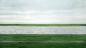
or here:
http://artobserved.com/artimages/2008/01/andreas-gursky-hong...

Disucussion:
http://en.wikipedia.org/wiki/Andreas_Gursky
[2] Assuming the pixel quality is up to par
