Live data from Hacker News

Russia in color, a century ago

archive.boston.com

151–160 of 196 posts

Re: Russia in color, a century ago

#151
post #139

Earlier quoted context omitted.

At the risk of being pedantic, I'll explain it too you in another level of detail. First, lets backup though. shawnc 19 hours ago | link | parent | flag These are so amazing. The world wasn't sepia toned a hundred years ago! As silly as that statement is, my brain is actually having a hard time really believing these photos are from 100 years ago. I'm in awe. OK. This was the original statement. The somewhat minor bu…

> None of the film emulsions (prior to NC portra) really give you a contemporary look. To get that, you have to bring the image into digital. I went back and had a look at the photos, and you do have a point. The ones that are most striking to me, though, have--to my eyes, at least--an HD video look to them, not a Photoshop look. And that's one thing that's striking about them to me: They look so immediate and real,…

The ones that are most striking to me, though, have--to my eyes, at least--an HD video look to them.

This is an interesting way to put it.

An HD video look to them, not a Photoshop look. And that's one thing that's striking about them to me: They look so immediate and real, like they were shot yesterday. This property is something we've been trained to associate with video.

So, I think this is the crux of the matter. A trained artist is trained to get the "HD look" without the "Photoshop look".[1] Its like fight club: the first rule of using photoshop, is don't let anyone know you are using photoshop.

Example. Your mind expects certain relationships to hold - an image subject closer to you has more resolvable detail than one farther away - for one. A visual cue for relative depth perception: if i can see it better it must be closer. But, in photoshop, I can differentially sharpen the fore-ground and the back-ground. If I do this to get a "uniform" level of detail,[2] it looks "high-definition" because the background has a higher level of detail [sharpness] than it should (according to your brain). But there is no increase in pixel resolution (ie, definition level) An image like this can be almost difficult to mentally process, you will want to look over every inch to take in all the detail. [Note: how this has nothing to do with color - i can pull this off with neutral colors].

Now, is this a "photoshop look"? Arguably, yes. To someone that is trained in these techniques. The idea that one can make a still image look "cinematic" HD is actually a good way to put it.

So, "looks like photoshop" as I was using it may have been not easy to understand. To many, this might mean "looks like Glamour photography, with airbrush and vivid colour". That is but a tiny subset of cases [popular photography, etc]. Almost all PJ and FA work is heavily (as in 80 layers) photoshopped if its going into a gallery. But it doesn't "look like it", if what you are expecting is something else. But, if you understand how these images are working, you will see they look nothing like the files that come out of RAW or a Digital scan of the negative.

The master of "HD" type looks is Gursky [see footnote 1]. His images have no unnatual colours, but the would be impossible without the powerful colour control you get in photoshop. Ie, the irony is that the more agressive you are with the tonal controls, the more you need color control (and 16bits and large color spaces, etc) to keep the normal part of the look. But its the tonal control that enbale you to create the "definition" that is so distinctive.

______________

[1] Take a look here:

http://upload.wikimedia.org/wikipedia/en/thumb/a/aa/Rhein_II...
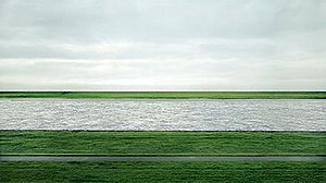
or here:

http://artobserved.com/artimages/2008/01/andreas-gursky-hong...

Disucussion:

http://en.wikipedia.org/wiki/Andreas_Gursky

[2] Assuming the pixel quality is up to par

Re: Russia in color, a century ago

#152
post #50

Note that those shown are all heavily restored (also cropped) versions of the originals. They are all from the Library of Congress collection (~1900 of the ~3500 he made). An example of an unrestored version for comparison is at http://www.loc.gov/pictures/collection/prok/item/prk20000025... .

Anybody know an easy place to download the entire batch? The LoC page makes getting them in bulk a bit of a pain.

I think a bash script and wget will be your best bet there. I looked too and couldn't find a way. If I end up getting some shell script working I'll post it here for you.

Re: Russia in color, a century ago

#153
post #78

These are so amazing. The world wasn't sepia toned a hundred years ago! As silly as that statement is, my brain is actually having a hard time really believing these photos are from 100 years ago. I'm in awe.

Same here except one thing is the same for me: the feeling of the photos or the "vibe" if you will. Because I've seen so many black and white or sepia photos of the past I have this weird image in my head that everything back before color photos was dark and dreary and even people living in that time, in color, saw everything as washed out and bleak. After seeing these in color, "true" color (as in not added after the fact), one thing stays the same. If you pay attention you'll notice that every shot with people in it feels dreary. No one is smiling. Everyone has the same almost depressed, somewhat emotionless expression on their faces. So while I have a hard time dealing with the fact that the world was in color back then the one thing I don't have to reconcile with my preconceived notions of the past is how gloomy the people all seem. I wonder why everyone in old photos states blankly like that. Is it because they're genuinely living a hard life? Could it be that smiling for photos wasn't customary back then? Both?

Also, photos from the 60's through the early 80's also seem to have a unique feel to them. I live in Chicago where some of the buildings have been around since just after the Chicago Fire and to see pictures taken of such places through the 20th century is so strange. I know intellectually that people saw the area in full color like I see it today but somehow older photos of the same streets and places I walk by feel like they're just not the same place. In an old photo a certain building or park will seem, well, old yet when I walk by it, it seems modern as ever even though the place hasnt physically changed much if it all since the early 1900's.

It's weird and I'm glad to know other people have that same sort of relation to older photos. I don't even quite know how to describe it but I did the best I could here.

Re: Russia in color, a century ago

#154
post #135

Earlier quoted context omitted.

I understand how this type of color photography works, as does anyone who read the article, since the article explained it. It's basically the same as Technicolor That sentence says, no you don't understand. The images are monochromes, set with chemistry. 100yrs ago. Then they are scanned into a computer. Imported into photoshop. The color is from photoshop. The working color space is from photoshop. The output color…

These images do not look like Photoshop. The color gamut of the original negatives would probably be outside of the gamut of RGB. What has happened in post-processing is that the contrast and saturation have been exaggerated (is it too much, is that all you're really saying?). I've pulled some of these very same images into Photoshop and reconstituted them into color images. What you've described in so many words is…

[deleted]

Re: Russia in color, a century ago

#155
post #135

Earlier quoted context omitted.

I understand how this type of color photography works, as does anyone who read the article, since the article explained it. It's basically the same as Technicolor That sentence says, no you don't understand. The images are monochromes, set with chemistry. 100yrs ago. Then they are scanned into a computer. Imported into photoshop. The color is from photoshop. The working color space is from photoshop. The output color…

These images do not look like Photoshop. The color gamut of the original negatives would probably be outside of the gamut of RGB. What has happened in post-processing is that the contrast and saturation have been exaggerated (is it too much, is that all you're really saying?). I've pulled some of these very same images into Photoshop and reconstituted them into color images. What you've described in so many words is…

These images do not look like Photoshop. I don't think the images fit the definition of over-colorful. You think that being produced in Photoshop diminishes or alters the reality of these scenes. You fail to demonstrate is why we should care where the color space and tonal separation come from. You haven't demonstrated an understanding of is how color film has always worked.

In all fairness, I think you wrote this while I was addressing most of this in a side-bar discussion upthread. But it makes sense to pull some of these ideas out together just to think about.

To start, take a look at this image: http://upload.wikimedia.org/wikipedia/en/thumb/a/aa/Rhein_II...

This is Rhein II, an image by [Andreas] Gursky, [which] fetched $4.3m (£2.7m) at Christie's, New York on November 8, 2011, becoming the most expensive photograph ever sold. [According to wikipedia.]

So, why look at this? Well, it adresses a couple of things. If you think you know what does and "does not look like photoshop" this will expand your data set. In particular, its not high contrast, or brightly colored or really in any way showing "photoshop". In fact, its not even a digital capture, its film. But the reason why this is the most expensive photograph in the world? Its a tour de-force of photoshop. Its so good, its invisible. Its full of mind-tricks. The space is completely unnatural, yet it looks perfectly normal. Etc.

But to a trained eye, this very much "looks like photoshop".

And it looks like alot of other images. Not all of which are so mind-bending, but in subtle and not so subtle ways may distort reality. Lots of PJ work has this color pallete and tonal range, but of course they aren't allowed all the fun that Gursky gets to have. And so often they just take their "visual look" and overall style from this school of Art.

The visual signature is very, very difficult if not impossible to pull off [in color] using modern analogue methods, not to mention more primitive. But MFA kids and the like can pull it off all the time, from just about and image input. Miracles of modern technology. =D

So, with that in mind, I'd direct you to more direct answers upthread:

http://news.ycombinator.com/item?id=4494818

http://news.ycombinator.com/item?id=4496128

Re: Russia in color, a century ago

#156
post #155

Earlier quoted context omitted.

These images do not look like Photoshop. The color gamut of the original negatives would probably be outside of the gamut of RGB. What has happened in post-processing is that the contrast and saturation have been exaggerated (is it too much, is that all you're really saying?). I've pulled some of these very same images into Photoshop and reconstituted them into color images. What you've described in so many words is…

These images do not look like Photoshop. I don't think the images fit the definition of over-colorful. You think that being produced in Photoshop diminishes or alters the reality of these scenes. You fail to demonstrate is why we should care where the color space and tonal separation come from. You haven't demonstrated an understanding of is how color film has always worked. In all fairness, I think you wrote this wh…

I gave this discussion some thought this morning. Basically the argument boils down to "it's not an old picture, it's modern, it's been post-processed in Photoshop, recently. What you're reacting to is a modern photograph" Correct me if I'm mistaken.

If that is the case, I still disagree. I'll bring the old saw from Ansel Adams that the negative is the score, and the print is the performance. He reprinted some of his most famous photographs throughout his lifetime, and some of these prints are arguably better than others. My point being, that since Prokudin-Gorksy isn't around to give us his performance, others have stepped up and created something they feel is analogous to the actual experience and perhaps amped it up a bit for our color-weary eyes.

There is no way for us to experience these images in the original without the three lens projector Prokudin-Gorsky used. With any method, you can claim that the colors and presentation are an artifact of the production process. If I see a beautiful image, sometimes it's apparent that Kodachrome or Velvia had been chosen specifically because of the way they enhance color or saturation. Would we even be having this discussion in these images had been captured on Kodachrome?

I have some idea of what is possible in Photoshop, and I can say with certainty that these images don't "reek" of Photoshop in the same way that those on the news stand do, with their plastic women and too-white teeth. What has been done is the most rudimentary work necessary to render both an image which is both colorful and complete by proper registration of the layers and by some manipulation of the contrast and saturation. I think that the technicians who put these images together have respected the work and the original intent of the artist (as far as I can suppose it), and have breathed new life into this artifact. What they have done is less invasive and less manipulative than the restoration of the Last Supper.

What puzzles me is this purism. This sense that Photoshop is so dominant over our visual senses that we cannot see past it and make statements about the work itself. That it has to be Photoshop that we find colorful, interesting, or worthy of note.

Not all viewers are equally naive. Some find tone-mapped HDR obtrusive, and the halos, contrast inversion and lack of shadows physically sickening. Some look at HDR and say gee wiz. I think readers on this site deserve more credit by default than the second category.

What I really want to know, is a suggest for fixing this alleged problem, of these images looking like Photoshop. What is the way to experience these images without that obtrusive technical monster in the way? What is the pure experience without some monkey at the keyboard interposing their vision on the work? How can I find myself enamored with the thing in itself, rather than a modern process or technique. Where is the original artwork, and how do you suggest I experience it?

As an aside, I'm very intrigued by your description of Gursky's photo being full of mind-bending and subtle tricks. What is unnatural about the space? I see what looks like compression, possibly by the use of a long lens. The lake should not be sunlit without the ground before and after being sunlit, unless there are some particularly rectangular clouds overhead. Some items have been cloned out, but I haven't been to the site or seen photographs of it to know what. Essentially, what is the visual signature that is present in this photo by Gurksy that is present in the Prokudin-Gorksy photos? I'm just not seeing it. I'd love to see a mockup in Photoshop that would simulate how you think the Prokudin-Gorsky images should look, or does the mere use of Photoshop somehow make it impossible to create an approximation of the ideal look of this work.

Re: Russia in color, a century ago

#157
post #68

Earlier quoted context omitted.

reminds me of the story (not sure if it is true or not) of how the telephone revolutionised the world - prior to that, you had to be introduced to someone by a third party before you could speak to them; subsequent to the telephone the word 'hello' was invented. Or so the story goes

Myth busted: http://www.pitara.com/discover/5wh/online.asp?story=184

Thanks for the link. Would have been nifty if 'Ahoy!' had of caught on!

This is the reference which backs up my point, however it makes it slightly more eloquently- saying that 'Hello' was a way to cut across Social barriers which were much more rigid before the invention:

http://books.google.com.au/books?id=AgLDhOySfMgC&lpg=PA3...

Ps apologies for the mess

Re: Russia in color, a century ago

#158

Earlier quoted context omitted.

I probably mostly hear from purists and those people that don't want to look at the facts because "records are better than CD's" and similar arguments. I didn't know they were competing with medium format film now. That's .. saying something. o.o

Which is so funny because when music is produced digitally (99% of the recordings in the past decade) a CD can be a bit-perfect copy of the original mastering. A vinyl record is a stamp of a stamp of a stamp of a scraping of the original master. Better than a CD? Evidence of complete mental breakdown, more like.

This always makes me wonder whether there isn't something about the imperfections from these analog copies (not to mention various analog playback mechanisms) that 'adds' to the richness/perceived value of the music... Perhaps on some level some percentage of us prefer to know that we have a copy of a copy, or some level of imperfection, in our version that we play, vs a straight up 100% clone

Re: Russia in color, a century ago

#159
post #155

Earlier quoted context omitted.

These images do not look like Photoshop. I don't think the images fit the definition of over-colorful. You think that being produced in Photoshop diminishes or alters the reality of these scenes. You fail to demonstrate is why we should care where the color space and tonal separation come from. You haven't demonstrated an understanding of is how color film has always worked. In all fairness, I think you wrote this wh…

I gave this discussion some thought this morning. Basically the argument boils down to "it's not an old picture, it's modern, it's been post-processed in Photoshop, recently. What you're reacting to is a modern photograph" Correct me if I'm mistaken. If that is the case, I still disagree. I'll bring the old saw from Ansel Adams that the negative is the score, and the print is the performance. He reprinted some of his…

I think its worth backing up a bit. "What puzzles me is this purism." "Not all viewers are equally naive." "the original intent of the artist" "Where is the original artwork" "What I really want to know, is a suggest for fixing this alleged problem" "There is no way for us to experience these images in the original" "What you're reacting to is a modern photograph."

Nobody thinks like this anymore. These were debates from a long time ago. This is all strawman. These questions don't need to be answered. Digital post processing is the norm. It does not make an image worth anything. It does not ruin it. It is just a fact or not (and in these cases, we know its true).

Second, why does this even matter? Well, for (1), it opens up an entirely new realm of colours. Second (2), it allows for an entirely new realm of image-data-translations. So, we can assign point X a unique color, and then translate point X and all its neigbours to unique colors, without ruining the "image" information in the process. (3) It enables an entirely new rage of output colours, so what we see is and relate too is more/less similar based on 1x2x3. This is independent of the quality of the input image, but is magnified when these inputs are high-quality (because more translation can occurr with better tonality, et). Here is the intuition: Photoshop workin space vs Monitor output space.

http://www.luminous-landscape.com/Images32/17.jpg

Massive difference. Of course none of this has to do with what the image originally took in, this is just what we can do with it after we have it. We can do alot.

So, takeaway #1 is the actual color pallette of digital is unique. The acual image may be a tiny subset, and it may be designed such that it maps to an even tinier subset that is shared with C-print or whatever else you choose. But although I may end up in a output space not blowing through the space during my translations is critical. If I am workin in space I am very constrained on translations. Ina space, I can do lots of translations and then jam the output into space at the end, wit a lot less damage.

The next question is: style and image composition. Is that unique to digital, and if so how? Why does it matter? Is it visible. etc. This is actually alot more important than the color range. The color range, we can (if we want to) keep "normal looking" pretty easily. But we need powerful tools to keep it normal looking, if we want to also have stong image tonal controls. Each time we dial up an RGB curve, it gives us more color in addition to more contrast. In chemistry, the paper controls the contrast level (for the most part). But the paper is the whole image, so a strong contrast and a punch color go together. the whole image has this "look". Kodachrome, Vevia etc for example is typical. But in digital, I can have a stong contrast and a muted color, because I can turn down the color for each turn up of contrast. So, even on a cloudy day, I can have stong contrast in the midtones, with no black shadows. I can add strong contrast to the light sky, without blown out highlights. I can have stong overal contrast from forground to background. I can have massive tonal seperations between a green grass and a grey river. etc.

This look is very "contemporary". To sum, its strong local contrast with muted to natural color. There are unnatural amounts of information present in all kinds of atypical relationships. Visual cues of depth and relative location do not act like normal. etc. Its more "interesting" to look at, because there is actually more information in the image.

What does this say about image quality? Nothing. This is true for good images and bad images. You can generate some of these effects on instagram. Its just more stuff to look at that is precisely tailored to the way your brain processes the images (ie, midtone=yes, shadows=no, etc). There are a whole host of subtle mind tricks, if you want to go there. Point of fact is ansel adams is using these techniques in many of his prints, just not in color. Its just that with PS this is all easier, faster, and far more widespread the understanding.

So, is some of this present in the images? Yes, it seems it is. These images are also interesting in their own right, this is not a critique. But for the many folks who are wondering "how it is possible" they are so lifelike and HD and cinematic and etc. This is in part the reason. In his day, they would have been nice BW prints. But the colour space of "lanterns" vs the color space of ProfotoRGB? is not comparable. lots more information extraction is possible in color today than 100 years ago, no doubt. And thats part of the reason for this "uncanney valley" of hyper-reality people seem to notice here. The extra information paired with the artifacts of glass plate images, and all that is almots-not-quite-perfect-but-still-very-cool.

So, is this insightful? I don't know. That's for you to decide, I was only sharing this for those who cared.

Not all viewers are equally naive...I think readers on this site deserve more credit by default

WEll, this may or may not be well known. My first few answers were thinking everyone knew this. But I hope you don't feel like this is talking down to you. This is also providing the foundation to understand Gursky. Its abit outside the scope of this discussion, but suffice it to say he is projecting freehand N-dimensional spaces, that are masked to appear normal. Consider a panaroma from the mars rover. But stiched together in an imaginary plane. But now consider that the rover is flying, not stationary. Its sort of a picasso in photoshop. But it looks "normal". Until you see how it doesnt. How it cant possibly be real. But then you step back, and it looks normal. you step up and can see every detail, perfect. The color is normal. The contrast is not extreme, etc. It looks "normal" but its not. .....

In a 2001 retrospective, New York's Museum of Modern Art described the artist's work, "a sophisticated art of unembellished observation. It is thanks to the artfulness of Gursky's fictions that we recognize his world as our own."[7] Gursky’s style is enigmatic and deadpan. There is little to no explanation or manipulation on the works. .[8]

.....

His photography is straightforward? But wait...

Camera position is the co-star of these pictures. Usually Gursky places his lens high above, far away, on cranes, or even on helicopters. His pictures often entail multiple views of the same subject, different subjects seamlessly spliced together, and digital manipulation.

Notice how little of this is explained in the catalog:

http://www.christies.com/LotFinder/lot_details.aspx?intObjec...

For more reading up on this, with explanations:

http://www.amazon.com/Why-Photography-Matters-Never-Before/d... [disregard the star rating]

Another Gursky that is more obviously mind-bending:

http://www.matthewmarks.com/new-york/artists/andreas-gursky/

Re: Russia in color, a century ago

#160
post #155

Earlier quoted context omitted.

These images do not look like Photoshop. I don't think the images fit the definition of over-colorful. You think that being produced in Photoshop diminishes or alters the reality of these scenes. You fail to demonstrate is why we should care where the color space and tonal separation come from. You haven't demonstrated an understanding of is how color film has always worked. In all fairness, I think you wrote this wh…

I gave this discussion some thought this morning. Basically the argument boils down to "it's not an old picture, it's modern, it's been post-processed in Photoshop, recently. What you're reacting to is a modern photograph" Correct me if I'm mistaken. If that is the case, I still disagree. I'll bring the old saw from Ansel Adams that the negative is the score, and the print is the performance. He reprinted some of his…

[deleted]
Post reply on HN