Live data from Hacker News

Pepsi: Breathtaking Design Strategy (2008) [pdf]

jimedwardsnrx.files.wordpress.com

211–220 of 276 posts

Re: Pepsi: Breathtaking Design Strategy (2008) [pdf]

#211

Worth mentioning that this is the same design company that blew $35MM on a terrible redesign of Tropicana Orange Juice, which they reverted back within a couple days (but kept the mock orange cap) https://www.thebrandingjournal.com/2015/05/what-to-learn-fro...

Their new design was just yet another example of how the currently in vogue "minimalism everywhere" design aesthetic sucks. The Tropicana case study is such a great example because the effects were so drastic, but only really because there were easily substituted goods - consumers basically thought the carton was just "generic store brand OJ". My guess is that other recent brand redesigns to this boring, same, sans-s…

Years and years ago we used to have a supermarket here called Kwik-Save (here been the UK) and they had a range called No-Frills.

Their packaging was absolutely genius because it instantly stood out on every shelf.

https://pbs.twimg.com/media/Da0flNiWkAAUda7.jpg
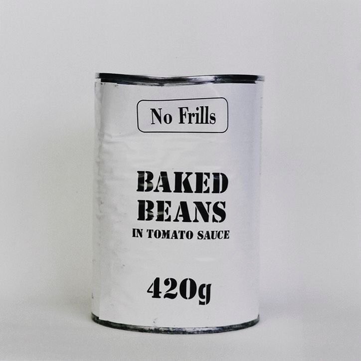
Other than the font it seems like everyone wants to got that way, of course if you move with the crowd you can't stand out from it.

Re: Pepsi: Breathtaking Design Strategy (2008) [pdf]

#212
post #45

PepsiCo Inc (PEP, Nasdaq) isn't merely a beverage company - as explained in this strategy document - it is a space company. The Pepsi Universe, with respect to its 8 light year characteristic length, reflects the scale of the total addressable market (TAM) that PepsiCo can expand into. Noted short-seller and equity valuation skeptic Jim Chanos once described the TAM of space companies as infinite, because space itsel…

It will also take infinite time unfortunately

Re: Pepsi: Breathtaking Design Strategy (2008) [pdf]

#214
post #210

Earlier quoted context omitted.

> In pre-publicity for Shift, Arnell reveals that his habit of eating up to 50 oranges a day has left his hands bright orange in color. Bullshit. You'd be in a permanent sugar rush until your pancreas went on fire.

I don't know about Arnell's case, but it's actually possible to turn orange by eating orange things. Although I think it's more common with carrots and young children. https://en.wikipedia.org/wiki/Carotenosis

Not even that difficult.

My ex had a few excessive habits when she was 21, but one was eating lots of carrots (like a bag a day?) and her palms turned a distinct orange.

Re: Pepsi: Breathtaking Design Strategy (2008) [pdf]

#215
post #210

Earlier quoted context omitted.

> In pre-publicity for Shift, Arnell reveals that his habit of eating up to 50 oranges a day has left his hands bright orange in color. Bullshit. You'd be in a permanent sugar rush until your pancreas went on fire.

I don't know about Arnell's case, but it's actually possible to turn orange by eating orange things. Although I think it's more common with carrots and young children. https://en.wikipedia.org/wiki/Carotenosis

That’s how flamingos turn pink.

Humans occasionally turn permanently blue by being pranked into eating colloidal silver.

Re: Pepsi: Breathtaking Design Strategy (2008) [pdf]

#216
post #27

What came first: logo or journey? I wonder what was created first - the agency creating the new logo (and then backing into the justification for it), or did the justification for it actually come first & that lead the agency down the path to how the logo was ultimately created.

Seems all very post-hoc

Re: Pepsi: Breathtaking Design Strategy (2008) [pdf]

#218

Earlier quoted context omitted.

I see high level design docs like this on occasion. I decided I am not qualified to comment, but my opinion is very polar. Either it is all a very expensive pile of poop or brilliance and design beyond my understanding. When looked upon at a distance I cannot discern which opinion is correct.

This Pepsi redesign is just particularly (spectacularly) bad. There are plenty of brand briefs which are intelligent, strategic and grounded in reality.

English Premier League had a fantastic rebrand: where they selected a nice color set that stood out (it was "their" color set), new font, new visual style guide including new animations, new logo (that causes some controversy but it prints well). They also made a piece of music that makes you feel that you just watched something great/fantastic/historic - even if the match itself wasnt good.

Most of the time modernizing the logotypes and fonts to make them simpler does not work, but here someone came with a coherent strategy that simply looks good and is distinct enough.

https://medium.com/look-and-logo/a-closer-look-at-the-premie...

https://www.youtube.com/watch?v=px3NqI7-v50

Re: Pepsi: Breathtaking Design Strategy (2008) [pdf]

#219

despite how silly this may seem to many in the HN audience, I will contend that: if you were running a multi-billion dollar sugar water company whose main moat is the brand, and spent hundreds of millions on ads each year as one of the key line items in the budget, you too would want this level of sophistication and thought put into a brand refresh. Probably even more. And you can imagine that this document was debat…

They were supposed to make on field consumer tests - by showing them the new logotype.

Consumer research existed long before IT started A/B testing everything.

Re: Pepsi: Breathtaking Design Strategy (2008) [pdf]

#220
post #210

Earlier quoted context omitted.

I don't know about Arnell's case, but it's actually possible to turn orange by eating orange things. Although I think it's more common with carrots and young children. https://en.wikipedia.org/wiki/Carotenosis

That’s how flamingos turn pink. Humans occasionally turn permanently blue by being pranked into eating colloidal silver.

No problem they'll just drink bleach to correct it.
Post reply on HN