Worth mentioning that this is the same design company that blew $35MM on a terrible redesign of Tropicana Orange Juice, which they reverted back within a couple days (but kept the mock orange cap) https://www.thebrandingjournal.com/2015/05/what-to-learn-fro...
Their new design was just yet another example of how the currently in vogue "minimalism everywhere" design aesthetic sucks. The Tropicana case study is such a great example because the effects were so drastic, but only really because there were easily substituted goods - consumers basically thought the carton was just "generic store brand OJ". My guess is that other recent brand redesigns to this boring, same, sans-s…
Their packaging was absolutely genius because it instantly stood out on every shelf.
https://pbs.twimg.com/media/Da0flNiWkAAUda7.jpg
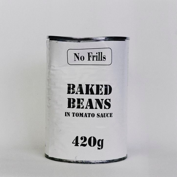
Other than the font it seems like everyone wants to got that way, of course if you move with the crowd you can't stand out from it.