Earlier quoted context omitted.
There is an "Apple" market for the first company that designs a simple microwave oven. The user interface on most of those things is atrocious. A beautiful oven with two dials would kill on the market. (maybe there is one, but I couldn't find one browsing on appliance stores)
>A beautiful oven with two dials would kill on the market. And it did, in the 1970s https://upload.wikimedia.org/wikipedia/commons/c/cd/1971rr4....
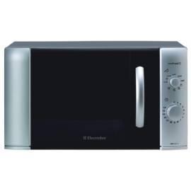
Still running as my only microwave although I don't use it for much, other than warming the occasional cup of water for a tea.
Last Christmas I rented a cabin for vacation. The MW had more buttons than my TV remote control. Icons and button placement were completely not intuitive. I am convinced that this is done just because more buttons suggests more functions and more advanced product. Everyone else is doing it so they all slap them on to compete. You get 4 buttons and an LCD to do what a rotary dial did.