Live data from Hacker News

The end of the nice GTK button

blog.brixit.nl

591–600 of 666 posts

Re: The end of the nice GTK button

#591

Earlier quoted context omitted.

It's not very clear to me it's clickable.. Is it an action, or a link to a different page/view? If it's an action (accept/decline invite), make it a button. If it's navigation, make it a text link. You are giving totally disparate cues to the user when the actions taken upon clicking are of the exact same type. My initial reaction to a piece of text directly next to a button is "why is there random unrelated text the…

Literally zero reason not to? I think it’s emphasising the “default” action quite nicely, and de-emphasising the other action quite appropriately. “Decline invitation” needs to be something you can do, of course, but it will be used I find that having buttons side by side forces me to think in a mildly unpleasant way, like I have to read two thinks more carefully because there is more onus on me to decide which is th…

No, that's still not a reason to conceal the behaviour/purpose of the UI element.

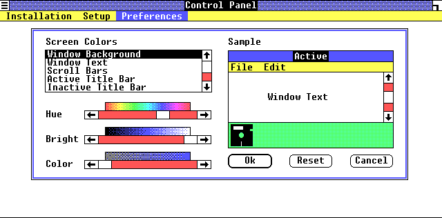
If you want to emphasize/de-emphasize a UI element, you can do something like was established on most GUIs 30+ years ago: make the default/safest option have a thicker border, and the secondary/de-emphasized option have a thin border. Early examples (1985 and 1991 respectively):

https://guidebookgallery.org/pics/gui/settings/appearance/wi...
https://guidebookgallery.org/pics/gui/system/features/search...
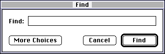
Note how immediately-obvious it is which action is the "typical". You don't even have to read the text, you could even squint your eyes or glance from a great distance and still understand which button is the one you probably want.

UI design involves trust, especially for software where people are trying to actually get something done. Making unconventional designs erodes your users' trust. Have respect for them and what you can reasonably expect them to "know" arriving at your software, and they will have an easier time and love you for it. As we can see, these conventions have existed for decades, and deviating from them warrants a very compelling reason, not just "cuz it looks neat".
Re: The end of the nice GTK button

#592
post #452

Earlier quoted context omitted.

I disagree. I had to sit and think for a few minutes as it was extremely unintuitive - my first impressions were that I couldn't decline the invitation at all, and the button was disabled or missing for some reason (I've seen some bad CSS in my career so it no longer surprises me when it goes missing).

The button and link next to each other is a common pattern that has been used for decades at this point. It's core to Google's material design. I agree that it might not be ideal, but when it is used literally everywhere I do not believe it's that hard to read.

Decades? Any examples of this? Material Design has only been around since 2014, so that's not really a good example to cite.

Re: The end of the nice GTK button

#593
post #530

Earlier quoted context omitted.

JetBrains did a lot of work to reduce typing latency of their IDEs: https://blog.jetbrains.com/idea/2015/08/experimental-zero-la... As an aside, I find it amusing that more latency is introduced by a USB keyboard than existed in an entire 80's computer (from keypress to rendering on screen). See also: Carmack's rant about how it takes longer to put a pixel on the screen than ping across the Atlantic.

> As an aside, I find it amusing that more latency is introduced by a USB keyboard than existed in an entire 80's computer Uh what?

Found the article I was thinking of:

>at the time I did these measurements, my 4.2 GHz kaby lake had the fastest single-threaded performance of any machine you could buy but had worse latency than a quick machine from the 70s (roughly 6x worse than an Apple 2), which seems a bit curious.

>We can see that, even with the limited set of keyboards tested, there can be as much as a 45ms difference in latency between keyboards. Moreover, a modern computer with one of the slower keyboards attached can’t possibly be as responsive as a quick machine from the 70s or 80s because the keyboard alone is slower than the entire response pipeline of some older computers.

https://danluu.com/keyboard-latency/

Re: The end of the nice GTK button

#594
post #585

Earlier quoted context omitted.

> it is minuscule, and it is the peak I managed to get when moving as fast as possible. At the same refresh rate, blitting, say, 1024x1024 pixmaps would yield 576MiB/s so here we are talking about 72 times less. If 70% of the pixels are the same shade of gray, that’s not impressive at all. If you are serializing image data and storing it over the network, you can do better than uncompressed with virtually no CPU load…

> Besides, at 8 MiB/s, lossless video codecs are pretty doable for fullsceen UI. Modern VNC implementations (Ultra, Tiger, etc.) make a joke of this figure and can still get good text quality. Here's how tigervnc looks on the exact same situation: https://www.veed.io/view/0ca6898a-a535-4f0a-accb-b22e2e184b0... Sure, it uses less bandwidth (between 2 and 2.5 MiB for the busy part of this video) but it is also full of…

True! VNC is not ideal because it's pretty old by now. Chrome Remote Desktop would've been a better example, and even that is behind what can be done, as I believe it still uses VP8. It's possible even a lossless codec like ffv1 could be plausible in the window of 8 MiB/s, but I'm not sure it's necessary, as even old h264 does a pretty convincing job at very low bitrates.

Here's a snippet of my 2256x1504 screen, uncompressed:

https://files.catbox.moe/9k6cnm.png

Here's a snippet of my 2256x1504 screen from an OBS recording:

https://files.catbox.moe/va46ze.png

This is using x264 at just 0.5 MiB/s. Not even pegging a CPU core.

If you move really fast, then there are some artifacts during motion (same recording):

https://files.catbox.moe/myhnc7.png

...But they are not really noticeable in motion, and it clears up quickly.

I don't have a high framerate, high DPI display to test, but I'm guessing most people will only strongly care about one or the other since displays that do both are pretty expensive.

And yeah, chroma subsampling on subpixel rendering should impact legibility, but in practice it's difficult for me to tell any difference.

I've played around for a bit and I don't go above 1 MiB/s so far. I probably would need to play a video for that.

Re: The end of the nice GTK button

#595

Earlier quoted context omitted.

It's not very clear to me it's clickable.. Is it an action, or a link to a different page/view? If it's an action (accept/decline invite), make it a button. If it's navigation, make it a text link. You are giving totally disparate cues to the user when the actions taken upon clicking are of the exact same type. My initial reaction to a piece of text directly next to a button is "why is there random unrelated text the…

Literally zero reason not to? I think it’s emphasising the “default” action quite nicely, and de-emphasising the other action quite appropriately. “Decline invitation” needs to be something you can do, of course, but it will be used I find that having buttons side by side forces me to think in a mildly unpleasant way, like I have to read two thinks more carefully because there is more onus on me to decide which is th…

The button to decline doesn't add an entity. There are already two options to consider whether to accept or decline. Making the external state and internal state match avoids confusion.

Re: The end of the nice GTK button

#596

Earlier quoted context omitted.

> Equity for serif, Concourse for sans-serif and Triplicate for monospace Are you a lawyer? (There is an in-joke here, I swear)

No, but Matthew Butterick, who made them, is: https://mbtype.com/ , https://mbtype.com/bio.html .

Yes, that was the in-joke. :) They're among my favorite typefaces (as is his newer Century Supra).

Re: The end of the nice GTK button

#597
After sharing this in https://www.reddit.com/r/gnome/comments/tn8why/the_end_of_th... , a commenter pointed out an issue going into more detailed discussion around these buttons and some of the tradeoffs to consider in having outlines or not: https://gitlab.gnome.org/GNOME/libadwaita/-/issues/228

Re: The end of the nice GTK button

#598
post #106
post #95

Earlier quoted context omitted.

“Scale-independent layout” (layout that ignores pixel aliasing) really requires PPI over ~200, that is, more than most desktop monitors provide. We’re still just not there.

It’s going to be a bloody mess for a long time, because the choices for how to handle resolution independence are all inherently filled with compromise. With font rendering, I think there is hope. Horizontal subpixel positioning with vertical hinting seems like a good tradeoff to me. Grid fitting vertically is not too jarring, and grid fitting horizontally to subpixels instead of pixels looks pretty good too, on low…

> The fix might be a new API that reveals true coordinates…

We already have this with `ResizeObserver` using the `device-pixel-content-box` option. [1]

[1]: https://developer.mozilla.org/en-US/docs/Web/API/ResizeObser...

Re: The end of the nice GTK button

#599
post #594

Earlier quoted context omitted.

> Besides, at 8 MiB/s, lossless video codecs are pretty doable for fullsceen UI. Modern VNC implementations (Ultra, Tiger, etc.) make a joke of this figure and can still get good text quality. Here's how tigervnc looks on the exact same situation: https://www.veed.io/view/0ca6898a-a535-4f0a-accb-b22e2e184b0... Sure, it uses less bandwidth (between 2 and 2.5 MiB for the busy part of this video) but it is also full of…

True! VNC is not ideal because it's pretty old by now. Chrome Remote Desktop would've been a better example, and even that is behind what can be done, as I believe it still uses VP8. It's possible even a lossless codec like ffv1 could be plausible in the window of 8 MiB/s, but I'm not sure it's necessary, as even old h264 does a pretty convincing job at very low bitrates. Here's a snippet of my 2256x1504 screen, unco…

> Here's a snippet of my 2256x1504 screen from an OBS recording:

I wouldn't be able to stand something like this at all, it looks horrible to me. The text is all smudged.

Re: The end of the nice GTK button

#600

Earlier quoted context omitted.

They still exist on BSD! But yes it has gone away on Linux.

Huh Til that ifconfig is deprecated. I still use it periodically, but my work laptop is on 18.04

It can be restored with the `net-tools` package, thankfully. That's among my first installs on a Linux box. Never quite got into `ip addr show` when I've most of the ifconfig flags memorised from use.

Which may contradict my previous point slightly, but at least it is easy to put the system back into a state I want and the system will maintain this state.

Post reply on HN