Earlier quoted context omitted.
It's not very clear to me it's clickable.. Is it an action, or a link to a different page/view? If it's an action (accept/decline invite), make it a button. If it's navigation, make it a text link. You are giving totally disparate cues to the user when the actions taken upon clicking are of the exact same type. My initial reaction to a piece of text directly next to a button is "why is there random unrelated text the…
Literally zero reason not to? I think it’s emphasising the “default” action quite nicely, and de-emphasising the other action quite appropriately. “Decline invitation” needs to be something you can do, of course, but it will be used I find that having buttons side by side forces me to think in a mildly unpleasant way, like I have to read two thinks more carefully because there is more onus on me to decide which is th…
If you want to emphasize/de-emphasize a UI element, you can do something like was established on most GUIs 30+ years ago: make the default/safest option have a thicker border, and the secondary/de-emphasized option have a thin border. Early examples (1985 and 1991 respectively):
https://guidebookgallery.org/pics/gui/settings/appearance/wi...
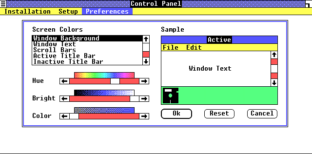
https://guidebookgallery.org/pics/gui/system/features/search...
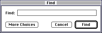
Note how immediately-obvious it is which action is the "typical". You don't even have to read the text, you could even squint your eyes or glance from a great distance and still understand which button is the one you probably want.
UI design involves trust, especially for software where people are trying to actually get something done. Making unconventional designs erodes your users' trust. Have respect for them and what you can reasonably expect them to "know" arriving at your software, and they will have an easier time and love you for it. As we can see, these conventions have existed for decades, and deviating from them warrants a very compelling reason, not just "cuz it looks neat".