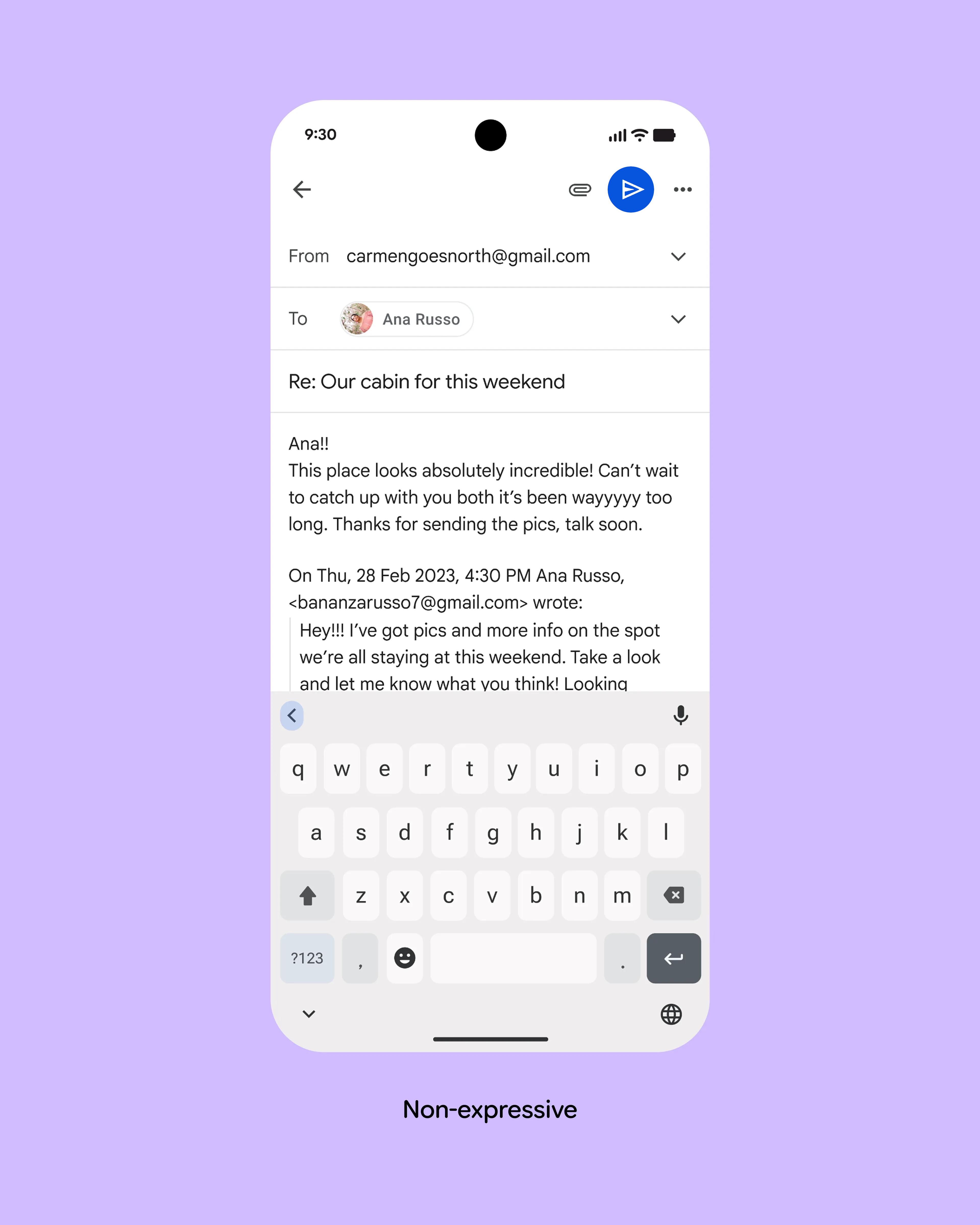
It's incredible how bad this keeps getting and how much they ignore formerly well-established UI principles in favour of "vibe design" and pseudoscientific "studies". What is the explanation for this? What is the reason that even the most well-funded companies in the world fuck this up so bad? At some point they resize the send button into a circle of comically huge proportions — eating even more space from the actua…
The executives at Google don't care about any of this stuff, they use iPhones.
They know that people are always going to buy Android phones no matter what they do to the system because "cheaper and more megabytes for the money" than iPhones.