Live data from Hacker News

Material 3 Expressive

design.google

91–100 of 577 posts

Re: Material 3 Expressive

#91
post #24

That's a mixed bag. Have a look at the linked https://m3.material.io/blog/building-with-m3-expressive to get a better impression of what this is about. From the guidelines given there, many parts of the design make sense and will help designs work better - grouping objects properly, be aware of contrast to highlight important elements, more options for good typography (instead of basically none, Android/Material offe…

It's been a meme [0] for a while that Google is eventually designing all icons to look the exact same. I think the UX engineers have been kicked out.

[0]https://miro.medium.com/v2/resize:fit:1400/0*X5Zz-PxT8087KG2...

Re: Material 3 Expressive

#92

It's funny that the people who designed this monstrosity of a web page feel qualified enough to advice other people about design.

Who would be qualified enough to talk with you about new design trends then?those that design on your taste? Rarely, if ever, new design trends are liked by everyone. All in all, I think they are qualified enough.

Re: Material 3 Expressive

#93
post #14

> Expressive design makes you feel something. It inspires emotion, communicates function, and helps users achieve their goals. I sometimes wonder if the people writing this sort of thing really believe what they're writing? Their case study is mostly just "make buttons that people use a lot stand out". Oh wow! Such emotion! Much feels!

I doubt it's actual people writing it anymore, probably something from Gemini. All the emotions, none of the feels.

Re: Material 3 Expressive

#94
post #41

The 'send' example perfectly illustrates why I would find Material 3 hard to use - it makes it harder to write the message but easier to send. It's less usable.

I went through a few thoughts when seeing the design: - I do have trouble spotting the send button on the old design - Maybe just moving it to a similar position as the new design would help - I don't actually want it near the keyboard because I might accidentally tap it - There's plenty of space, why can't they just have a button that actually says 'send'?

> There's plenty of space, why can't they just have a button that actually says 'send'?

Words? Are you crazy, this is 2025!

/s

Re: Material 3 Expressive

#95
post #14

> Expressive design makes you feel something. It inspires emotion, communicates function, and helps users achieve their goals. I sometimes wonder if the people writing this sort of thing really believe what they're writing? Their case study is mostly just "make buttons that people use a lot stand out". Oh wow! Such emotion! Much feels!

I unfortunately think this is a case of manufactured consent:

> You don’t say something because it’s true; you say it because you believe it—and you believe it because it’s what gets rewarded.

Re: Material 3 Expressive

#96
post #14

> Expressive design makes you feel something. It inspires emotion, communicates function, and helps users achieve their goals. I sometimes wonder if the people writing this sort of thing really believe what they're writing? Their case study is mostly just "make buttons that people use a lot stand out". Oh wow! Such emotion! Much feels!

I notice that Google's design never speaks for itself. It's always married with overbearing verbiage that sounds like it was penned for a Will Ferrell film.

Re: Material 3 Expressive

#97
post #24

That's a mixed bag. Have a look at the linked https://m3.material.io/blog/building-with-m3-expressive to get a better impression of what this is about. From the guidelines given there, many parts of the design make sense and will help designs work better - grouping objects properly, be aware of contrast to highlight important elements, more options for good typography (instead of basically none, Android/Material offe…

For anyone not familiar with previous designs, each component in https://m3.material.io/components has a "comparison with Material v2" section.

Biggest change seems to be that everything is round and purple now. It looks more playful and less professional.

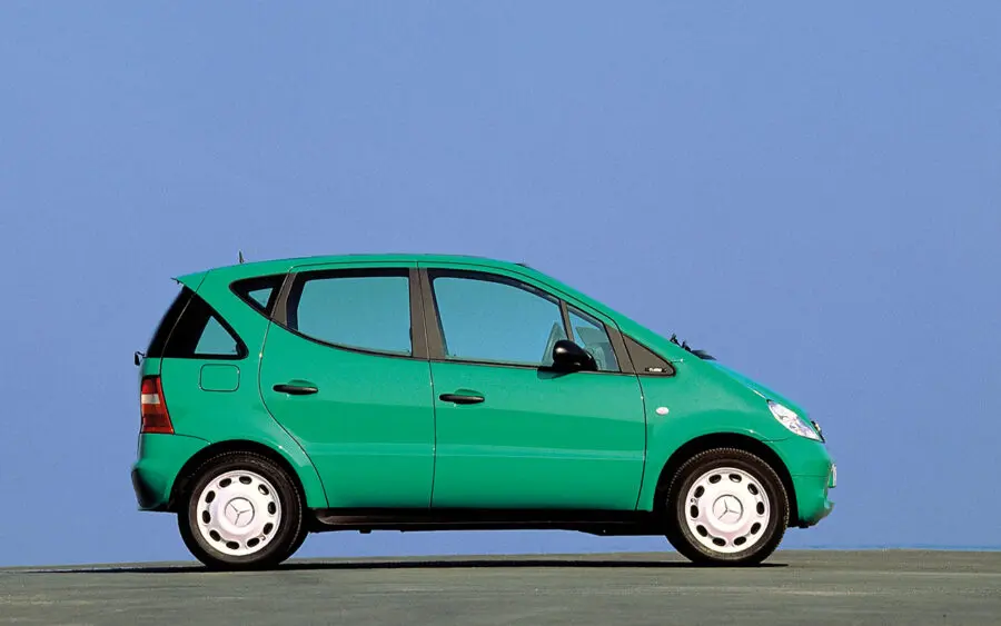
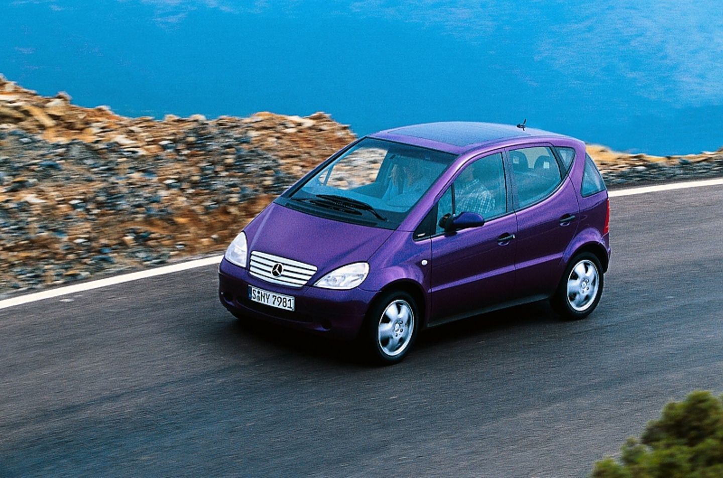
Edit: I dislike their recent color picks. First that teal in Google Maps, now the purple. Why? Are they trying to copy the color paltette of the first Mecedes A-Class (aka "Listerine" colors [1][2])?

[1] https://prestigeandperformancecar.com/wp-content/uploads/A97...

[2] https://image.stern.de/31749130/t/Ag/v2/w1440/r0/-/01--artik...

Re: Material 3 Expressive

#98
"how much time does it take on first use to spot a button"

We need to help first time users work out how to use our software, but I don't follow the logic on why we should prioritise around this. I get that we can lose users early on if they are confused by our apps, but that's not the full picture.

For a regular-use app (such as email in the example), what % of a user's time is spent as a new user, vs time spent as a no-longer-new user? Obviously over the lifetime of an app the amount of time spent as a new user is far less than that spent as a non-new user. After a few uses I know where the button is. But the design compromises (eg less space in the UI for content due to the oversize button) persist.

At some point the training wheels on the bike stop helping and start hindering.

This is the same gripe I have with the argument for UI animations "informing the user about what's happening". macOS (which stands out due to its refusal to just add a preference to fully disable animations) has educated me on the concept that an app minimises 'into the dock where it lives' many thousands of times now. I get it, honestly.

Maybe the solution is to have the UI grow in complexity as the user becomes more familiar? After the enlarged 'send' button has been clicked 5 times, reduce its size... maybe even do this gradually, a couple of pixels per click until it reaches 'expert size'. Or have an internal list of user actions and once a few of them have been completed offer to put the UI into intermediate mode?
Re: Material 3 Expressive

#100
post #14

> Expressive design makes you feel something. It inspires emotion, communicates function, and helps users achieve their goals. I sometimes wonder if the people writing this sort of thing really believe what they're writing? Their case study is mostly just "make buttons that people use a lot stand out". Oh wow! Such emotion! Much feels!

Since a few years I can't tell if these things are satirical or serious, a lot of people working for FAANG are completely delirious and barely connected to the reality of 99.999% of the population.

> M3 Expressive designs were rated higher across desirability attributes, including “modernity,” “subculture,” and “rebelliousness.”

What does it even mean ?

Post reply on HN