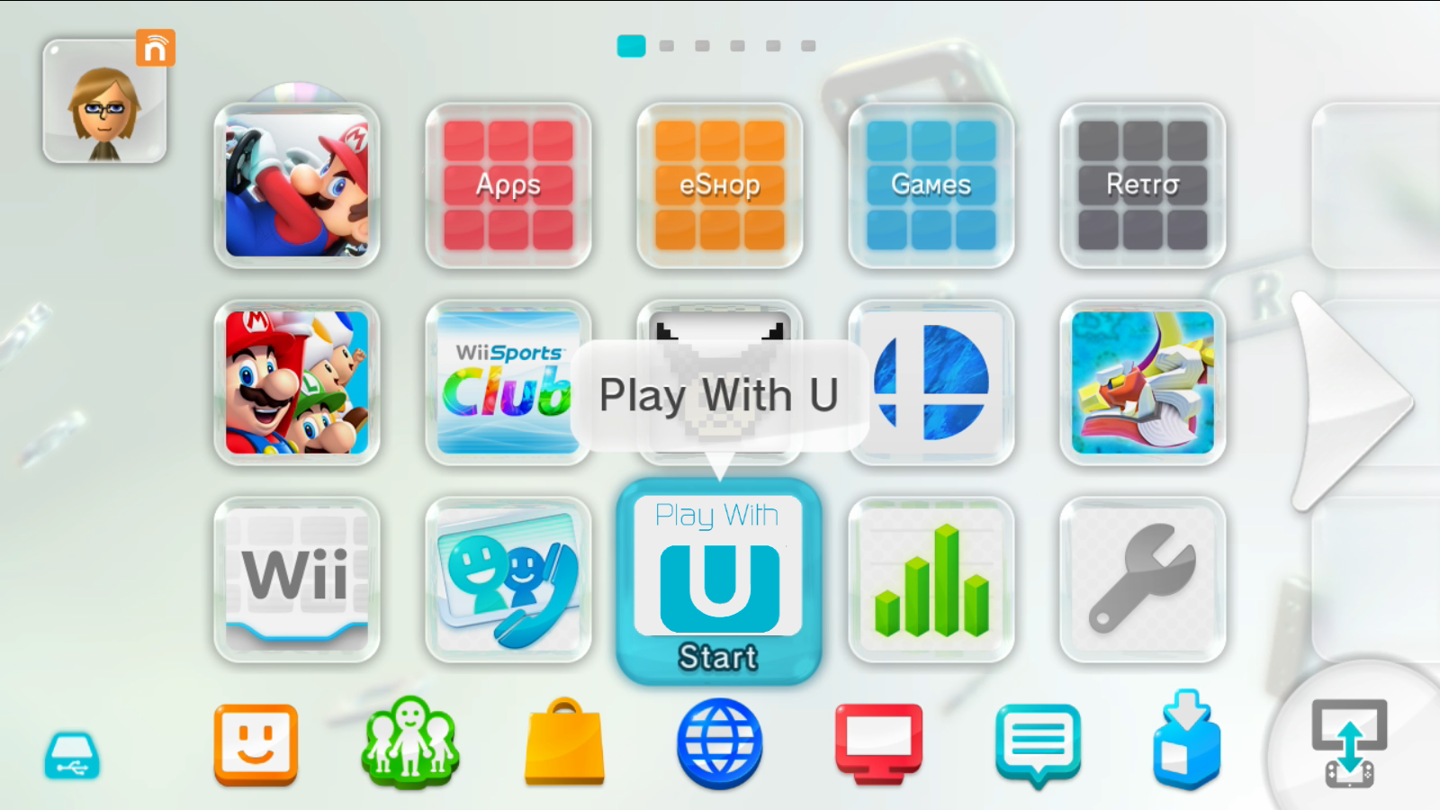
They went way too far with the corner radii and pill shapes imo, looks like a Fisher Price toy. Some inner buttons retained the old radii and don't match the outer window radii anymore.
It’s a trend that’s visible in other designs too, like Material 3 Expressive. I’m not a fan of Windows but I believe that probably the best modern UI design system for desktops right now is probably the flavor of Fluent used in Windows 11. It still retains somewhat desktop-like information density, doesn’t go overboard on radii, and has a touch of depth. I’d like to see more design languages exploring in its general…
Apple still has the best "get out of the way, be invisible" UI.
Both are valid ways to approach to a problem, but I like KDE's batteries included, infinitely customizable way better.