Live data from Hacker News

macOS Tahoe

apple.com

131–140 of 1001 posts

Re: macOS Tahoe

#131
post #62

They went way too far with the corner radii and pill shapes imo, looks like a Fisher Price toy. Some inner buttons retained the old radii and don't match the outer window radii anymore.

It’s a trend that’s visible in other designs too, like Material 3 Expressive. I’m not a fan of Windows but I believe that probably the best modern UI design system for desktops right now is probably the flavor of Fluent used in Windows 11. It still retains somewhat desktop-like information density, doesn’t go overboard on radii, and has a touch of depth. I’d like to see more design languages exploring in its general…

I still find KDE superior in productivity, information density and "useful effects" category.

Apple still has the best "get out of the way, be invisible" UI.

Both are valid ways to approach to a problem, but I like KDE's batteries included, infinitely customizable way better.
Re: macOS Tahoe

#132

Whoa, you can now search clipboard history. Go to Spotlight Search, Command+4. You'll get a list of entries, each with a copy button, and is searchable. Even shows the app it was copied in.

At last Apple implemented a decent clipboard history. KDE has this thing for a decade now, I guess... KDE also can encode entries as QR codes, so you can make URLs transferable to your phone or whatnot. -- Sent from my MacBook Air.

If you use KDE Connect, your clipboard history immediately goes to your phone's clipboard :)

Re: macOS Tahoe

#133

Apple no longer cares about disabled people. Transparent UI, with controls sitting on top of arbitrary and changing content can NEVER be legible/discernible. Apple knows this, but fashion was more important than function and they decided, "who cares about disabled people, anyway." Microsoft learned this lesson back in the Vista era but Apple's charging ahead with this terrible set of changes that will literally disab…

[deleted]

Re: macOS Tahoe

#134
post #62

They went way too far with the corner radii and pill shapes imo, looks like a Fisher Price toy. Some inner buttons retained the old radii and don't match the outer window radii anymore.

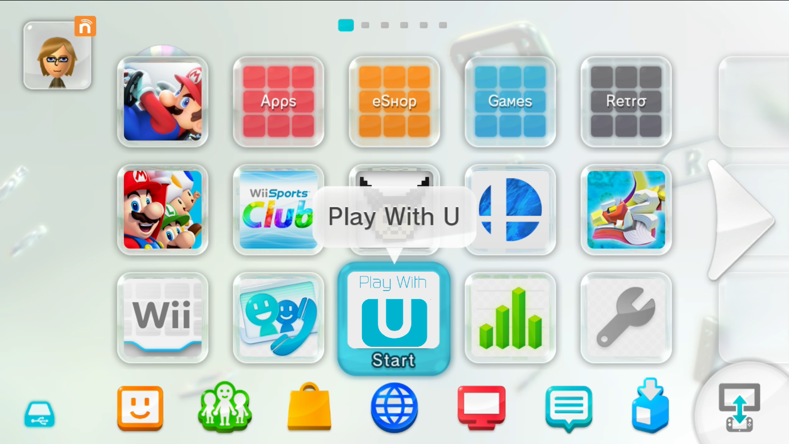
It reminds me of the Wii U interface[1]. Except less playful. It really is a disaster.

[1] https://wiki.cemu.info/images/1/1a/Wii_U_Menu.png

Re: macOS Tahoe

#135
post #16

Earlier quoted context omitted.

This is the last ever version with Intel support, right? That's a milestone of sorts.

I'm not sure what I'm going to do with my 2020 iMac in a year. I really want to be able to repurpose that 5k screen but Apple does not make it easy. I might just leave it in perma-Windows Boot Camp.

If you're up for a project, you can swap the guts of those 5K iMacs for an aftermarket controller board which turns it into a regular monitor. It's a bit janky but a hell of a lot cheaper than buying a new 5K monitor.

Re: macOS Tahoe

#136

[flagged]

Now imagine it being said by someone presenting and doing the same hand pyramid stance that they make every Apple employee in WWDC videos do.

All kidding aside, it’s weird to read. Ever since I was a kid, I was taught that beginning a sentence with “And” or “But” is not “correct”. Times change and all that, I get it - it’s just weird though.

Re: macOS Tahoe

#137

Earlier quoted context omitted.

It’s a trend that’s visible in other designs too, like Material 3 Expressive. I’m not a fan of Windows but I believe that probably the best modern UI design system for desktops right now is probably the flavor of Fluent used in Windows 11. It still retains somewhat desktop-like information density, doesn’t go overboard on radii, and has a touch of depth. I’d like to see more design languages exploring in its general…

I still find KDE superior in productivity, information density and "useful effects" category. Apple still has the best "get out of the way, be invisible" UI. Both are valid ways to approach to a problem, but I like KDE's batteries included, infinitely customizable way better.

I think KDE has the right spirit but its execution leaves something to be desired.

Re: macOS Tahoe

#138

Apple no longer cares about disabled people. Transparent UI, with controls sitting on top of arbitrary and changing content can NEVER be legible/discernible. Apple knows this, but fashion was more important than function and they decided, "who cares about disabled people, anyway." Microsoft learned this lesson back in the Vista era but Apple's charging ahead with this terrible set of changes that will literally disab…

I've been submitting endless feedback about how Liquid Arse breaks dark mode during the beta. I keep seeing dark text on dark backgrounds all over the place in both Tahoe and iOS 26, for example: https://imgur.com/a/R3DTcSd

I've pretty much given up with submitting feedback though.

Re: macOS Tahoe

#139
post #4

Any actual interesting changes under the hood other than UI changes? I cant remember the last time macOS release that actually brings any useful feature I use.

- Apple Sparse Image Format allows you to create virtualized disk images with a virtualized file format that can be formatted to any kind of file

- Terminal.app now supports 24-bit color and powerline glyphs

- Vehicle Motion Cues to reduce motion-sickness when in a moving vehicle

Re: macOS Tahoe

#140
post #95

I've been running it since the RC and am currently in the process of uninstalling it. The new UI is so incredibly ugly I honestly cannot understand how they thought it was acceptable to even released as a beta let alone an RC and now release. There's SO much padding and wasted screen real estate, disjointed looking floating inner panels, window corners that are so rounded you see gaps in full screen apps, inconsisten…

I was on RC too, for a few days, and also uninstalled. I'm glad I did, the fresh Sequoia install feels much nicher. Even with reduce transparency on, the design was too ugly and the drab gray icon jails for non-squircle icons were downright offensive. First macOS version I'm gonna skip and I've been a day one updater since mountain lion, very sad.

lol are you an ATP listener?

I don’t think the icon situation is enough to keep me off the release, but agree that the design is just kind of a mess and not my taste.

Post reply on HN