Android be like: been there done that
UI Design Dos and Don'ts
51–60 of 121 posts
Re: UI Design Dos and Don'ts
#52"Images that are not @2x will appear blurry" That's quite an exaggeration. "Blurry" is not what most people would perceive. They won't perceive a problem with the site at all and in most cases will never notice or care. Sure it's nice to use hi-res images, but I prefer using just one image that is slightly higher resolution than normal... maybe 1.5x and then increase compression. The result is noticeably better, sati…
What advantage is there to shipping a single asset?
On the web, use the "srcset" attribute on img tags. If the device supports @2x, it'll fetch the right version.
On an iPhone app, any advantages are far outweighed by the headaches of resizing "@1.5x" assets for each device resolution.
Now consider the iPhone 6+, which has @3x resolution. At 1.5x it feels blurry.
But forgetting that, would @2x users notice? They won't be able to articulate something is wrong, much like if you pick a suboptimal line height, they won't be able to articulate "it's less legible." It's all these little things, combined, that make a project feel amateurish.
Re: UI Design Dos and Don'ts
#53Apple has been a driving force for better UI in a number of areas, but some of their choices are baffling. Even in this page, the "Contrast" section uses a large black header, but a small grey font on a white background for the content. Who chose Shift-Command-] for switching tabs in Safari? Why include the power switch in the keyboard, which makes it challenging to clean? Could their glossy displays be any more refl…
Well, even better: this page [https://developer.apple.com/library/safari/documentation/Net...] is two clicks away.
Re: UI Design Dos and Don'ts
#54Apple has been a driving force for better UI in a number of areas, but some of their choices are baffling. Even in this page, the "Contrast" section uses a large black header, but a small grey font on a white background for the content. Who chose Shift-Command-] for switching tabs in Safari? Why include the power switch in the keyboard, which makes it challenging to clean? Could their glossy displays be any more refl…
I also feel like iOS has gone downhill. I know they were trying to get away from skeuomorphic design, but I feel they went too far in the opposite direction. Everything is flat, it's hard to tell what is a button that can be clicked on sometimes (usually it's just a blue label with no distinguishing background), and there seems to be a frequent lack of contrast generally.
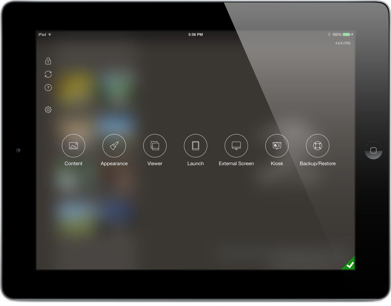
I've never fully embraced Apple's view of flat design for that reason. I feel buttons should resemble something that looks like it can be tapped on, and that that is not against the current aesthetic of iOS (e.g., http://ipadportfolioapp.com/images/overview/Customization_2x...).
Re: UI Design Dos and Don'ts
#55Apple has been a driving force for better UI in a number of areas, but some of their choices are baffling. Even in this page, the "Contrast" section uses a large black header, but a small grey font on a white background for the content. Who chose Shift-Command-] for switching tabs in Safari? Why include the power switch in the keyboard, which makes it challenging to clean? Could their glossy displays be any more refl…
Most likely, that shade of grey was chosen precisely because the section headline is black. If both were black, it would compete with the typographic hierarchy, making it distracting to skim the entire page.
Good design is a form of engineering. You have a set of principles and successful patterns– such as the ones on the linked page– but your job is adapting to real world constraints. In this case, the challenge is making a headline look like a headline only relative to the example, not the page.
As far as the Safari tab shortcut, that's consistent with the rest of OS X. How did they originally arrive at that shortcut? They probably tried several combination, all within reach of the home keys, and that felt most right.
Why include the power switch on the keyboard? I know every user's first question is "where is the on switch?" and that position seems highly visible, and it can be consistent across all macs. In my entire history of using Macs, I've never had an issue cleaning the power key.
No idea why they made the displays more reflective. But given their overall attention to detail, a lot of thought probably went into it.
Re: UI Design Dos and Don'ts
#56Is it ment to be ironic? Considering that I'm reading this from a phone and they don't even follow their own first point "Formatting Content".
Re: UI Design Dos and Don'ts
#57Earlier quoted context omitted.
Do you have a better example? I don't find the select diag's like in Desktop Chrome easier to use especially on a mobile. I think what they've done is better than anything else I've seen. With enough following it'd become the norm like anything else.
Cultured Code's date picker for Things has been my favorite: http://culturedcode.cachefly.net/things/videos/things-iphone...
I used gldate picker. http://glad.github.io/glDatePicker/
I find it's familiarity calendar display coupled with iphone friendly format strikes a good balance.
Re: UI Design Dos and Don'ts
#58Many of these are blatantly obvious. Most bad design isn't because people don't know better; it's due to laziness.
> laziness Or more likely time constraints.
Without being there at the time the decisions are made, a lot of it appears to be laziness to someone looking from the outside.
It could be laziness, but a lot of times, I found that it was time constraints to deliver and fix it later, but later never comes or it's not important enough to revisit and change.
Re: UI Design Dos and Don'ts
#59Earlier quoted context omitted.
Do you have a better example? I don't find the select diag's like in Desktop Chrome easier to use especially on a mobile. I think what they've done is better than anything else I've seen. With enough following it'd become the norm like anything else.
Cultured Code's date picker for Things has been my favorite: http://culturedcode.cachefly.net/things/videos/things-iphone...
How do I choose a date that's 30 odd years ago - a birthdate for example.
Re: UI Design Dos and Don'ts
#60Many of these are blatantly obvious. Most bad design isn't because people don't know better; it's due to laziness.
This list helps people realize where they've been lazy.