Live data from Hacker News

Airline flights of the world visualized with WebGL

callumprentice.github.io

21–30 of 79 posts

Re: Airline flights of the world visualized with WebGL

#21
post #15

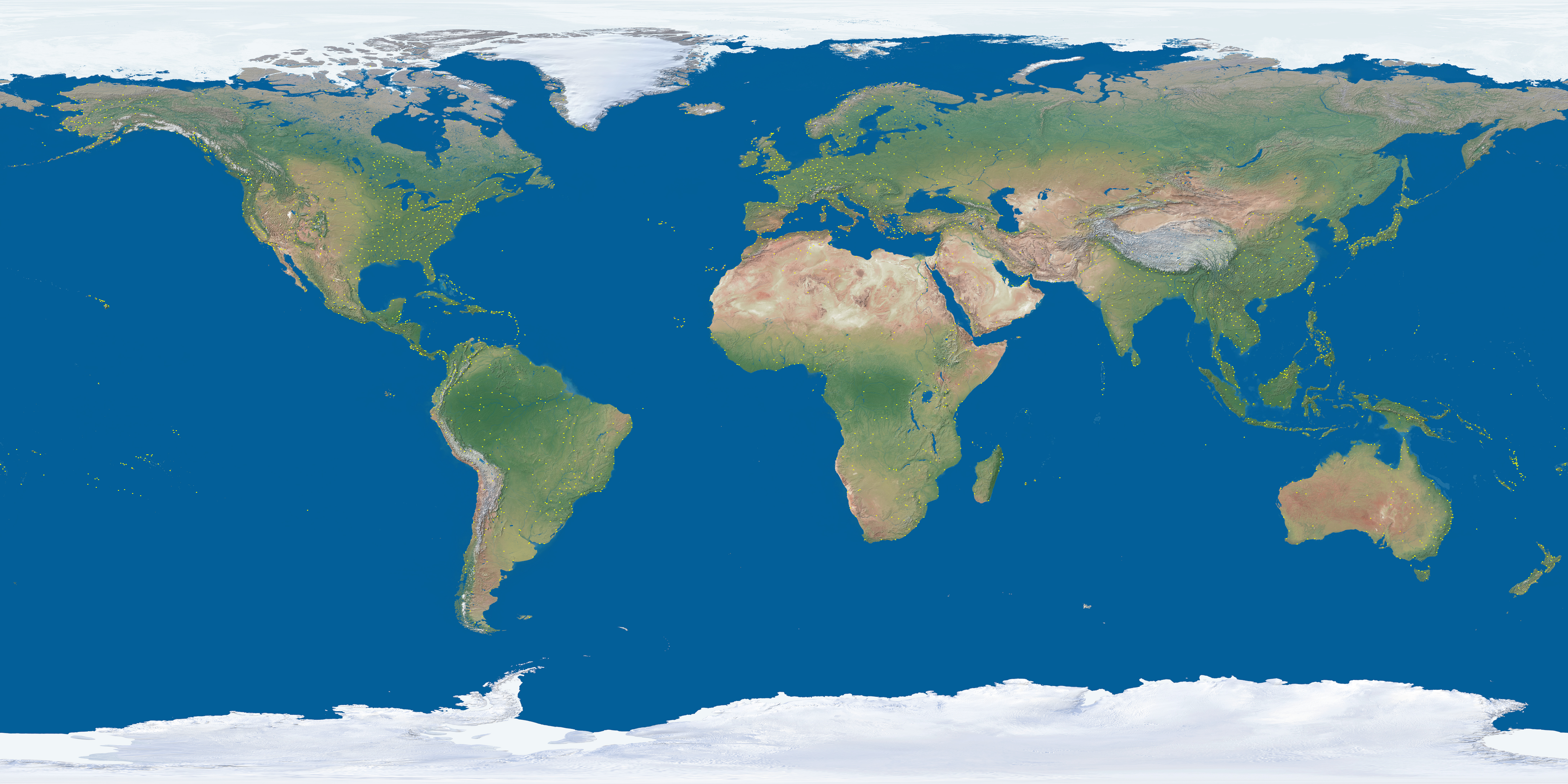
The polar regions seems a bit stretched out. Is the earth in perspective? Making the flight paths accurate!?

Probably an artifact of the texture being in a cylindrical projection, mapped back onto a shpere. Here is the texture image http://callumprentice.github.io/apps/flight_stream/images/ea...
Re: Airline flights of the world visualized with WebGL

#26
post #10

This is beautiful, It's amazing to see how humanity goes over every part of the planet. Which flights are those few going over the north pole?? [~30fps/OSX-Chrome]

North Pole flights are North America and mid-Europe to Japan / China / Korea. Pioneered by Finnair and KLM. One of the ETOPS certification criteria for modern airliners is demonstrable navigation stability and accuracy over the Pole. Navstar GPS is not so useful there; GLONASS is better but inertial platforms still the best at those latitudes.

SAS was the first airline to fly over the North Pole.[0]

[0] https://en.wikipedia.org/wiki/Scandinavian_Airlines#Trans_po...

Re: Airline flights of the world visualized with WebGL

#29
post #24

Interesting, on a desktop browser. On mobiles, 100% probability to kill Chrome on Android.

Because there might be some optimization tricks the author missed, or because the canvas implementation on mobile is bad/unoptimized/doesn't use hardware accelleration? Also, "probability" indicates you didn't even try it.

I did (both Safari and Chrome, iPhone 6), the framerate is definitely low (~10 frames per second?) but it didn't kill it so your statement might be a bit exaggerated. Framerate is a bit lower on Chrome, too.

Post reply on HN