Live data from Hacker News

What was nice about the UI of Windows 2000

movq.de

91–100 of 213 posts

Re: What was nice about the UI of Windows 2000

#91

> Hiding filename extensions was one of the capital sins in computer history Amen. The first thing I do on any (Windows) OS installation is make sure file extensions are shown. I guess Microsoft did that for "simplicity", but it also made for easy "virus.jpg.vbs" files.

A puppy.jpg.vbs file would be shown as "puppy" with "VBScript" in the type column. The full name may be worse though. "puppy.gpj.vbs‬"‭ (which is actually "puppy\u202Egpj.vbs\u202C") looks like an image extension, but is a script (as the type column also shows).

Edit: Looks like HN removes those directional override characters. When present, the text looks like "puppy.sbv.jpg"
Re: What was nice about the UI of Windows 2000

#92
post #20
post #9

Earlier quoted context omitted.

Why are designers not understanding this these days? I think one reason is that flat UI is super easy. Skeuomorphic is extremely hard to get right, and if you don't get it right it looks super tacky. Most people who have the word "designer" in their job title don't have the artistic skills needed to pull it off. This is why most designers are opposed to skeuomorphic. Somewhere in between is the right approach. The Ne…

What’s the meaning of skeuomorphic design for a generation that has never worked with the original physical artifacts they’re based on, though?

They create a consistent design language.

Do you need to know the meaning of the latin words manus (hand) and facere (to make) to understand the English words manual (by hand), factory (place which makes things) and manufacture (to assemble)? Do we need new words now that Latin comprehension is dwindling? Not really.

Language works by metaphor, even if the thing you're alluding to doesn't exist anymore.

Re: What was nice about the UI of Windows 2000

#93
post #44

Earlier quoted context omitted.

My parents never had any problem understanding where they can click on Windows 3.11. They never could understand how to interact with DOS GUIs. Nowadays they have decades of experience with computers. They still can't predict what part of a web-site they can interact with, but they have memorized all the actions they can make on the phone apps they use.

Let’s look at the very website we on. Would you prefer for every clickable element here to be a button? Or even underlined as a link? Do you ever get confused navigating this website?

Wouldn't hurt if interactive elements didn't require me to zoom in order to interact with them on mobile.

Re: What was nice about the UI of Windows 2000

#94
Windows 2000 was the peak of Windows UI. While features and functionality has improved in many ways, everything UI change since then has been a step backward.

Microsoft (and IBM and others) did a ton of good HCI research in the 70s and 80s, and used that research to make better UI for their operating systems. But sometime around the mid-90s when high-color displays started becoming the norm, UI experts started gradually being replaced by art-school types, and now it seems very little consideration is given to actual UI functionality, and the driver is entirely some bizarre sense of style from people who don't know anything about Human Computer Interaction, but seem to think no more deeply than "less is more".

These UI elements had reasons to look and act the way they did. This communicated information to the user (even if the user didn't realize it), and made software much more predictable and discoverable, and ultimately, more intuitive.

Re: What was nice about the UI of Windows 2000

#95

Andreas Kling has said that one of his inspirations for SerenityOS was the Windows 2000 UI ( https://corecursive.com/serenity-os-with-andreas-kling/ ). I found his general goal for SerenityOS ("Roughly speaking, the goal is a marriage between the aesthetic of late-1990s productivity software and the power-user accessibility of late-2000s *nix.") to be strangely validating ('Wait... So it's not just me?!'). And so of…

[deleted]

Re: What was nice about the UI of Windows 2000

#96

> Since that button down there is called "Start", it implies that you can probably do something with it, maybe start programs? Click and you'll see the Start Menu: Over time it seems like a lot of designs stop feeling the need to lead the user in this way. There is an assumption that by now everyone knows what the menu in the bottom left corner does, and we are no longer in the phase of trying to teach the population…

I was a wee little kid when I first touch windows 95, and only ever used dos before. The "Start" button made no sense. The computer was already started, and clicking randomly popped up menus and opened documents in their right programs, so it felt like the natural way to progress. The owner of the computer had to point me to the start menu. Even now I still think it was a cursed UI. It was the place primarily to clos…

As a kid who started on Windows 3.1, the 95 Start menu made so much more sense. It felt revolutionary.

Re: What was nice about the UI of Windows 2000

#97
post #41

When Windows XP came out, computer magazines wrote articles on how to switch the more modern, colorful UI back to the old, grey, drab, boring UI of Windows 95/98/2000. I was young at the time and this seemed absurd to me. Why would you willingly use a UI that looks like wearing an old grey tie for a dusty office job in a depressing concrete building?

The older UI was also noticably faster. The new UI looked like a daycare: saturated colors and all thick, rounded borders on everything.

Re: What was nice about the UI of Windows 2000

#98

Earlier quoted context omitted.

> There is an assumption that by now everyone knows what the menu in the bottom left corner does, and we are no longer in the phase of trying to teach the population to use a computer for the first time Strong disagree, because: > Every day there are new young people using a computer for the first time I can assure you these people have no idea what the start button is or does... it doesn't help that it no longer eve…

We do agree. I said the first thing you quoted was the wrong approach, because of the second thing you quoted. Having it say “start”, like it used to, would help solve that.

Ok but, were you around during that time? I remember it not helping much at all to tell people what to do.

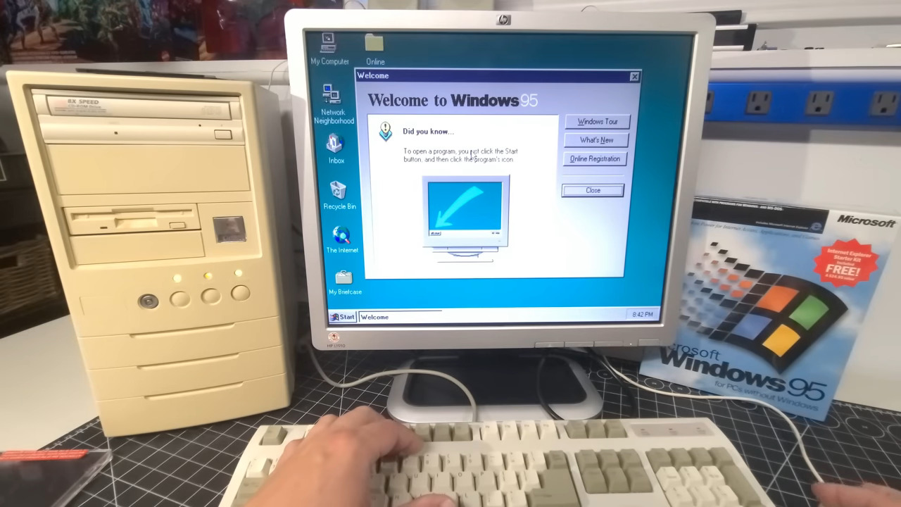
When Windows 95 first came out, they had to have a giant arrow pointing to the Start menu with an explanation of what that would do: https://a.imagem.app/Ge6OCZ.jpeg

Then they had a scrolling animation with an arrow and some text ("Click the Start button to begin") that slid in from the right side of the taskbar and pointed right at the Start button.

Re: What was nice about the UI of Windows 2000

#100
post #30
post #21

> Me: "I don't like smartphone UIs. Everything is flat, nothing indicates where you can touch or not. I have to randomly try everything on the screen." Response by non-tech person: "Well, yeah, of course you have to try everything? How else would this work?" I think this goes deeper than many tech people realize. From what I understood from talking with "nontechnical"(*) friends, relatives, etc, for a good potion of…

It started with iOS 7 and Jony Ive Steve Jobs was right. Then when he died (after removing Scott Forstall), Jony Ive got to do his hardware minimalism in software too. And everything Steve Jobs favored was suddenly derided as “skeumorphism”. It’s like what USSR did with Stalin under Khrustchev. I still remember when Chrome app just had a big white area where you’re supposed to enter the url and you had no idea unless…

Windows 8 was released a whole year before iOS 7, so the blame here is misplaced (though I won't argue that Ive's approach to UI design was worse than what came before).
Post reply on HN