Live data from Hacker News

Icons in Menus Everywhere – Send Help

blog.jim-nielsen.com

51–60 of 340 posts

Re: Icons in Menus Everywhere – Send Help

#52
I actually like the icons from his example of Google Docs, it makes it easy for me to locate an action type I’m looking for (add/delete etc) without reading the labels, then once I narrowed it down - I can read the label to find the precise action I want.

Re: Icons in Menus Everywhere – Send Help

#53
post #2

This a really interesting and persuasive read for me. I've been thinking about this topic as part of brainstorming a simple design system and I had come to the conclusion that the inconsistency of not having icons for every menu item was a big annoyance. After seeing how descriptive the icons are in older menu examples compared to the abstract blobs in newer menus, I have to admit I might be wrong. At the very least,…

Check out how Blender’s entire UI (menus, buttons, hotkeys, pie menus, toolbar tools, context menus, etc) is built on a single abstraction: operators -- universal command objects that can be used in many contexts.

Every operator has:

Identifier: mesh.extrude_region_move

Label: human-readable string, like "Extrude Region"

Description: tooltip text, like "Extrude selected vertices, edges or faces along their normals"

Icon: optional enum from Blender’s built-in icon set, like ICON = 'MESH_EXTRUDE_REGION'

RNA properties: parameters / flags like direction, axis, booleans

Poll function: whether it is available in current context, like only enabled when a mesh is in edit mode

Execution logic: the actual command code

Blender’s designers generally follow these principles:

Operators always have labels. Icons are optional. Most menu items use no icon by default. Only well-established visual operations (cursor, transform tools, viewport shading modes, etc.) get icons.

Unlike macOS Tahoe’s vague "everything gets an icon" ideology, Blender uses icons when they convey meaning, but not when they’re decorative filler.
Re: Icons in Menus Everywhere – Send Help

#54
post #3

I always thought menus had icons so they could be matched to the same functionality on the toolbar. If a menu lacks an icon, then it's probably not on the toolbar. This falls apart when there is no toolbar. But I have definitely found an action in the menu, looked at the icon, and matched it to a a button elsewhere.

I believe Microsoft Office 97 for Windows was the first time I saw icons next to menu items. Office 97 had highly customizable menus and toolbars. Each menu item and toolbar item could be thought of as an action with an icon and a label, and that action could be placed in either a menu or a toolbar. Not every menu item had an icon associated with it. Additionally, each icon was colored and was clearly distinct.

Re: Icons in Menus Everywhere – Send Help

#55
post #47
post #38

Earlier quoted context omitted.

Maybe you misunderstood the author. They wrote: ‘ It’s not that I think menu items should never have icons. I think they can be incredibly useful. It’s more that I don’t like the idea of “give each menu item an icon” being the default approach. ’ The point is, if every item in a long menu has an icon, then they typically can’t all be very distinguishable and recognizable, and blur together visually. It creates more v…

But isn’t the second half of the article the author pointing out a bunch of menu examples from macOS Tahoe where some items have icons and others don’t and still coming to the conclusion that it’s confusing? How is that not a contradiction of the prior declaration?

Yeah, that's a bit inconsistent. I think they are criticizing that it appears to be random which menu items have icons assigned, instead of (for example) giving all important or frequently used items an icon, or in some way that creates visual structure in the menu. Personally, what I find the most disconcerting in those examples is that the menu items aren't consistently inset.

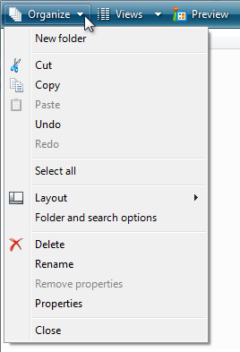
Here is what I would think is a fairly good use of icons: https://learn.microsoft.com/en-us/windows/win32/uxguide/imag... The icons are positioned such that they introduce groups of menu items, and they create a visual structure that one learns to recognize with repeated use.

Re: Icons in Menus Everywhere – Send Help

#56
post #21

I changed the UX in my mobile app from text only to icon + text by default in menus, buttons, and links. There are several reasons I made the switch, but the primary reason is that it makes it easier to build a kind of muscle memory for navigating and performing particular actions. In essence, the text is there for new users and the icons are there for experienced users.

Exactly. Reading a line of text is a lot slower than recognizing an icon. Those icons are for power users who are really familiar with the app.

This is true when you know what you're looking for, the icons are distinct and you have good eyesight.

Re: Icons in Menus Everywhere – Send Help

#57
My biggest design peeve of the examples posted is the inconsistent indentation of each section of the menu. Where if any single item in the section has an icon it gets indented, but if none do it doesn't, and seeing them next to each other is jarring. I feel this is especially inconsistent design because if a menu item has a check mark it indents all menu items in the whole menu. I would have thought Apple would have the taste to keep things more consistent across the whole menu than that, as it seems sloppy.

Re: Icons in Menus Everywhere – Send Help

#58
post #29

Just right-click any file in VSCode/Cursor to see how absolutely chaotic and tedious a long menu is without icons. Now imagine that Google Docs example without icons. It’s much easier to recognize the funnel icon to make a filter, than to skim all that text.

Perhaps the solution is to split the menu up instead of giving you a long, tedious menu that is unparseable without even more visual noise of icons.

Re: Icons in Menus Everywhere – Send Help

#59
I wonder if part of the problem is the lack of color in these examples? I remember Microsoft Office 97 and 2000, which had icons in their menus (albeit only for a few actions, not for every action). However, those icons were colored and appeared visually distinct from each other.

Yesterday I booted my 350MHz Power Mac G4 for the first time in 13 years. I booted into Mac OS 9.2.2. I remember the Apple menu having icons for every item. Once again, though, every icon was in color.

Re: Icons in Menus Everywhere – Send Help

#60

Hilarious: I looked at first two examples on the page, showing a menu and contextual menu, and I saw no problem. Icons? What icons? That's when I realized that, much like advertisements on a web page, my brain had utterly filtered them out.

My brain first started doing this with online ads as well.

The habit has adapted and evolved very strongly with the amount of exercise it gets from UIs, textbooks, signage, and basically every other visual medium possible these days. It has actually become a problem with how often I overlook important information due to it being situated in a "nothing useful will ever be here" zone. But it's difficult to consciously control that instinct when it's correct 99.999% of the time.

Post reply on HN