I don't know if it's because I'm colorblind (red-green), but looking at this page gives me a headache... you might want to test it out with some other colorblind people.
The Flat Design Era
31–40 of 99 posts
Re: The Flat Design Era
#32Microsoft seems to be the biggest current proponent of flat design, and I must say it's not so great for usability. When I see this: http://www.istartedsomething.com/wp-content/uploads/2011/09/... I have no idea what is and is not a button. I suppose it's all a button. But there are zero affordances in this UI. This is now finding its way to Microsoft's websites. On outlook, I can't quickly find the buttons to do key…
Oddly enough, the first thing that comes to mind when I see the new `Outlook` is: "all text is actionable."
Everything on that Outlook screen seems to be clickable, with the possible exception of the logo (upper left) and copyright notice (bottom left).
It reminds me of the `acme`[0] editor a bit; not nearly as flexible, of course, because it is executing pre-programmed commands, not arbitrary shell commands.
I bring `acme` up for two reasons: (a) it gives you an interesting perspective on "text as actions" and (b) look at that menu system... no buttons, no distinguishing marker, the menu is just text! The buttons are just text!
The editor itself is fairly nice to work in; a big departure, yes. Intuitive? Kind of; it only becomes intuitive once you understand "mouse-chording", after that the UI makes plenty of sense, even when it's almost entirely "flat."
--
So, if you assume everything is clickable by default (which is true, give or take a few very specific targets that have no obvious action anyways), why then does the user need skeuomorphic hints?
If 90% of the non-whitespace results in a "button press", that fact should become obvious fairly quickly, even to the uninitiated.
If you cut out all the cruft and only leave the functionality, the functionality will inherently "float" to the surface. And that seems to be the case in Microsoft's latest bout of UX.
Re: The Flat Design Era
#33I don't know if it's because I'm colorblind (red-green), but looking at this page gives me a headache... you might want to test it out with some other colorblind people.
Don't worry: I have nearly perfect vision. (I say nearly only because I haven't had a checkup in a while.)
And this site gives me a bit of a headache, too.
Just skimming it, it's a bit too dark and a bit of a strain to read; part of that may be the office lighting though.
The funny thing is: it's _very close_ to my terminal color scheme, just lacking a lighter shade of the background [which would differentiate content from the background], and a "brownish-orange" for highlights/accents [links and things].
The text in my terminal is also slightly "whiter" and a much bolder font-face.
So perhaps some of these suggestions would help make the site more readable in general, though I've never tested my terminal style with a color-blind audience so YMMV. :)
Re: The Flat Design Era
#34There's a balance to be struck between affordable and honest (not kitsch) design. To get it just right is where the devil is.
For examples look no further than Apple's iOS (borderline kitsch) and Microsoft's Metro (reduced affordance). I think one UI that gets this balance done very well is Facebook.
Re: The Flat Design Era
#35Microsoft seems to be the biggest current proponent of flat design, and I must say it's not so great for usability. When I see this: http://www.istartedsomething.com/wp-content/uploads/2011/09/... I have no idea what is and is not a button. I suppose it's all a button. But there are zero affordances in this UI. This is now finding its way to Microsoft's websites. On outlook, I can't quickly find the buttons to do key…
Oddly enough, the first thing that comes to mind when I see the new `Outlook` is: "all text is actionable." Everything on that Outlook screen seems to be clickable, with the possible exception of the logo (upper left) and copyright notice (bottom left). It reminds me of the `acme`[0] editor a bit; not nearly as flexible, of course, because it is executing pre-programmed commands, not arbitrary shell commands. I bring…
Even if all text is clickable, not everything should have such a similar visual weight.
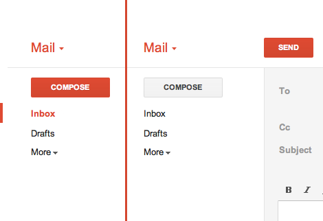
In Gmail, there's a big ass red button that does exactly what you think it will do. (http://25.media.tumblr.com/tumblr_lyrwjaXatd1qea4hso1_500.pn...) I bet I could use Gmail for the first time in Arabic if I had to. I'm not sure I could use Outlook.com.
Re: The Flat Design Era
#36We certainly didn’t invent the flat style but arriving at it was a violent process. We tore through hundreds of revisions (we have the LayerVault timelines to prove it) to potential interfaces before arriving at the answer that now makes us say “of course.” The desk at LayerVault’s original headquarters (my Manhattan apartment) still has the battle scars from objects being slammed down in anger. At one point, while working on a mockup, a MacBook was slammed shut so hard it was nearly unhinged.
It sounds like that MacBook isn't the only thing that's unhinged...
Re: The Flat Design Era
#37Jon Friis (Co-Founder of www.kera.io) has also mastered this technique.
Re: The Flat Design Era
#38Earlier quoted context omitted.
> But normal people need their hand held as to what a button is. Subtle drop shadows and gradients are the best way to instantly get someone to understand that yes, this element does something. Something important is lost in flatland. I disagree. Go to http://google.com . How many of the items in the bar at the top have gradients? Is there any confusion about whether they're clickable? Now go to Google+. Is there any…
The two most prominent buttons on the home page have subtle drop shadows and gradients. Google is actually a great example of restrained skeuomorphic design. If I had to advocate for just one aesthetic (which is silly on its face), I suppose restrained skeuomorphism would be the one.
That's affordance, not skeuomorphism.
From Wikipedia: a skeuomorph is "an element of design or structure that serves little or no purpose in the artifact fashioned from the new material, but was essential to the object made from the original material"
The gradient and shadow on buttons are not just ornamental, they serve the purpose of conveying depth, and consequently that they afford being pushed (also, real-world buttons are usually a solid color).
Re: The Flat Design Era
#39Earlier quoted context omitted.
Oddly enough, the first thing that comes to mind when I see the new `Outlook` is: "all text is actionable." Everything on that Outlook screen seems to be clickable, with the possible exception of the logo (upper left) and copyright notice (bottom left). It reminds me of the `acme`[0] editor a bit; not nearly as flexible, of course, because it is executing pre-programmed commands, not arbitrary shell commands. I bring…
Even if all text is clickable, not everything should have such a similar visual weight. In Gmail, there's a big ass red button that does exactly what you think it will do. ( http://25.media.tumblr.com/tumblr_lyrwjaXatd1qea4hso1_500.pn... ) I bet I could use Gmail for the first time in Arabic if I had to. I'm not sure I could use Outlook.com.
And that big red button was only added much later. The first versions of gmail didn't have that.
MS is doing something very wise here. They are starting flat and then over time they will find a balance between what needs to be more obvious than other things. Just wait and see.
Re: The Flat Design Era
#40Microsoft seems to be the biggest current proponent of flat design, and I must say it's not so great for usability. When I see this: http://www.istartedsomething.com/wp-content/uploads/2011/09/... I have no idea what is and is not a button. I suppose it's all a button. But there are zero affordances in this UI. This is now finding its way to Microsoft's websites. On outlook, I can't quickly find the buttons to do key…
I find your comment unfair and I am not even a MS user. Usability is so much more about how it work, not just how it look. All design systems will have some learning curve. A learning curve where you have to understand that everything a button is pretty close to being easy to learn. So in my mind, the problem you seem to think there is is a pseudo problem. I.e. it's not actually a problem. The Map is not the territor…
The difference is that glossy buttons have affordances that make them stand out from the rest of the interface. Which means that even after learning what is and isn't a button, you can find them more quickly. Completely flat interfaces lose this advantage, but they also have other benefits.