Live data from Hacker News

The Flat Design Era

layervault.tumblr.com

11–20 of 99 posts

Re: The Flat Design Era

#11

Flat design certainly has it's place in the world but it's important to keep in mind that ultimately it's just another aesthetic. Distressed, Glossy, Flat, Matte, Woodsy, etc, these are all just styles that lay on top of what is good information architecture and interaction design. It's not about flat design being right or wrong, it's more about whether it's appropriate for the job/task and audience/market. There are…

"Flat design" is, yes. It's just a horrible label for a much broader concept, which is "form follows function", "clarity", "honesty".

Skeuomorphism is an easy target because it is dishonest by definition. Things that appear "cutting edge" or "high quality" today will, in a few years, seem dated, clunky, and pointless.

By contrast, pick up a copy of Die Neue Typography and see how well not just Tschichold's designs, but his ideas, hold up today. Skeuomorphism is a symbol of the Old UI. What we need is the New UI.
Re: The Flat Design Era

#12
post #10

Can't make a post like that without giving a demo. Example please! It'll also help blank slates like me adopt this "flat design" faster.

Here's an example of a page designed for our open-source repository, along with a link to download the PSD: https://layervault.com/permalink/t64izx8Jae

Re: The Flat Design Era

#13
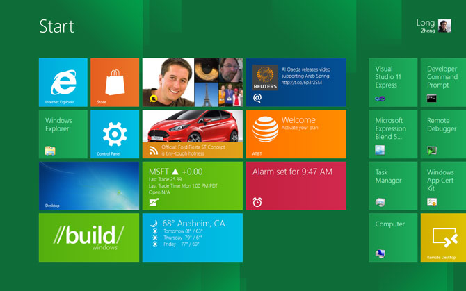
Microsoft seems to be the biggest current proponent of flat design, and I must say it's not so great for usability.

When I see this: http://www.istartedsomething.com/wp-content/uploads/2011/09/... I have no idea what is and is not a button. I suppose it's all a button. But there are zero affordances in this UI.

This is now finding its way to Microsoft's websites. On outlook, I can't quickly find the buttons to do key tasks: http://cdn-static.zdnet.com/i/story/70/00/001893/eb-new-outl...

I think the reaction to excessive skeuomorphism is well founded, but removing all affordances isn't the proper way to move forward either.

Re: The Flat Design Era

#15
The thesis seems fair, but when you go to LayerVault's main landing you get this swirling, vertigo-like background canvas behind the main content. This hardly seems "cut ... down to the bone" nor seeking "the most impact with the fewest elements" as the article professes.

Granted marketing content has different usability requirements than functional software. But I'd argue that dizzying your prospective customers with swirling animations is counterproductive and not an example of "lean design".

Re: The Flat Design Era

#16
post #7

If your audience is developers and designers, a pure flat design is great and will likely work well. But normal people need their hand held as to what a button is. Subtle drop shadows and gradients are the best way to instantly get someone to understand that yes, this element does something. Something important is lost in flatland. On a side note, the vault and picture frame image on the main homepage for layervault.…

> But normal people need their hand held as to what a button is. Subtle drop shadows and gradients are the best way to instantly get someone to understand that yes, this element does something. Something important is lost in flatland. I disagree. Go to http://google.com . How many of the items in the bar at the top have gradients? Is there any confusion about whether they're clickable? Now go to Google+. Is there any…

The two most prominent buttons on the home page have subtle drop shadows and gradients. Google is actually a great example of restrained skeuomorphic design.

If I had to advocate for just one aesthetic (which is silly on its face), I suppose restrained skeuomorphism would be the one.

Re: The Flat Design Era

#17
Nowadays, I tend to avoid gradients because it's so easy to mess it up. It's not only about choosing 2 colors, it's about eveything that happens in between. Putting some text on top of it requires to be readable on both colors, and everything in between.

Buttons can have depth without gradients. Check the ones on http://www.facebook.com. A flat background color, a subtle 1px light on top, a subtle 1px shadow on the bottom, and a darker border all around.

Depth is not only achieved through "3D" gradients and shadows. It is achieved in flat design through size, color, spacing. It's hierarchy by balance.

It's like a well-balanced music mix: if it sounds good on average level, it'll even sound better on loud level. Flat design is balance before the lighting tweaks.

Re: The Flat Design Era

#18
post #7

Earlier quoted context omitted.

> But normal people need their hand held as to what a button is. Subtle drop shadows and gradients are the best way to instantly get someone to understand that yes, this element does something. Something important is lost in flatland. I disagree. Go to http://google.com . How many of the items in the bar at the top have gradients? Is there any confusion about whether they're clickable? Now go to Google+. Is there any…

The two most prominent buttons on the home page have subtle drop shadows and gradients. Google is actually a great example of restrained skeuomorphic design. If I had to advocate for just one aesthetic (which is silly on its face), I suppose restrained skeuomorphism would be the one.

For sure, Google doesn't seem to be headed toward "flatland", which was my point. Even Google, who seems to be clinging to "restrained skeuomorphism" uses flat, clickable elements in many places. I seriously doubt that they'd do so if their usability testing showed that users don't understand them.

I've got to say, I don't understand why people keep mentioning drop shadows, though. Drop shadows seem fairly uncommon. Even Google only uses them for mouseover.

And mouseover is, in my opinion, too late to indicate what's clickable and what isn't. It's a nice confirmation, but the user should already know before they even move their mouse. If you've got a user aimlessly moving their mouse over things trying to determine what's clickable, you've failed at design.

Re: The Flat Design Era

#19

Flat design certainly has it's place in the world but it's important to keep in mind that ultimately it's just another aesthetic. Distressed, Glossy, Flat, Matte, Woodsy, etc, these are all just styles that lay on top of what is good information architecture and interaction design. It's not about flat design being right or wrong, it's more about whether it's appropriate for the job/task and audience/market. There are…

"Flat design" is, yes. It's just a horrible label for a much broader concept, which is "form follows function", "clarity", "honesty". Skeuomorphism is an easy target because it is dishonest by definition. Things that appear "cutting edge" or "high quality" today will, in a few years, seem dated, clunky, and pointless. By contrast, pick up a copy of Die Neue Typography and see how well not just Tschichold's designs, b…

> "form follows function", "clarity", "honesty".

http://byamt.wordpress.com/2009/03/03/dieter-rams/

> By contrast, pick up a copy of Die Neue Typography and see how well not just Tschichold's designs, but his ideas, hold up today.

Dieter Ram's designs also hold up. Honesty is at the center of it all. This is also the reason why people still quote Confucius. Honesty is simply living and experiencing in the purest way possible.

Re: The Flat Design Era

#20
post #17

Nowadays, I tend to avoid gradients because it's so easy to mess it up. It's not only about choosing 2 colors, it's about eveything that happens in between. Putting some text on top of it requires to be readable on both colors, and everything in between. Buttons can have depth without gradients. Check the ones on http://www.facebook.com . A flat background color, a subtle 1px light on top, a subtle 1px shadow on the…

"A flat background color, a subtle 1px light on top, a subtle 1px shadow on the bottom, and a darker border all around."

This is exactly how Windows 3.1 was drawing its UI. :) (not that there is anything wrong with that)

Post reply on HN