Oh no. It looks like every button and menu is now a translucent layer, so that any noise from the background shows through and muddles the text. This seems like an accessibility nightmare. Translucent layers generally make software unusable for me. In the video, I saw several instances that would be really really bad for me, where I’d be straining to understand the text. Looks really cool and futuristic though. Just…
Ironic that it's the 20th anniversary of this other design masterpiece:
https://cdn.arstechnica.net/wp-content/uploads/2015/07/Scree...
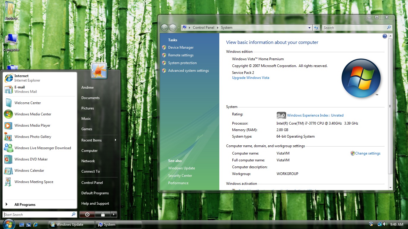
I don't know that a redesign was called for at all. I guess they needed to show something if Siri still isn't ready, but this is just not it.
I'd have personally hoped for them to beef up iCloud+ but I know it doesn't sell devices to the general user.