Live data from Hacker News

Apple introduces a universal design across platforms

apple.com

441–450 of 1001 posts

Re: Apple introduces a universal design across platforms

#441
post #148

Oh no. It looks like every button and menu is now a translucent layer, so that any noise from the background shows through and muddles the text. This seems like an accessibility nightmare. Translucent layers generally make software unusable for me. In the video, I saw several instances that would be really really bad for me, where I’d be straining to understand the text. Looks really cool and futuristic though. Just…

Ironic that it's the 20th anniversary of this other design masterpiece:

https://cdn.arstechnica.net/wp-content/uploads/2015/07/Scree...
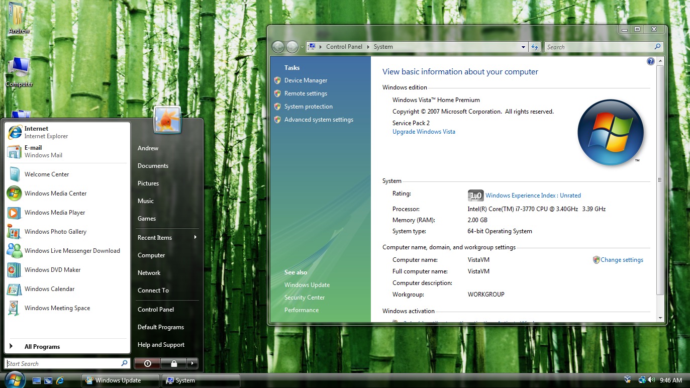
I don't know that a redesign was called for at all. I guess they needed to show something if Siri still isn't ready, but this is just not it.

I'd have personally hoped for them to beef up iCloud+ but I know it doesn't sell devices to the general user.

Re: Apple introduces a universal design across platforms

#442
post #247

Earlier quoted context omitted.

Same. I was kind of slowly preparing myself that I might be switching to android and it seems this might be the final straw. Will wait until Sept to see how new iphone and google pixels will look like but most likely I will do the transition (even though been developing for iOS for more than 10 years.

I've tried to escape the walled garden to Android before, and I've given up. No matter which company's phone or what version of Android, it didn't work well as a phone, alarm, and reliable device that I use for stuff like my home security. Things broke on Android like clockwork, and the clock didn't work. The latest Google pixel devices are specifically blocked from using Wyze devices right now due to a typo in the p…

>it didn't work well as a phone, alarm, and reliable device

If you google "ios alarm not working" you'll find out alarms on iOS are absolutely not reliable, they are often silent.

Re: Apple introduces a universal design across platforms

#443

I'm really showing off my age here, but it has been all down hill since skeuomorphic design; because the focus was primarily on usability and teachability as first-class concepts. Heck, companies were spending millions on usability research at the time, much of which was used. I taught people to use computers in the 90s and early 2000s, and having those concepts matching to real world objects helped immensely. Recent…

IMHO skeuomorphic design had a few wins, but also plenty of losses. Sometimes the real world interface is just not as intuitive as it should have been. But I'm 100% behind you on "make buttons look like buttons" and "don't hide functionality behind arbitrary gestures that you never tell the user". UI designers may hate menus these days, but they were so good for letting a user browse through looking for the thing the…

I think we need a word for “buttons look like buttons”, as opposed to “the Contacts app looks like a real-world leather-cladded address book” skeuomorphism. I’m seeing “skeuomorphism” increasingly used for the former, where people mostly mean “not flat design”, whereas originally it meant only the latter.

Re: Apple introduces a universal design across platforms

#445
post #148

Oh no. It looks like every button and menu is now a translucent layer, so that any noise from the background shows through and muddles the text. This seems like an accessibility nightmare. Translucent layers generally make software unusable for me. In the video, I saw several instances that would be really really bad for me, where I’d be straining to understand the text. Looks really cool and futuristic though. Just…

Their existing glass effect is distracting enough.

Re: Apple introduces a universal design across platforms

#446
Transparency has been around for a while - I remember playing around with it on linux desktops back when I was still using CRT monitors.

I turn it off now. Turns out the instances where I want to see through a window are basically nil. They make for nice screenshots though.

Re: Apple introduces a universal design across platforms

#447

Earlier quoted context omitted.

> having those concepts matching to real world objects helped immensely A lot of those real world objects no longer exists, or are less frequently used than their counterparts, so I sort of see why moving away from that design language makes sense. I'll hold of judgement of "Liquid Glass" until I've seen and used, but I don't feel like it's necessary. It's certainly not "the biggest" design update ever. System 9 to M…

> [...] this is something that only Apple can do well, because you do need to ensure that hardware can keep up. Yeah, about that. When iPhone SE2 was first released (April 2020), it featured the A13 Bionic, which was the most powerful SoC Apple has had at the time (to be succeeded by A14 in iPhone 12 couple months later), and ran iOS 13. Every succeeding iOS release, the phone felt a little more sluggish. Right now,…

Having lived through the whole iPhone 4 thing, I'm extremely hesitant to upgrade my iPhone 13 Pro here.

To be clear, an irreversible update caused my iPhone 4 to become immediately unusable.

Re: Apple introduces a universal design across platforms

#448

Earlier quoted context omitted.

macOS (I'm still on Sonoma tho): System Settings -> Accessibility -> Display -> Reduce Transparency. (I also recommend Reduce Motion, but YMMV - some animations are really helpful.) iOS: Settings -> Accessibility -> Display & Text Size -> Reduce Transparency. You're welcome.

You can also disable animations on iOS. When switching between screens, there’s just a long pause instead of the animation. These pauses drive me crazy, it’s simply not possible to configure the device to be responsive.

macOS is awful in so many places. I would prefer if they had an option to disable only some of the animations. "Show Desktop" is so sudden and zoomy I almost get motion sickness, but Mission Control is more subtle and really helps me figure out which window is which.

My strategy for multiple desktops is to not use them at all. But I'm enjoying the comfort of a 43" screen, so all the windows I need just fit.

IMHO iOS strikes an almost perfect balance. It animates things in response to continuous drag gestures (notification centre, app switching), but almost nothing else. Maybe macOS could take a page from that book? E.g. dragging the menu bar; the animation plays out in direct response to user action.

Re: Apple introduces a universal design across platforms

#450
post #397

I installed it. I really wanted to love it but it’s bad. It’s very busy and the proportions in the Settings app are awful. It’s on the “cozy” side of things (as opposed to “compact”). This means you see less options at one time on the screen and have to scroll more around the OS to get where you need to. As for accessibility… It’s hell. Have a look: https://imgur.com/a/6ZTCStC

Holy cow that's bad. 2 slightly different grids overlaid with transparency feels like a joke but here t is
Post reply on HN