Live data from Hacker News

London Tube map redesigned by Essex lecturer goes viral

bbc.co.uk

41–50 of 61 posts

Re: London Tube map redesigned by Essex lecturer goes viral

#41

Earlier quoted context omitted.

Well, it is likely recognisable for someone who have used it in the past. I was looking for some features that make it stand out. The Peru flag is one of the most recognizable because of its shape. The American one because, well, America :)

Am I missing something? The Peru flag is a 2:3 rectangle, which is the most common flag shape.

No, you are not missing anything - I meant the Nepalese flag (https://en.wikipedia.org/wiki/Flag_of_Nepal)
Re: London Tube map redesigned by Essex lecturer goes viral

#42
post #17
post #5

> He added: "I also thought, 'Let's get the geography as well because, with maps, shapes and geography are important. Funny. I remember watching a design documentary years ago where they made the exact opposite point: subway maps were trying to get the geography right but that became unwieldy and confusing, so the epiphany was that connections mattered more than the geography. That the way people were using the maps…

I'll never forget the day I thought I might change from one station to the next by walking, because they were right next to each other on the metro map – only to discover they were actually a couple of miles apart. Or the time a relative visiting the city took the wrong train because when they needed to go north, the metro map showed northbound trains as eastbound in that area. I think there is a compromise to be mad…

On the other hand, there are two stations on the Berlin map which look quite far apart but are easily walkable in 5 minutes.

Re: London Tube map redesigned by Essex lecturer goes viral

#43
post #25
post #17

Earlier quoted context omitted.

I'll never forget the day I thought I might change from one station to the next by walking, because they were right next to each other on the metro map – only to discover they were actually a couple of miles apart. Or the time a relative visiting the city took the wrong train because when they needed to go north, the metro map showed northbound trains as eastbound in that area. I think there is a compromise to be mad…

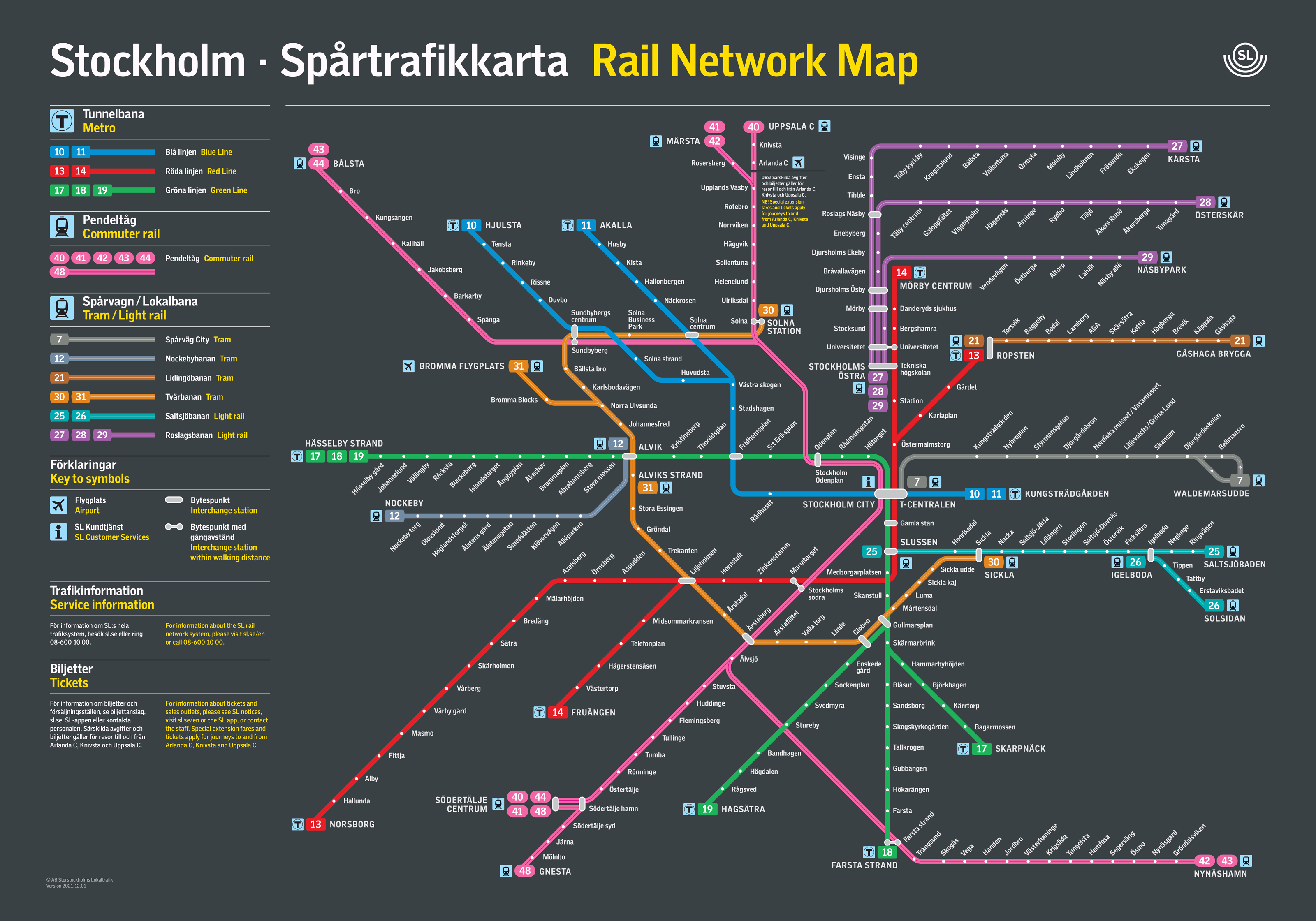
That is a good map. It is also, crucially, so very much simpler than the London Underground one. At a certain point that stops being as feasible.

That’s because it only shows the metro. The map on SL’s (Stockholm’s transit agency’s) website is more complicated (but still good): https://sl.se/contentassets/7bf3767b47ed44ff98b06403c08eaa6b...

Re: London Tube map redesigned by Essex lecturer goes viral

#44
post #8

This is far more difficult to follow than the normal one. Some lines, particularly London Overground on the North side of the city, are all over the place.

It’s pretty hard to fit the 5 or so nearly parallel commuter lines from north London into a totally circular diagram

Re: London Tube map redesigned by Essex lecturer goes viral

#45
Ever after watching Jay Foreman's videos on Harry Beck's tube map (https://www.youtube.com/watch?v=cTLCfl01zuE and https://www.youtube.com/watch?v=jaEhvWXmLyk), a reply from TfL like this one hits differently:

> A TfL spokesperson said the original Tube map was "an iconic piece of world-renowned design" and there were no plans to change it.

Re: London Tube map redesigned by Essex lecturer goes viral

#46
An underappreciated thing transport maps have to do: on arriving at a station I need to figure out what platform to get on my train at to go in the right direction. Simplified grid-oriented maps like the classic tube map help disambiguate northbound/southbound eastbound/westbound.

Unless the station wayfinding is all going to be relabeled hubwards/rimwards/turnwise/widdershins then this circularized map is just confusing.

Also, how do you make a circular tube map and not make the circle line into a circle?

Re: London Tube map redesigned by Essex lecturer goes viral

#48
post #30

Who actually needs a map? It seems to me that an app that tells me which route to take is a faster and easier way to navigate the underground.

Reading maps is a learned skill. It gets faster with practice. Also, important to keep both on hand in case of emergency. It would suck to be stranded underground without service or sense of direction.

Sure, in case of an emergency. But I feel that focusing on the map is optimizing the wrong thing.

Re: London Tube map redesigned by Essex lecturer goes viral

#49
post #31

Not sure I enjoy it. It's aesthetically pleasing at first, but then it just annoys me. All maps have problems with representing distance and space in a 2D form, but this become a little absurd. As an artistic experiment I'd give him a pass except he explicitly said: "Let's get the geography as well because, with maps, shapes and geography are important. Let's try to make my map better than TfL in every way". He then…

This is the thing people forget about maps - any map is a falsehood, because it's not the thing mapped. It has a purpose and will bend various things to best serve that purpose. A subway map is NOT a walking map; it's (usually) a guide to the transit system and how to get from station to station.

A subway isn't just any random graph, though, and preserving the information about geography at least to some extent makes it more useful in a variety of real life cases.

Re: London Tube map redesigned by Essex lecturer goes viral

#50
post #17

Earlier quoted context omitted.

I'll never forget the day I thought I might change from one station to the next by walking, because they were right next to each other on the metro map – only to discover they were actually a couple of miles apart. Or the time a relative visiting the city took the wrong train because when they needed to go north, the metro map showed northbound trains as eastbound in that area. I think there is a compromise to be mad…

On the other hand, there are two stations on the Berlin map which look quite far apart but are easily walkable in 5 minutes.

Bank and Monument are what spring to mind, though in both projections look pretty close.
Post reply on HN