Live data from Hacker News

London Tube map redesigned by Essex lecturer goes viral

bbc.co.uk

11–20 of 61 posts

Re: London Tube map redesigned by Essex lecturer goes viral

#11

"The London Underground map is one of the most recognisable in the world" Why? How is it more recognizable that, say, the Paris one? Or New York? EDIT: Since there are down votes, I will clarify my question do that we do not jump into underground nationalism: I was looking for unique features that make it recognizable. As I mentioned in a comment: the ~~Peru~~ (EDIT: Nepal) flag is unique, this recognizable for insta…

> one of

> more than
Re: London Tube map redesigned by Essex lecturer goes viral

#12

Because I cant find an actual link to the map or the post in the article, here's the page that the author seems to run http://www.tubemapcentral.com/

Thank you. TFA links to the map that was part of the Google/Samsung ad, but not to the map that apparently everyone is excited about and is the topic of the story. Ridiculously petty editorial choice for information hiding.

Yeah, the complete lack of a link to a high quality version of the fancy map is baffling on the article about this fancy map

Re: London Tube map redesigned by Essex lecturer goes viral

#13
post #9

"The London Underground map is one of the most recognisable in the world" Why? How is it more recognizable that, say, the Paris one? Or New York? EDIT: Since there are down votes, I will clarify my question do that we do not jump into underground nationalism: I was looking for unique features that make it recognizable. As I mentioned in a comment: the ~~Peru~~ (EDIT: Nepal) flag is unique, this recognizable for insta…

It is " one of the most recognisable". That statement does not define which underground maps are the most recognisable in the world, just that London is one of them , which is undoubtedly correct.

It doesn't even specify "underground"

Re: London Tube map redesigned by Essex lecturer goes viral

#14
post #9

"The London Underground map is one of the most recognisable in the world" Why? How is it more recognizable that, say, the Paris one? Or New York? EDIT: Since there are down votes, I will clarify my question do that we do not jump into underground nationalism: I was looking for unique features that make it recognizable. As I mentioned in a comment: the ~~Peru~~ (EDIT: Nepal) flag is unique, this recognizable for insta…

It is " one of the most recognisable". That statement does not define which underground maps are the most recognisable in the world, just that London is one of them , which is undoubtedly correct.

Well, it is likely recognisable for someone who have used it in the past. I was looking for some features that make it stand out.

The Peru flag is one of the most recognizable because of its shape. The American one because, well, America :)

Re: London Tube map redesigned by Essex lecturer goes viral

#16

"The London Underground map is one of the most recognisable in the world" Why? How is it more recognizable that, say, the Paris one? Or New York? EDIT: Since there are down votes, I will clarify my question do that we do not jump into underground nationalism: I was looking for unique features that make it recognizable. As I mentioned in a comment: the ~~Peru~~ (EDIT: Nepal) flag is unique, this recognizable for insta…

Since there are down votes, I will clarify my question do that we do not jump into underground nationalism: I was looking for unique features that make it recognizable.

As I mentioned in a comment: the Peru flag is unique, this recognizable for instance.

If the map was round then yes, it is recognizable. Does it have any such features?

Or is it just recognizable because London is well known, so some stations are too?

Re: London Tube map redesigned by Essex lecturer goes viral

#17
post #5

> He added: "I also thought, 'Let's get the geography as well because, with maps, shapes and geography are important. Funny. I remember watching a design documentary years ago where they made the exact opposite point: subway maps were trying to get the geography right but that became unwieldy and confusing, so the epiphany was that connections mattered more than the geography. That the way people were using the maps…

I'll never forget the day I thought I might change from one station to the next by walking, because they were right next to each other on the metro map – only to discover they were actually a couple of miles apart.

Or the time a relative visiting the city took the wrong train because when they needed to go north, the metro map showed northbound trains as eastbound in that area.

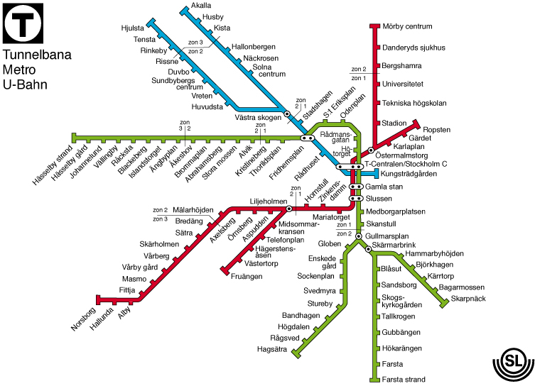
I think there is a compromise to be made. The best example of it I've found is the Stockholm metro map[1], which has straight, artificial lines but where the spacing and geometry between stations is still relatively faithful to reality. (Compare to what I assume is the real geography[2].)

[1]: http://www.bevenhall.se/tbana/tunnelb.jpg

[2]: https://pbs.twimg.com/media/BzU070lCEAASgqr.jpg

Re: London Tube map redesigned by Essex lecturer goes viral

#18
post #5

> He added: "I also thought, 'Let's get the geography as well because, with maps, shapes and geography are important. Funny. I remember watching a design documentary years ago where they made the exact opposite point: subway maps were trying to get the geography right but that became unwieldy and confusing, so the epiphany was that connections mattered more than the geography. That the way people were using the maps…

The Tube map is roughly geographic. Amersham really is North West of London. Waterloo really is South of the river. It doesn't try to preserve the geographic integrity you'd need for say, a walking map but it also isn't willing to just put a station where it would fit best aesthetically despite being completely wrong for geography.

Re: London Tube map redesigned by Essex lecturer goes viral

#19
post #5

> He added: "I also thought, 'Let's get the geography as well because, with maps, shapes and geography are important. Funny. I remember watching a design documentary years ago where they made the exact opposite point: subway maps were trying to get the geography right but that became unwieldy and confusing, so the epiphany was that connections mattered more than the geography. That the way people were using the maps…

It is useful for the geography to be at least close-to-correct, because step 1 of navigating a transit map is deciding if transit is the best way to go. The tube map is well known for having spots that make this deceptive, e.g. tourists would take the tube from Bank to Mansion House, although it would often be faster to walk.

Re: London Tube map redesigned by Essex lecturer goes viral

#20

I just watched videos of vigilantes fixing potholes and creating flyers for local businesses that look better (for free). any other similar stories of people taking matters into their own hands?

Here is a man that painted his own highway sign: https://www.youtube.com/watch?v=26-4oARwfF4
Post reply on HN