Earlier quoted context omitted.
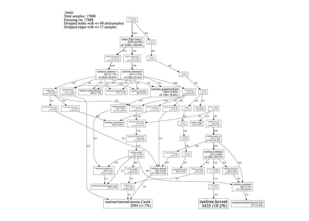
> I look at the reddest part of the chart, I look at the peaks Neither of these are really the places I look at when examining flame graphs. I tend to look at the bottom, and work my way up. The key thing (imo) to look for are wide pieces that are not a core part of what the code you're profiling is supposed to do. In the first example of your first link, you have a flame graph of code that seems to draw an image. Th…
> I think flame graphs, like all graphs, are more helpful when the reader has a lot of context about what's supposed to happen, or some intuition about how the chart is supposed to look. Yeah, and then your comment... just ends? So, what I get here is that, in a flame graph, the reddest part isn't the most interesting, and neither is the widest part, nor the part with the most peaks. So, what, exactly , am I looking…
So yes, height doesn't matter much, you read bottom to top to get context, and width is what you're looking for.
But like any chart, it can't tell you what to optimise, or what Can be optimized. It just tells you what parts of the code are taking up the most time, in a hierarchical way. Asking for a complete description of what to see here is like asking for a complete description of what to look for in a histogram. Like, ofc it matters what the histogram is of!