Live data from Hacker News

Flame Graphs: Making the opaque obvious (2017)

tech.popdata.org

11–20 of 58 posts

Re: Flame Graphs: Making the opaque obvious (2017)

#11
post #7

Earlier quoted context omitted.

> I look at the reddest part of the chart, I look at the peaks Neither of these are really the places I look at when examining flame graphs. I tend to look at the bottom, and work my way up. The key thing (imo) to look for are wide pieces that are not a core part of what the code you're profiling is supposed to do. In the first example of your first link, you have a flame graph of code that seems to draw an image. Th…

> I think flame graphs, like all graphs, are more helpful when the reader has a lot of context about what's supposed to happen, or some intuition about how the chart is supposed to look. Yeah, and then your comment... just ends? So, what I get here is that, in a flame graph, the reddest part isn't the most interesting, and neither is the widest part, nor the part with the most peaks. So, what, exactly , am I looking…

As I understand it, flame graphs add to normal x-axis-as-time ones by merging repeated calls to the same function, so if one function is called a lot it shows up as one wide chunk and not many small chunks spread out.

So yes, height doesn't matter much, you read bottom to top to get context, and width is what you're looking for.

But like any chart, it can't tell you what to optimise, or what Can be optimized. It just tells you what parts of the code are taking up the most time, in a hierarchical way. Asking for a complete description of what to see here is like asking for a complete description of what to look for in a histogram. Like, ofc it matters what the histogram is of!
Re: Flame Graphs: Making the opaque obvious (2017)

#12

OK, shameful confession time here: I just cannot grasp flame charts, no matter how hard I try. And yes: that's just me, I'm dumb, etc. etc. (and I freely admit all of that, including the et-ceteras!) I tried to follow along with things that are relevant to my job, like https://randomascii.wordpress.com/2016/09/05/etw-flame-graph... ...And totally failed? I look at the reddest part of the chart, I look at the peaks, a…

Did you read the linked article? It starts with a very simple example and then builds up to a real-world case, unlike the articles you linked, which both start off with an advanced case.

Re: Flame Graphs: Making the opaque obvious (2017)

#13

OK, shameful confession time here: I just cannot grasp flame charts, no matter how hard I try. And yes: that's just me, I'm dumb, etc. etc. (and I freely admit all of that, including the et-ceteras!) I tried to follow along with things that are relevant to my job, like https://randomascii.wordpress.com/2016/09/05/etw-flame-graph... ...And totally failed? I look at the reddest part of the chart, I look at the peaks, a…

> I do memory/CPU traces like all day every day, and I fix code all the time based on that So I take it you understand one of the standard visualizations produced by a CPU profiling tool, e.g. it takes a call stack sample every millisecond. The x-axis is time (one sample per ms, if you have only one CPU), and the y-axis is the call stack. Now for a flamegraph, you basically have the same visualization, but you sort t…

As an example, imagine you sampled a program and got 5 CPU call stack samples.

  c               c
  b               b               d
  a       a       a       a       a
  main    main    main    main    main
In a flamegraph, you would see:

  [c              ]
  [b              ][d     ]
  [a                                     ]
  [main                                  ]

Re: Flame Graphs: Making the opaque obvious (2017)

#14
How do flame graphs handle the case where most of the time is spent in some leaf function that is called from all over the program? In this case, each individual stack would not take much time but in aggregate, a lot of time is spent in the function at the top of all of the call stacks. This should not be that uncommon to have hotspots in things like copying routines, compression, encryption etc that are not associated with any particular stack.

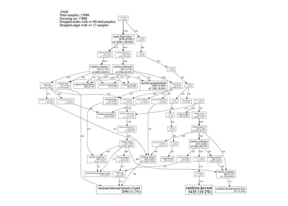
pprof from https://github.com/google/pprof can produce a DAG view of a profile where nodes are sized proportional to their cumulative time, e.g., https://slcjordan.github.io/images/pprof/graphviz.png and such a view would seem to cover the case above and subsume the usual use cases for a flame graph, would it not?

Although I guess a flat text profile of functions sorted by time would also highlight these kinds of hot spots. Still, if we want a single graphical view as a go-to, it's not clear that flame graphs are all that much better than pprof DAGs.

Re: Flame Graphs: Making the opaque obvious (2017)

#15

How do flame graphs handle the case where most of the time is spent in some leaf function that is called from all over the program? In this case, each individual stack would not take much time but in aggregate, a lot of time is spent in the function at the top of all of the call stacks. This should not be that uncommon to have hotspots in things like copying routines, compression, encryption etc that are not associat…

My flame graph tool (KDAB hotspot) has a bottom-up flame graph for that purpose.

Re: Flame Graphs: Making the opaque obvious (2017)

#16

OK, shameful confession time here: I just cannot grasp flame charts, no matter how hard I try. And yes: that's just me, I'm dumb, etc. etc. (and I freely admit all of that, including the et-ceteras!) I tried to follow along with things that are relevant to my job, like https://randomascii.wordpress.com/2016/09/05/etw-flame-graph... ...And totally failed? I look at the reddest part of the chart, I look at the peaks, a…

Did you read the linked article? It starts with a very simple example and then builds up to a real-world case, unlike the articles you linked, which both start off with an advanced case.

> Did you read the linked article?

From https://news.ycombinator.com/newsguidelines.html: "Please don't comment on whether someone read an article"

And yes, I did, and I truly don't grasp even the 'simple' explanation. I already admitted I'm dumb.

Do you have anything to add to the discussion?

Re: Flame Graphs: Making the opaque obvious (2017)

#17

Earlier quoted context omitted.

> I do memory/CPU traces like all day every day, and I fix code all the time based on that So I take it you understand one of the standard visualizations produced by a CPU profiling tool, e.g. it takes a call stack sample every millisecond. The x-axis is time (one sample per ms, if you have only one CPU), and the y-axis is the call stack. Now for a flamegraph, you basically have the same visualization, but you sort t…

As an example, imagine you sampled a program and got 5 CPU call stack samples. c c b b d a a a a a main main main main main In a flamegraph, you would see: [c ] [b ][d ] [a ] [main ]

Yeah, I imagine it, and still don't see how the flame graph would help?

Shown as a hierarchical bar chart, this would suggest 'b' is problematic.

Where, color-wise (because peak-wise, 'c' would be the culprit here) do I see this issue in a flame graph? Because I fear that either 'main' or 'a' would have the most dominant shade of red here?

Re: Flame Graphs: Making the opaque obvious (2017)

#18

Earlier quoted context omitted.

Did you read the linked article? It starts with a very simple example and then builds up to a real-world case, unlike the articles you linked, which both start off with an advanced case.

> Did you read the linked article? From https://news.ycombinator.com/newsguidelines.html : "Please don't comment on whether someone read an article" And yes, I did, and I truly don't grasp even the 'simple' explanation. I already admitted I'm dumb. Do you have anything to add to the discussion?

> Do you have anything to add to the discussion?

Do you? Can you point out where it (edit: the simple example) breaks down, instead of just repeating that you're dumb?

Re: Flame Graphs: Making the opaque obvious (2017)

#19

How do flame graphs handle the case where most of the time is spent in some leaf function that is called from all over the program? In this case, each individual stack would not take much time but in aggregate, a lot of time is spent in the function at the top of all of the call stacks. This should not be that uncommon to have hotspots in things like copying routines, compression, encryption etc that are not associat…

My flame graph tool (KDAB hotspot) has a bottom-up flame graph for that purpose.

Right, but then you have to know to consult both top-down and bottom-up. Seems like a DAG is a union of these views.

Re: Flame Graphs: Making the opaque obvious (2017)

#20

How do flame graphs handle the case where most of the time is spent in some leaf function that is called from all over the program? In this case, each individual stack would not take much time but in aggregate, a lot of time is spent in the function at the top of all of the call stacks. This should not be that uncommon to have hotspots in things like copying routines, compression, encryption etc that are not associat…

> How do flame graphs handle the case where most of the time is spent in some leaf function that is called from all over the program?

In my experience, they don't really. They're very good for finding easy wins where a high/medium-level operation takes much longer than you'd expect it to, not so much for finding low-level hotspots in the code.

> such a view would [...] subsume the usual use cases for a flame graph, would it not?

I don't think it does. A flame graph gives you a good idea of the hierarchical structure (and quickly). Sometimes you can work that out from a DAG, but not necessarily:

Let's say that A and B call M, and M calls X and Y. All four edges have roughly the same value. A flame graph can show you that 90% of the time spent in X started with A and that 90% of the time spent in Y started with B, but the DAG can't.

Post reply on HN