Live data from Hacker News

Why do everyone's logo fonts look the same? (2020)

justcreative.com

91–100 of 175 posts

Re: Why do everyone's logo fonts look the same? (2020)

#91
post #6

There's this great blog for Logo changes: https://www.underconsideration.com/brandnew/ You have to subscribe to read the articles now, but just looking at the thumbnails is fun enough

Thanks for sharing.

Browsing the before&after tag was especially enjoying: https://www.underconsideration.com/brandnew/archives/categor...

I found a nice counter example to the trend presented in the article: https://www.underconsideration.com/brandnew/archives/new_log...

Re: Why do everyone's logo fonts look the same? (2020)

#92
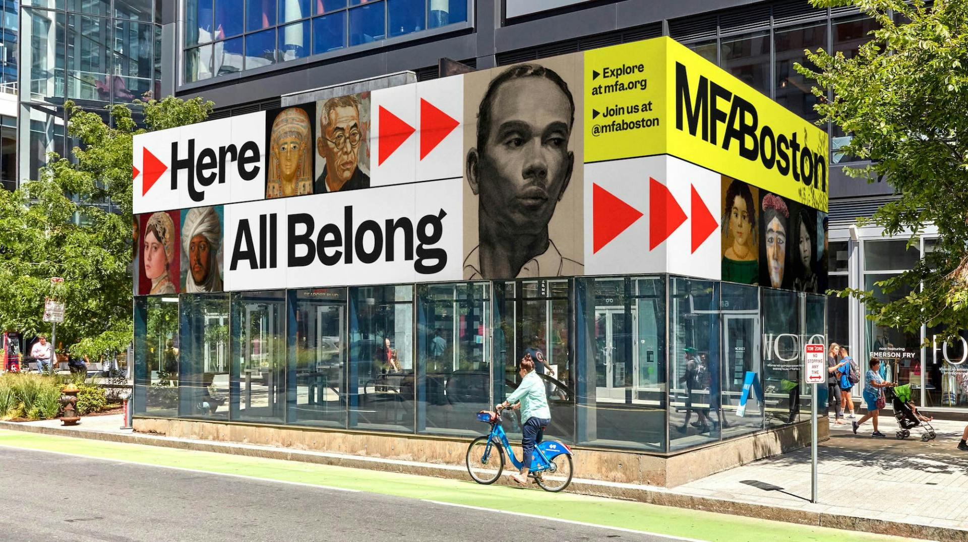
The one that bums me out the most is the Museum of Fine Arts in Boston. They went from an elegant serif font to a bland sans with a few funky tails.

Before: https://mir-s3-cdn-cf.behance.net/project_modules/disp/6a356...

After: https://creativereview.imgix.net/content/uploads/2022/09/MFA...

Their stated purpose was to make it more accessible. The reasoned that the neoclassical architecture and old-style font made the space intimidating to people who didn’t hold those things to be part of their culture and that it was out of tune with the increasing diversity of their collection and programs.

I think that’s the real trend here: change. Sans is so tempting because it hardly means anything and so designers will tell you it’s a blank canvas you can imbue with whatever values you want. If those values change, you don’t have to tear down your whole identity.

That’s deeply appealing for firms in the tech world considering the rapid change of pace. What’s disappointing to me is to see cultural institutions take the same defensive approach. A logo change is fine, but saying “we want to be accessible to everybody so we’ll strip out anything that ties us to a time, place, or tradition” is like trying to make a welcoming living room by replacing all the sofas, tables, and rugs with a milk crate and a metal foldout chair.

It doesn’t have to be that way. A few miles away the Boston Athenaeum did a rebrand with the same usual rhetoric on accessibility and diversity, but came through with a font that fits their tradition

Before: https://web.archive.org/web/20210126132351/https://bostonath...

After: https://bostonathenaeum.org/

Re: Why do everyone's logo fonts look the same? (2020)

#93
post #46
post #44

Earlier quoted context omitted.

You generally have to cater to the lowest common denominator, like that $150 prepaid Android phone with a non-HiDPI screen. Or someone on a 1336x720 Chromebook.

I think we all used Times New Roman for writing in 800x600 desktop CRTs with 15" curved displays and could read just fine.

And they had pixels the size of fingernails. Being able to see the pixels was not something that helped in the reading of anything

Re: Why do everyone's logo fonts look the same? (2020)

#94

The one that bums me out the most is the Museum of Fine Arts in Boston. They went from an elegant serif font to a bland sans with a few funky tails. Before: https://mir-s3-cdn-cf.behance.net/project_modules/disp/6a356... After: https://creativereview.imgix.net/content/uploads/2022/09/MFA... Their stated purpose was to make it more accessible. The reasoned that the neoclassical architecture and old-style font made the…

Wow I haven't been to the MFA in a while but have good memories there. The new logo is absolutely abhorrent.

Re: Why do everyone's logo fonts look the same? (2020)

#95
post #18

Earlier quoted context omitted.

Hopefully AI will make those uncreative designers redundant, freeing them to do something more aligned with their talents.

That's way too hopeful. AI is not creative, it's a tool that gives you what it calculates to be the best solution which is taken from the space of all pre-existing solutions. So if anything it will double down on the lack of creativity and keep showing whatever worked before referring us down a cycle of dull, but very machine-predictable mediocrity. AI is not the solution for making things more creative.

> AI is not creative

Are you sure? I'd say for example here it shows creativity: https://arxiv.org/abs/2310.08433

Re: Why do everyone's logo fonts look the same? (2020)

#96

The one that bums me out the most is the Museum of Fine Arts in Boston. They went from an elegant serif font to a bland sans with a few funky tails. Before: https://mir-s3-cdn-cf.behance.net/project_modules/disp/6a356... After: https://creativereview.imgix.net/content/uploads/2022/09/MFA... Their stated purpose was to make it more accessible. The reasoned that the neoclassical architecture and old-style font made the…

> Their stated purpose was to make it more accessible. The reasoned that the neoclassical architecture and old-style font made the space intimidating to people who didn’t hold those things to be part of their culture and that it was out of tune with the increasing diversity of their collection and programs.

Can put this under the dictionary definition of insanity. Or someone needed justification to get paid without doing any real work.

Re: Why do everyone's logo fonts look the same? (2020)

#97
post #6

There's this great blog for Logo changes: https://www.underconsideration.com/brandnew/ You have to subscribe to read the articles now, but just looking at the thumbnails is fun enough

Wow, thanks for that. I had no idea that e.g. Deezer got rid of their iconic logo https://www.underconsideration.com/brandnew/archives/new_log...

Meanwhile Reddit gave their new icon a neckbeard! Talk about embracing community history!

Re: Why do everyone's logo fonts look the same? (2020)

#98
To me, serif fonts convey a sense of the classic, and sans serif fonts convey moderness. So if the top people of a company says to designers "make the company more modern", it makes sense that one of the first things the designers will do is to change the serif logo to a sans serif one. It's not always a good decision though, some industries, like high fashion (as seen in the article) and literary (e.g. New Yorker, Littler Books) benefit from being "classy" and having a serif font.

Re: Why do everyone's logo fonts look the same? (2020)

#99
post #15
post #11

Earlier quoted context omitted.

> It's very noticeably in building architecture. My bad take: Modern architecture ugliness comes from architects using CAD with insufficient proficiency to create complex designs. Result: Mossty cubes and grids, with some advanced users adding fillets.

Just wait til the next generation come in, who've grown up designing widgetes for 3D printing. Weird procedural geometry, swoopy curves and crazy patterns galore! :D

I for one am here for techoGaudi-ism.

Re: Why do everyone's logo fonts look the same? (2020)

#100

Design is a bit of a fashion industry. Lots of people imitating each other. I'm not a designer but I know a few good ones and appreciate good design. What I appreciate in good design is not only looking good but standing out from the crowd. The problem with imitating others is that you end up looking like everything else. It's not offensive. But also not remarkable or memorable. A lot of web design suffers from being…

Personally, I am sick unto death of bland sans serif fonts and flat, minimalist design, but I realize that's just my opinion.
Post reply on HN