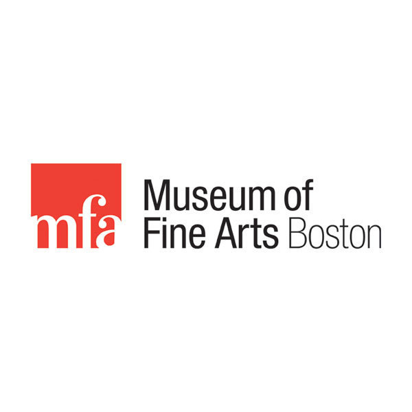
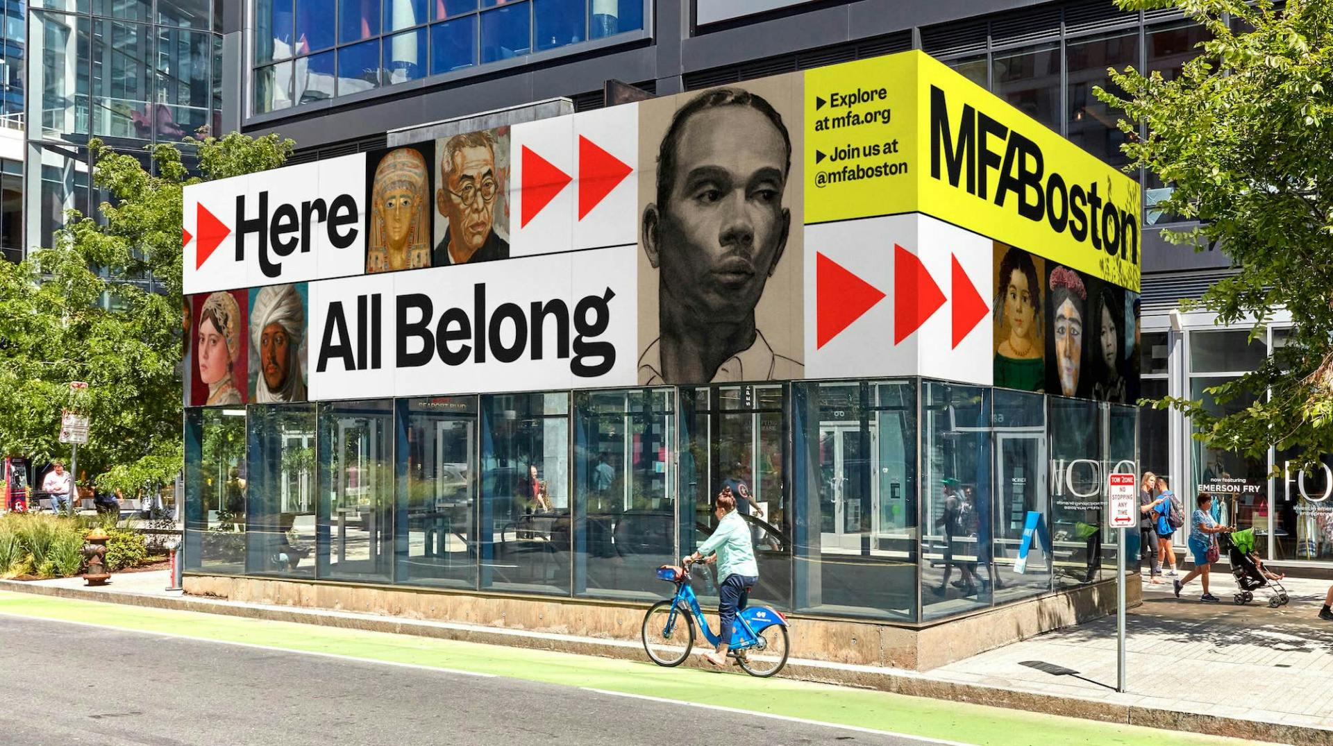
The one that bums me out the most is the Museum of Fine Arts in Boston. They went from an elegant serif font to a bland sans with a few funky tails.
Before: https://mir-s3-cdn-cf.behance.net/project_modules/disp/6a356...
After: https://creativereview.imgix.net/content/uploads/2022/09/MFA...
Their stated purpose was to make it more accessible. The reasoned that the neoclassical architecture and old-style font made the space intimidating to people who didn’t hold those things to be part of their culture and that it was out of tune with the increasing diversity of their collection and programs.
I think that’s the real trend here: change. Sans is so tempting because it hardly means anything and so designers will tell you it’s a blank canvas you can imbue with whatever values you want. If those values change, you don’t have to tear down your whole identity.
That’s deeply appealing for firms in the tech world considering the rapid change of pace. What’s disappointing to me is to see cultural institutions take the same defensive approach. A logo change is fine, but saying “we want to be accessible to everybody so we’ll strip out anything that ties us to a time, place, or tradition” is like trying to make a welcoming living room by replacing all the sofas, tables, and rugs with a milk crate and a metal foldout chair.
It doesn’t have to be that way. A few miles away the Boston Athenaeum did a rebrand with the same usual rhetoric on accessibility and diversity, but came through with a font that fits their tradition
Before: https://web.archive.org/web/20210126132351/https://bostonath...
After: https://bostonathenaeum.org/