>Right, so instead of taking 5 seconds to search youtube for a better copy of this clip which is everywhere, you'll just assume your prejudice is correct?
No, if the source you provided doesn't convey enough information, I'll assume that your claim is unsupported and respond accordingly. I'm not going to wade through the dumpster fire that is youtube search to try to do my opponent's work.
>I don't know where you got your date ranges:
From my previous comment:
>Reading the transcript, the date range for the figures is "pandemic period" and "recent period"
They correspond to literally the first few lines of the transcript
    0:00 according to this chart what is the
    0:02 biggest driver of inflation during the
    0:05 pandemic the blue is the dark blue is
    0:08 the recent period
>
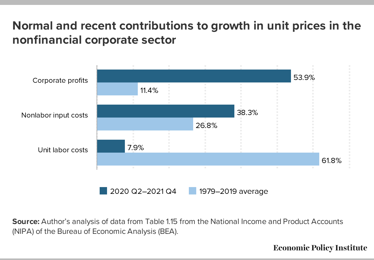
https://www.youtube.com/watch?v=0ixmqzjvb7kI traced down the original source to be: https://files.epi.org/charts/img/248291-29919.png
I don't see how this addresses my claim that the data was cherry picked. If anything it strengthens it.
1. the date ranges chosen for the dark blue period starts at 2020 Q2 and ends at 2021 Q4. This is an unusual date range to pick. Most analysis use round numbers and/or whole years. The start date conveniently corresponds to the trough of the pandemic recession period.
2. the date ranges chosen for the light blue period covers a 20 year period. This date period probably isn't cherry picked, but comparing long run data with short run data is inevitably going to show discrepancies, since long run data is less volatile than short run data.
Given that the BEA publishes such data on a quarter to quarter basis, they could have easily made a line chart showing the data across two decades. The fact that they chose to use a bar graph that only shows numbers for two suspiciously chosen time periods, and their overall reputation[1] makes it hard to take the chart at face value.
[1] https://en.wikipedia.org/wiki/Economic_Policy_Institute