Earlier quoted context omitted.
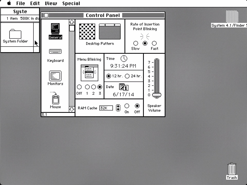
They clearly are regressions because they confuse many people and make a worse use of the same screen area. Also what are the problems being solved by these redesigns and rearrangements? What was solved by going flat in 10.9 -> 10.10? What was solved by going even flatter, and using the dreaded SF Symbols icons everywhere, in 10.15 -> 11.0? It's a done product — it's been one for quite a while. Could they just stop m…
People who complain are loud. Just because they’re loud doesn’t make the UI changes bad. I find I legitimately prefer the newer UI of Big Sur onwards. I just don’t feel the need to shout it from the heavens. An alternative take: you’re really going to suggest that one of the richest companies in the world doesn’t do extensive UI/UX testing before putting things out the door? They’re not just saying “yeah, this looks…
A good UI designer makes buttons look like buttons so our brain can quickly recognize them as such, without mistaking them for something else. A good designer has the window title in the same place no matter the application, so we know where to look before we even look. A good designer gives us a place to reliably perform common actions such as dragging the window.
We use our computers daily, and even imperceptible improvements to cognitive load and the amount of time it takes to perform actions make a difference over time. When I use my 2009 iMac running Snow Leaoprd, I perceive a reduction in friction compared to the latest macOS versions, and even compared to Catalina, which I use as my primary OS.