On phone support calls I usually can't even get people who know what a URL, URL bar, or even a search bar, is in the first place. "The box at the top where you type in websites you want to go to." "What are you talking about? I'm computer illiterate, I can't learn any of this fancy tech stuff. I just click my facebook icon and it comes up!" These people get all sorts of confused when something happens in their browse…
> I'm computer illiterate, I can't learn any of this fancy tech stuff. This learned helplessness scares me a bit. It's like the willingness to comprehend stops at "tap". "What are you talking about, 'steering wheel'?! I'm not a greasemonkey, are you talking about the thing I turn to make the car turn?" Not knowing is one thing, refusing to take in any new knowledge is another.
Every search bar looks like a URL bar to users
81–90 of 417 posts
Re: Every search bar looks like a URL bar to users
#82Earlier quoted context omitted.
I think a good point to bring up despite it being absurd. It's not that current trends in UX hide "what things really are" because we all decide what the metaphors are so much as current UX trends don't teach users the vocabulary we use to talk about the parts of a UI. You literally just have to know what a "search bar" is -- nothing is ever going to tell you. There's no text on the screen that says "Search Bar." The…
Correct. And decades of research have strongly suggested there's an upper limit to how much you can teach the average user. Remember: XEROX PARC's GUI breakthrough was "What if we make working on a computer feel like pushing stuff around on an office desk." "Educating the user" required walking three-quarters of the way to what they were already familiar with. Instead of trying to teach users how a search bar is diff…
I would absolutely kill for a shortcut that when held creates an overlay that puts labels on all the UI elements so I can say, "hold Ctrl+H and look for navigation bar."
Re: Every search bar looks like a URL bar to users
#83This is because Google and Microsoft have confused the users by allowing them to type whatever into wherever and they just figure it out. Some would call that good UI - probably myself included - but it teaches bad behavior and makes people dumber by obscuring what things really are.
> and makes people dumber by obscuring what things really are. "What things really are" is microscopic invisible electrical patterns thrumming through specially-shaped chemically-doped sand to shove some crystals back and forth to change some reflected and emitted light frequencies that hit a human eye to be interpreted by a human brain. Literally everything about UX is obscuring what things really are, because what…
Re: Every search bar looks like a URL bar to users
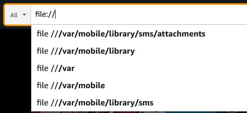
#84ref: https://i.postimg.cc/GmKmd2GH/amazonsearch.jpg
edit: then there's this clue https://www.amazon.com/gp/customer-reviews/R28STJLEYYUTF
Re: Every search bar looks like a URL bar to users
#85Just yesterday I witnessed my friend type a url into the google search bar (on the results page). She found what she was looking for, so I guess that's alright.
On the rare occasions when I’m manually typing out a url, that’s what I do also, just in case I ever mistype it. It’s better than being directed to the wrong site. Normally I don’t even need a url though, I’ll just google “chase bank” or wherever it is I’m trying to go.
Re: Every search bar looks like a URL bar to users
#86This is because Google and Microsoft have confused the users by allowing them to type whatever into wherever and they just figure it out. Some would call that good UI - probably myself included - but it teaches bad behavior and makes people dumber by obscuring what things really are.
Actually it was Mozilla
Looking at those old screenshots shows me how much the current autocomplete has regressed. The suggestions used to be so much better since it was a literal text search across titles and URLs. I remember you could configure how many results were displayed, I always set it to the max.
The 2-line rich display was awesome for scanning URLs too. The "URL after the title" we have now makes it impossible to do that.
Edit: Fixed most of these annoyances with this: https://www.userchrome.org/megabar-styling-firefox-address-b...
Re: Every search bar looks like a URL bar to users
#87Re: Every search bar looks like a URL bar to users
#88On phone support calls I usually can't even get people who know what a URL, URL bar, or even a search bar, is in the first place. "The box at the top where you type in websites you want to go to." "What are you talking about? I'm computer illiterate, I can't learn any of this fancy tech stuff. I just click my facebook icon and it comes up!" These people get all sorts of confused when something happens in their browse…
Ergo it’s actually bad UX design. Thinking desktop UX if that was an “Amazon app” there would be ONE singular search bar.
To make matters worse, Windows has a search bar in start (usually at the bottom); browser has a search bar (at the top); some websites have their own search bar; file explorer has its own search bar.
You get the point: bad UX design enforced by assumptions made at each layer of the OS/browser/website. Many out of the control of users and developers alike. Nonetheless, it’s overcrowding the UX with redundancy.
Historically speaking, users had an ability to “find stuff” on their system but it was never by an implicit “search bar”; users had to explicitly do something like: file -> find prior to entering search query.
The web browser was the one with the search bar (having one job: entering URLs not search terms) and when websites had a search feature it was typically placed in the middle of site or somewhere else (typically reserved for search terms).
Modern UX can be ridiculous in ways devs put too much emphasis on these “automatic” components. Like the annoying page header that suddenly scrolls with content and takes up 1/3 of the page. Ack! Don’t even get me started.
Re: Every search bar looks like a URL bar to users
#89Earlier quoted context omitted.
> I'm computer illiterate, I can't learn any of this fancy tech stuff. This learned helplessness scares me a bit. It's like the willingness to comprehend stops at "tap". "What are you talking about, 'steering wheel'?! I'm not a greasemonkey, are you talking about the thing I turn to make the car turn?" Not knowing is one thing, refusing to take in any new knowledge is another.
People get old and obstinate. It's sad but at the end of the day, they choose to be like this.
Heck, there have recently been articles about STEM students that do not know how to work with a basic file directory.
https://www.theverge.com/22684730/students-file-folder-direc...
Re: Every search bar looks like a URL bar to users
#90Earlier quoted context omitted.
What does it do better than Firefox Mobile? It has all settings, URL bar, and tabs at the bottom as well.
Probably doesn't have Firefox's infuriating tab manager that throws an idiotic "well golly you closed a tab!" popup over the next tab you intend to open.