Live data from Hacker News

Programming Fonts – Test Drive

app.programmingfonts.org

241–250 of 289 posts

Re: Programming Fonts – Test Drive

#241
post #225
post #161

It drives me crazy when fonts look at the old convention of "strike through zero" and for some reason decides they need to be different from the convention and allow the strike to pass the edges of the zero circle. "Anka/Coder" in the linked article is guilty of this. When the strike passes the edge of the circle, it's no longer a zero, it's a Danish or Norwegian "Ö" (Ø). It's been a part of their alphabet for centur…

So you're reading a number and then -blurp- your mind goes "Danish" or "Norwegian" letter? Context doesn't come into play? I mean - I can understand such confusion if you are dealing with some kind of multi-character random code or such (ie - a "confirmation code" for instance), and the site is primarily targeted to Danish or Norwegian users; in that case, the confusion would be valid. Much like such codes in "Englis…

> So you're reading a number and then -blurp- your mind goes "Danish" or "Norwegian" letter?

Yes.

Once you become really fluent in a different script, I find that misuse of it starts to become really annoying.

Before I had any proficiency in a language using the Cyrillic alphabet, if someone replaced say an A with a De (Д) or a W with a Sha (Ш) in an English text, I'd have no trouble reading it. Now, this kind of thing always trips me up and I've heard from several native speakers that they absolutely hate this kind of thing. To the people doing this to lyrics of metal songs in particular: please stop.

If I had to have a guess at why, I'd say if you are fluent in English but not a Cyrillic language, then your "System 1" autocorrects such mistakes to the the closest English word without you noticing. Once the other letters start to mean something, you consciously notice the mistakes as such. (For an example of the mental "autocorrect", did you notice the repeated "the" above? h/t Scott Alexander.)

Same idea with that game where you have words written in different colours but you have to read the colour instead of the word, so if "blue" is written in green you have to read "green". It's incredibly annoying in a language that you know, but really easy in a script/language that you don't know.
Re: Programming Fonts – Test Drive

#242

Earlier quoted context omitted.

Consolas is a proprietary font, and this list includes only free and/or open source fonts. It does include the similar Inconsolata.

Though Inconsolata was inspired by Consolas, I wouldn't consider it all that similar. For example, the digits in Inconsolata are much closer to the Franklin Gothic model. Also, Consolas has excellent hinting for Windows, while Inconsolata was originally designed with no hinting at all. They're not drop-in replacements.

Although Consolas is beautiful on Windows (and is one of my favourite monospace fonts), Inconsolata for me looks very good on Windows 10 (as I remember it didn't quite look as good on Windows 7). In fact, because the font is slightly thicker at lower font sizes, I find it easier to see and use -- so it's currently my default font in PuTTY and VS Code, for instance.

Thank you for your work on Inconsolata.

Re: Programming Fonts – Test Drive

#243
post #225
post #161

It drives me crazy when fonts look at the old convention of "strike through zero" and for some reason decides they need to be different from the convention and allow the strike to pass the edges of the zero circle. "Anka/Coder" in the linked article is guilty of this. When the strike passes the edge of the circle, it's no longer a zero, it's a Danish or Norwegian "Ö" (Ø). It's been a part of their alphabet for centur…

So you're reading a number and then -blurp- your mind goes "Danish" or "Norwegian" letter? Context doesn't come into play? I mean - I can understand such confusion if you are dealing with some kind of multi-character random code or such (ie - a "confirmation code" for instance), and the site is primarily targeted to Danish or Norwegian users; in that case, the confusion would be valid. Much like such codes in "Englis…

True, 1 d0nt get h0w anyone c0uld f1nd that an0ying 1n a font, when c0ntext make5 it readily apparent that they are letters.

Re: Programming Fonts – Test Drive

#245

I use a very simple test to verify if fonts are usable in programmer/technical environments: - check the readability of lower and upper case "i" (india) against the number "1" (one)and the lower and upper case "l" (lima). - Check the readability of the lower and upper case "o" (oscar) against the number "0". - check if the font can be used monospaced with being reasonable to good readability. If it passes those check…

- how much code can one fit on a screen, still maximum legibiilty?

- Is there a lighter weight variant from which one can steal ()[]{} ? Essential for Lisp programming, nice for every language.

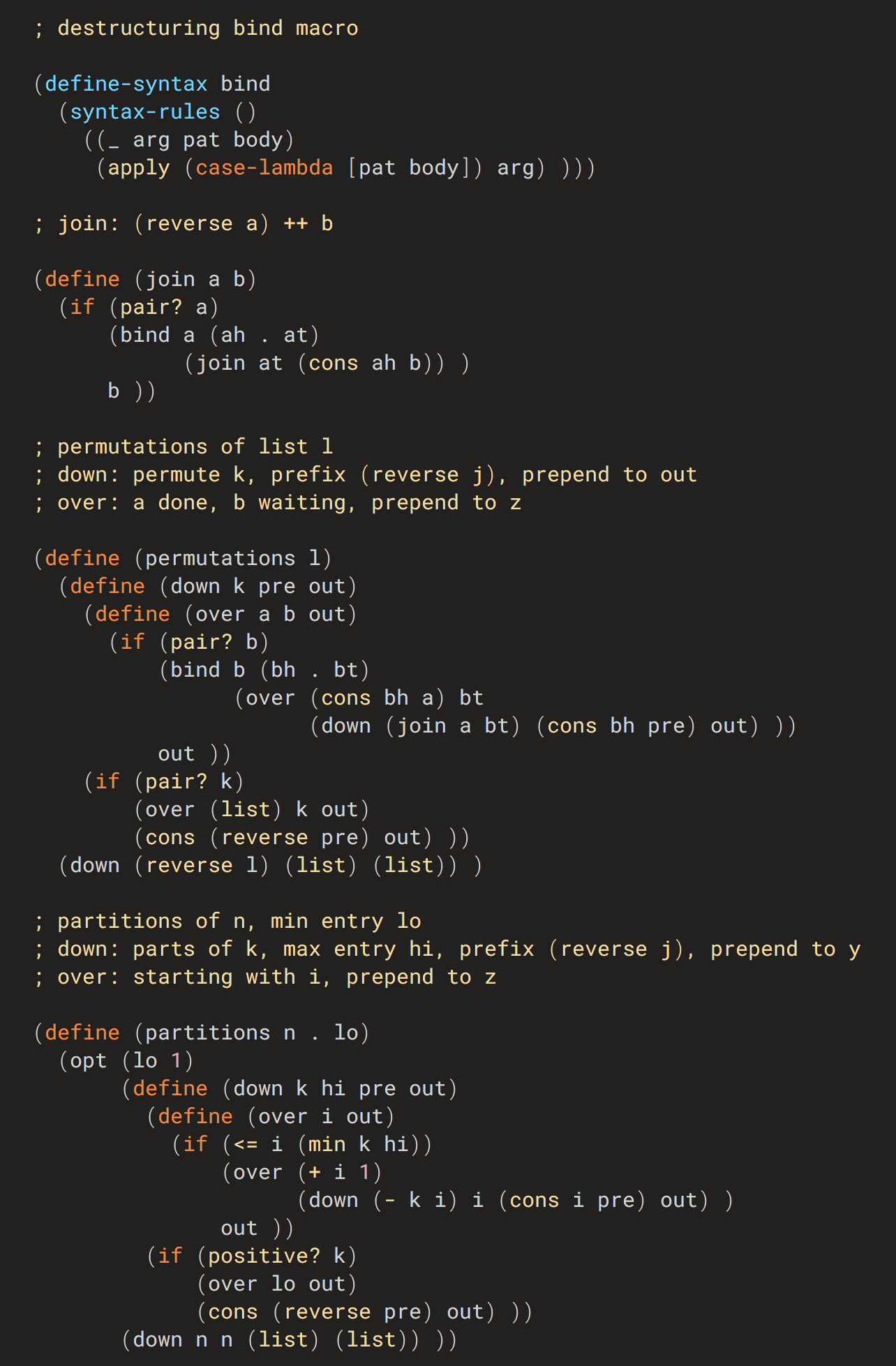
My current winner is Roboto Mono Regular, with brackets borrowed from Roboto Mono Light. The font disappears on me (attitude takes bandwidth) and one would never know I played with the brackets till one goes back to another font, and it becomes obvious brackets on a Retina display have no business having the same weight as body text.

Sample ('Zoom Out' for realistic scale): https://www.math.columbia.edu/~bayer/etc/RobotoLisp.png

Re: Programming Fonts – Test Drive

#246
post #4

One of my favorites is PragmataPro [0] (with powerline glyphs) and I'm sad it's not there. I guess they can't use proprietary fonts. PragmataPro was so weird when I started using it but it has grown on me and now I have a hard time switching to a terminal that uses something else. In any case, if you're like me and you look at the terminal screen for hours on end every single day, find some font that won't tire your…

All those ligatures for , =, etc. annoy me to no end. Ew.

Agreed, I don't get the ligature craze recently. They look ugly, and sometimes, they don't accurately reflect an operation most of the time, for instance when you use operator overloading.

PragmataPro does come without ligatures though, and that's what I've been using as my main font for over a year now.

Re: Programming Fonts – Test Drive

#247
post #225
post #161

It drives me crazy when fonts look at the old convention of "strike through zero" and for some reason decides they need to be different from the convention and allow the strike to pass the edges of the zero circle. "Anka/Coder" in the linked article is guilty of this. When the strike passes the edge of the circle, it's no longer a zero, it's a Danish or Norwegian "Ö" (Ø). It's been a part of their alphabet for centur…

So you're reading a number and then -blurp- your mind goes "Danish" or "Norwegian" letter? Context doesn't come into play? I mean - I can understand such confusion if you are dealing with some kind of multi-character random code or such (ie - a "confirmation code" for instance), and the site is primarily targeted to Danish or Norwegian users; in that case, the confusion would be valid. Much like such codes in "Englis…

Naive Danish speaker here. It is really jarring to look at, and is completely indistinguishable from ø. It is not that I cannot infer its meaning from the context, but it just stands out as a typo on first look and is really distracting. It surely would prevent me from using the font.

Re: Programming Fonts – Test Drive

#248
post #171
post #44

I'm surprised that the list doesn't mention consolas. It ships default with visual studio and it's so good that I use it on arch Linux as my terminal font and with intellij. It was designed with programming in mind and has some nifty characteristics like a slash through zero. This list also misses out on 'operator mono' which is a well thought out font for programming.

It is a Windows default font. Since you need admin rights to install fonts in Windows, it may be the only good programming font a corporate user have.

Lucida Console isn't too bad either -- it's very legible at small font sizes. On some of my work and personal systems I also have Lucida Sans Typewriter[1] (IIRC it was bundled with Office), which is taller and subjectively slightly better looking than Lucida Console

[1] https://docs.microsoft.com/en-us/typography/font-list/lucida...

Re: Programming Fonts – Test Drive

#249
post #161

It drives me crazy when fonts look at the old convention of "strike through zero" and for some reason decides they need to be different from the convention and allow the strike to pass the edges of the zero circle. "Anka/Coder" in the linked article is guilty of this. When the strike passes the edge of the circle, it's no longer a zero, it's a Danish or Norwegian "Ö" (Ø). It's been a part of their alphabet for centur…

Personally I'm a fan of the dotted zero since it looks clean and doesn't get confused with an O or an Ø. I guess it could get confused with a theta but how often does that show up in variable names?

Re: Programming Fonts – Test Drive

#250

I use a very simple test to verify if fonts are usable in programmer/technical environments: - check the readability of lower and upper case "i" (india) against the number "1" (one)and the lower and upper case "l" (lima). - Check the readability of the lower and upper case "o" (oscar) against the number "0". - check if the font can be used monospaced with being reasonable to good readability. If it passes those check…

- how much code can one fit on a screen, still maximum legibiilty? - Is there a lighter weight variant from which one can steal ()[]{} ? Essential for Lisp programming, nice for every language. My current winner is Roboto Mono Regular, with brackets borrowed from Roboto Mono Light. The font disappears on me (attitude takes bandwidth) and one would never know I played with the brackets till one goes back to another fo…

Interesting. It really look nicer
Post reply on HN