My Eve code sure would look good with these fonts...
Programming Fonts – Test Drive
41–50 of 289 posts
Re: Programming Fonts – Test Drive
#42It looks like these are all monospaced fonts. I realize that most programmers use monospaced fonts, but I personally find proportional fonts to be much more readable and pleasing to my eye. I would be really interested in a similar font comparison that included proportional fonts that are suitable for programming. Right now my favorite is Trebuchet MS. This renders beautifully on the high-DPI displays I use, and it h…
Curious. How do you line things up?
Not OP, but I use Verdana in Java.
Most things line up perfectly fine i IntelliJ.
I have had someone on my team with an itch for lining up variable assignment. That was the one thing that looked off.
  int abc              = 3
  int defg             = 4
int bigTestVaribale = 6Re: Programming Fonts – Test Drive
#43I really enjoy the Nerd Font pack, as it adds all kinds of symbols that are great for augmenting text editors like Vim:
https://github.com/ryanoasis/nerd-fonts
Then your editor can look like this:
https://raw.githubusercontent.com/wiki/ryanoasis/vim-devicon...
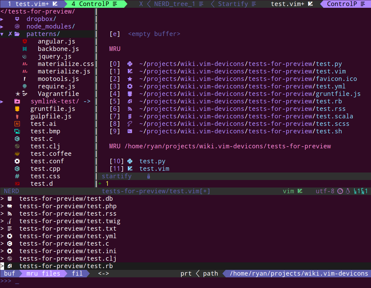
It's not all just for looks. For example you get icons for file types so it's also useful. My favorite is the Nerd Font version of Droid Sans Mono.
Re: Programming Fonts – Test Drive
#44I'm surprised that the list doesn't mention consolas. It ships default with visual studio and it's so good that I use it on arch Linux as my terminal font and with intellij. It was designed with programming in mind and has some nifty characteristics like a slash through zero. This list also misses out on 'operator mono' which is a well thought out font for programming.
Re: Programming Fonts – Test Drive
#45I'd like to see an elimination tournament of these so you can two fonts head-to-head and vote for your preferred until you discover you favorite.
Identifont is a similar system. It uses a twenty-questions style format to identify an unknown font.
Re: Programming Fonts – Test Drive
#46I like the 'M+' fonts for C++ code. Nice and compact to allow more characters to fit comfortably on a line.
Re: Programming Fonts – Test Drive
#47I'm surprised that the list doesn't mention consolas. It ships default with visual studio and it's so good that I use it on arch Linux as my terminal font and with intellij. It was designed with programming in mind and has some nifty characteristics like a slash through zero. This list also misses out on 'operator mono' which is a well thought out font for programming.
Consolas is a proprietary font, and this list includes only free and/or open source fonts. It does include the similar Inconsolata.
Re: Programming Fonts – Test Drive
#48Earlier quoted context omitted.
Curious. How do you line things up?
Not OP, but I use Verdana in Java. Most things line up perfectly fine i IntelliJ. I have had someone on my team with an itch for lining up variable assignment. That was the one thing that looked off. int abc = 3 int defg = 4 int bigTestVaribale = 6
(Another proportional font user) These cause problems in diffs as well. Change bigTestVarible to bigTestVAriable and all three lines show as changed.
Nevertheless, for teams that insist, the auto code formatter makes it look ‘nice’ for them.
Personally, I think vertical alignment apart from indentation is a mistake for more than these reasons. It implies a structure where there is none.
Re: Programming Fonts – Test Drive
#49It looks like these are all monospaced fonts. I realize that most programmers use monospaced fonts, but I personally find proportional fonts to be much more readable and pleasing to my eye. I would be really interested in a similar font comparison that included proportional fonts that are suitable for programming. Right now my favorite is Trebuchet MS. This renders beautifully on the high-DPI displays I use, and it h…
Verdana and Optima are my go to fonts. Have used proportional fonts since 2010, with close to no problems, save the occasional newbie who aligns assignments or types.
Re: Programming Fonts – Test Drive
#50It looks like these are all monospaced fonts. I realize that most programmers use monospaced fonts, but I personally find proportional fonts to be much more readable and pleasing to my eye. I would be really interested in a similar font comparison that included proportional fonts that are suitable for programming. Right now my favorite is Trebuchet MS. This renders beautifully on the high-DPI displays I use, and it h…
I'm curious to know how you started using proportional fonts for coding. All of the tooling for writing code defaults to monospace, so what started you coding in a different style?
For me it was efficiency of reading. It is proven that proportional, serif fonts read significantly faster (17%) [1] or [2] (6.1%). Also, in my opinion, scanning is much faster.
This makes sense: our eye uses the top and bottom of words to ‘key’ the word. Use proportional and you add information to this system.
[1] https://blog.codinghorror.com/comparing-font-legibility/
[2] https://journals.sagepub.com/doi/pdf/10.1177/001872088302500...
(edit: add references to research)