Live data from Hacker News

Programming Fonts – Test Drive

app.programmingfonts.org

21–30 of 289 posts

Re: Programming Fonts – Test Drive

#22
post #18

I quite like IBM Plex Mono as a programming font... https://github.com/IBM/plex would be nice if the page has a way of making suggestions of fonts to add.

There's a form at http://programmingfonts.org/ask where you could suggest additional fonts to add.

Re: Programming Fonts – Test Drive

#23
post #18

I quite like IBM Plex Mono as a programming font... https://github.com/IBM/plex would be nice if the page has a way of making suggestions of fonts to add.

Agree. It does seem to be in the repo though. You could submit a pull request for additions I suppose.

Oh, it's not in the to. My bad.

Re: Programming Fonts – Test Drive

#24

I like opening multiple tabs with different fonts and switching back and forth to make the differences more obvious. I've been experimenting with a variety of fonts in Sublime Text 3 on Linux, and I keep coming back to the default, which is apparently called emilbuS Mono, and looks like Bitstream Vera Sans Mono.

emilbuS Sublime :)

Re: Programming Fonts – Test Drive

#25
post #10
post #6

Earlier quoted context omitted.

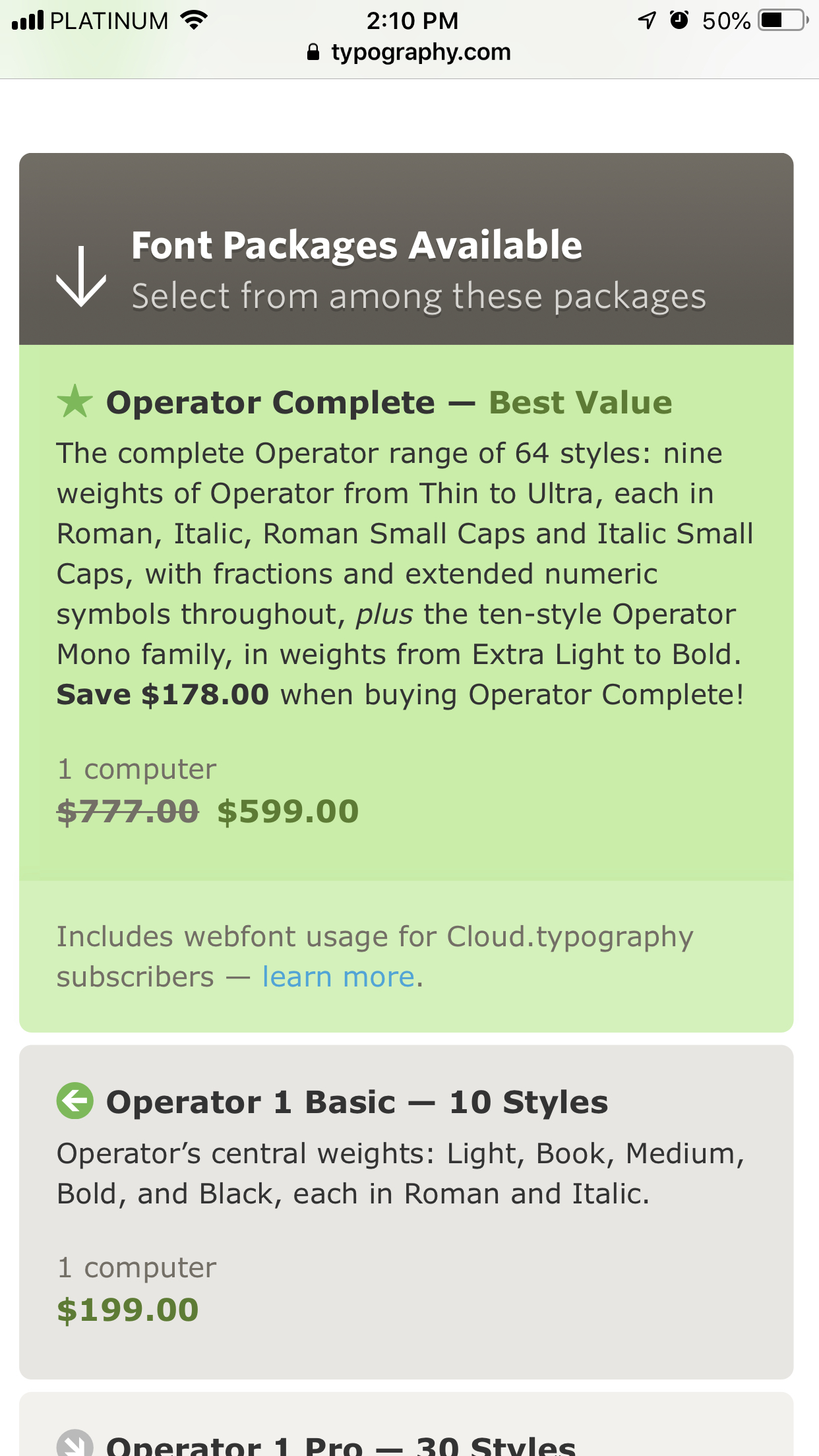
600usd is a bit steep- no disrespect to the designer.

It is $199 for 1 computer. Don't know where you see 600?

I’d imagine from the pricing for the complete font, which is that price: http://s.rnbk.org/Photo-2019-01-21-14-10-2jezMYmKLZXqYskTrz6...

Though, the price for the Mono-only (bottom of sidebar) does match what you said. So I’m guessing it’s just misread/UX.

Edit: sentence clarity

Re: Programming Fonts – Test Drive

#26
It looks like these are all monospaced fonts.

I realize that most programmers use monospaced fonts, but I personally find proportional fonts to be much more readable and pleasing to my eye. I would be really interested in a similar font comparison that included proportional fonts that are suitable for programming.

Right now my favorite is Trebuchet MS. This renders beautifully on the high-DPI displays I use, and it has easily-distinguished glyphs for the common mistakables like Il|. Its tilde is not very good though, so I used a font editor to swap in a better one.

But I'm always interested to hear about other options!

When I do have to use a monospaced font (e.g. in a terminal window), Liberation Mono is my favorite. Definitely worth a look if you like monospaced fonts.
Re: Programming Fonts – Test Drive

#29
My favourite for a few years now is a commercial font, Triplicate. It’s a true serif monospace font; every other monospace font I’ve encountered that is labelled “serif” is actually a slab serif. It has a proper italic face as well, which is a less rare, but it’s a functional italic face rather than ornamental.

It comes with some interesting variants, most notably Poly which is not fully monospaced, adjusting the widths of characters like i to be a little narrower, and W to be a little wider. I like to use that for code display.

https://practicaltypography.com/triplicate.html

Re: Programming Fonts – Test Drive

#30

It looks like these are all monospaced fonts. I realize that most programmers use monospaced fonts, but I personally find proportional fonts to be much more readable and pleasing to my eye. I would be really interested in a similar font comparison that included proportional fonts that are suitable for programming. Right now my favorite is Trebuchet MS. This renders beautifully on the high-DPI displays I use, and it h…

Verdana used to be my go to proportional font when I was doing Java. Helped with long variable names and long horizontal lines. My buddies thought I was nuts, but I found it very legible.

These days my eyes are dimming, so I dislike skinny fonts. Now I use DejaVu Sans Mono in _bold_ exclusively. Every now and then when HN does a programming font post, I try out different ones, but I always end up going back to DejaVu Sans Mono Bold.

Post reply on HN