Exactly, it's quite literally and deliberately a swastika. I've been trying to comment this, but FascistHackerNews keeps flagging my comments.
New logo
81–90 of 259 posts
Re: New logo
#82More interesting for the HN crowd I think is the article from the actual design company that did the redesign: https://www.pentagram.com/work/slack
Agreed, they have a pretty impressive and aesthetically pleasing portfolio: https://www.pentagram.com/work/
Yet at the same time, some of the logos in the Slack work are really bad.
https://pentagram-production.imgix.net/618d5092-a542-4dae-bd...
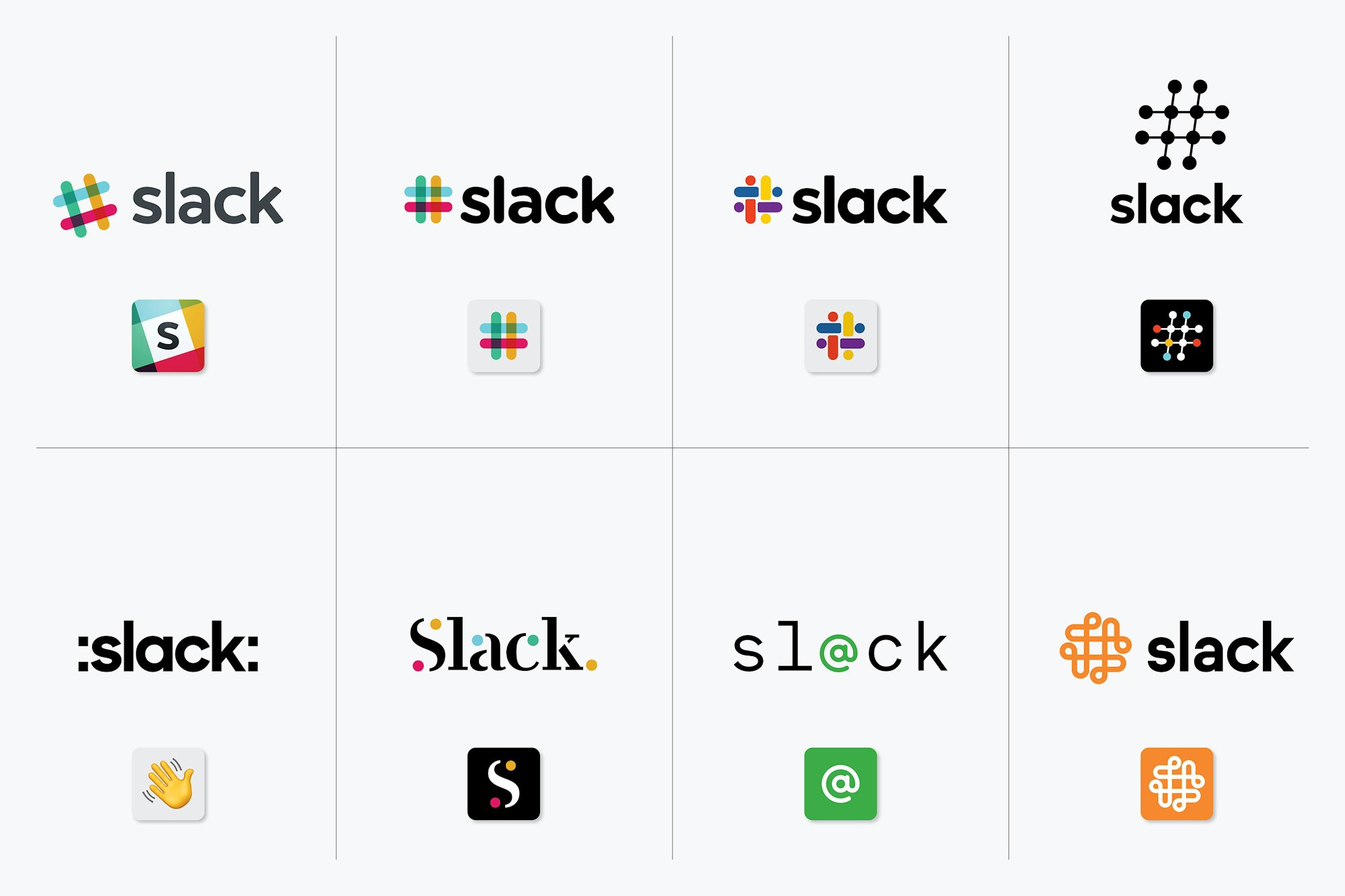
One is just colons added to the name and the wave emoji. The one beside it looks like it's from a 1997 tech company. The whole bottom row seems like it should be titled "We created these to show what not to do."
Re: New logo
#83Changing the logo doesn't help our team. I wish they'd used that money to get group calls working on iOS, speed up app on MacOS etc.
Funding the space program doesn't help the infrastructure, education and much needed aid for Opioid epidemic that's rampant in our country; therefore, we shouldn't fund NASA.
This is a wrong way of thinking.
You may have heard of the term "Throwing more developers at a problem doesn't help or too many cooks in the kitchen."
Slack should absolutely work on those issues - I agree, but not by sacrificing the rest of the business needs such as Branding.
Re: New logo
#84[warning: cannot be unseen] There is a swastika hiding in the negative space in the middle of the logo.
It's a swastikoid, like the Sun Microsystems logo (also Columbia Sportsware Company)!
https://latticelabyrinths.wordpress.com/
https://goodlogo.com/extended.info/sun-microsystems-logo-238...
https://goodlogo.com/extended.info/columbia-sportswear-logo-...
Re: New logo
#85This feels so generic. I get the problem they're referencing with too many colors and not working in all contexts. But the human mind being what it is, I never had a problem connecting "rainbow-colored #" with "Slack". This...this is just some kind of blob. I couldn't tell this apart from a big pharma company, or some kind of conglomerate that makes everything from toasters to jet planes. I'm reminded of the Philip M…
Wow. So you're telling me; that the icon that you've been viewing as the symbol for Slack over the last couple of years looked more familiar than the new logo they released today. That's mind boggling
Re: New logo
#86More interesting for the HN crowd I think is the article from the actual design company that did the redesign: https://www.pentagram.com/work/slack
Agreed, they have a pretty impressive and aesthetically pleasing portfolio: https://www.pentagram.com/work/
Paula needs to retire. She has ruined the Library of Congress logo - the classic Library of Congress logo by C&G&H with this crap: https://www.pentagram.com/work/library-of-congress/story
It's like they recycled left overs from the EFF logo job.
Pentagram is hit or miss depending on who leads the project. Michael Beirut is one of the better partners and designers at Pentagram.
Re: New logo
#87>Firstly, it’s not change for the sake of change.
Actually yes, it is.
Re: New logo
#88PSA: If the new sidebar is a little too aggressively purple for you (it was for me), the "Aubergine classic" sidebar is the old style
Aaaah thank you! Much better. Not a big fan of icon, but that's just an icon. The sidebar was bothering me more.
Re: New logo
#89It's four penises.
Re: New logo
#90This feels so generic. I get the problem they're referencing with too many colors and not working in all contexts. But the human mind being what it is, I never had a problem connecting "rainbow-colored #" with "Slack". This...this is just some kind of blob. I couldn't tell this apart from a big pharma company, or some kind of conglomerate that makes everything from toasters to jet planes. I'm reminded of the Philip M…
Agreed, the '#' had a long history of indicating a channel, like on IRC, and by extension text-based communication.