I'm not tyhat familiar with Mac software, but last time I checked, Apple had some pretty stringent standards for UI design. And well, unless you went to some extreme lengths, your menus, textboxes and buttons would look consistent.
Now, just double-checked a few apps (Firefox, mIRC, Visual Studio) between Windows 7 and latest insider buld of Windows 10. They look exactly the same. Office? Looks the same, too. Can you reference some app that does look different between them?
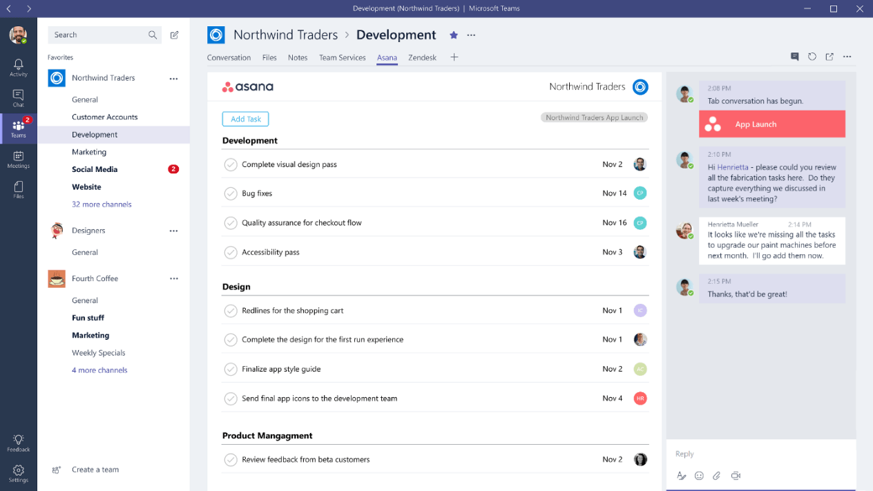
Still not seeing any sinificanmt difference between Teams and Discord either. From left to right:
- Narrow column with icons
- Wider column with list of somethings
- Even wider colunm with another list
- Less wide column with more icons and text.
Seriously, if you swap icons between the two, would you be even able to tell the difference? Sure, some content in some of those colunms is different -- these are different apps, after all, but saying that one interface looks entrirely different seems to me to be an exaggeration. From a designers' POV maybe, colors re different, and icons are in slightly different locations. From a users view, they are basically identical. For that matter, Slack seems to look exactly the same, too. At least based on what they show on their site. Except, of course, that being an Electron app and not following even what little Windows has for UI standards, they have to start the description form saying that to find settings you need to go a Workspace menu. Which, of course, doesn't look like a menu to begin with.
Honestly, I do not see how this is an improvement. Cheaper for the manufacturer, sure.