Live data from Hacker News

Go fonts

blog.golang.org

21–30 of 182 posts

Re: Go fonts

#21
post #12

Why does a programming language need its own font?

The font is ostensibly for the experimental UI, so that the font license would not encumber the code using the UI toolkit. That said, they did seem to put effort into making sure Go source code would look pretty.
Re: Go fonts

#22

Yuck, the monospace font feels too dense, and dislike the serifs.

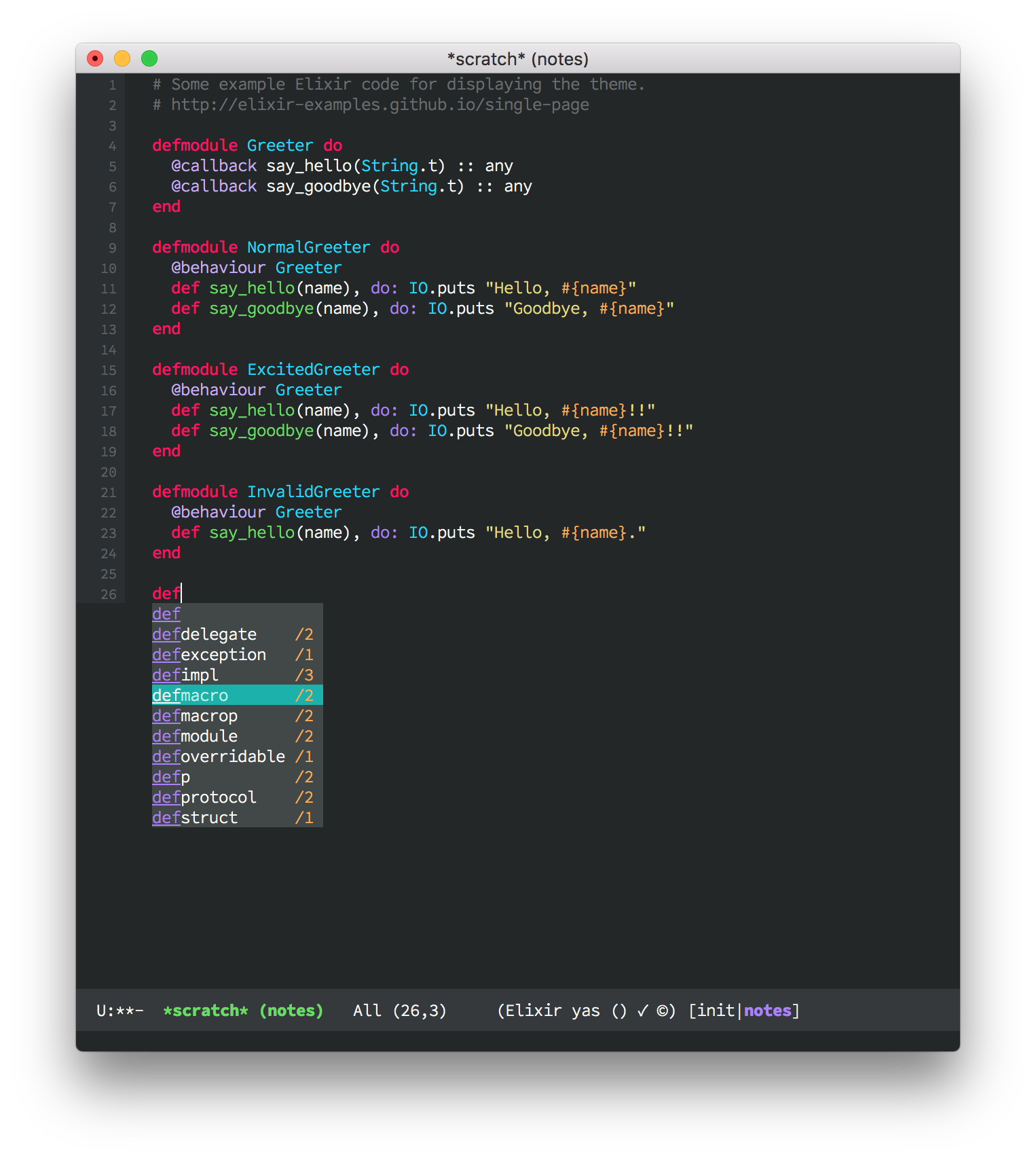
It's a pity when newer typefaces don't have lighter weights — they look far better on high resolution displays than normal/regular weights, which look almost bold.

My favourite example and what I use daily, Office Code Pro Light: https://raw.githubusercontent.com/sjrmanning/darkokai/screen...

Re: Go fonts

#23

Yuck, the monospace font feels too dense, and dislike the serifs.

I think the rendering is horrible too, with plenty of colour fringing and unevenness. The monospace font reminds me of the generic "Asian product manual font" - although the individual shapes are slightly different, it has a similar feeling to MS Mincho: http://lists.w3.org/Archives/Public/www-archive/2013Jul/att-...

The monospace is kind of okay, I guess, but considering the competition there's nothing special about it. Many users will be coding with colour keyword support anyway, so the idea that it's going to be super-great for Go code is strange.

I found the proportional font really hard to read.

It's not as if Google can't do good typography:

https://fonts.google.com/about

So this seems like a rather self-indulgent and not wholly successful side project.

Re: Go fonts

#24
Elements of the proportional font, like the little foot on the 'a' remind me of Lucida Grande. Lucida Grade was the original OS X system font, which B & H also developed. This is not their first rodeo, its all about licensing.

Re: Go fonts

#25
post #9

Why wouldn't they just use Google Droid? Strange.

From the comments here so far, it seems really important that they could be under the same permissive license as the rest of the project.

Re: Go fonts

#26
post #12

Why does a programming language need its own font?

Good question. Why does it need a mascot too at first place, I don't know either.

Re: Go fonts

#27
post #26
post #12

Why does a programming language need its own font?

Good question. Why does it need a mascot too at first place, I don't know either.

A mascot is just a type of logo, and logos definitely have their uses.

Re: Go fonts

#28
post #24

Elements of the proportional font, like the little foot on the 'a' remind me of Lucida Grande. Lucida Grade was the original OS X system font, which B & H also developed. This is not their first rodeo, its all about licensing.

The monospace is clearly an offspring of Lucida Typewriter. It is slightly condensed, a touch heavier, and with some obvious code-friendly variations (like a single-storey 'g' and a crossed zero) and a quirky, asymmetric curve inside the bowl of the 'b', 'd', 'g', 'p' and 'q' that I've instantly warmed to.

I'll give it a red hot go and develop in it for a day, but those chunky slab serifs are much busier than the Menlo I've preferred since 2009.

Re: Go fonts

#29
post #13

Earlier quoted context omitted.

Font licensing is complicated and Chuck is a friend. It was very important to us that Go programmers be unencumbered when distributing programs that use this font.

Why is it not possible to just use the system font for these UI elements?

[deleted]

Re: Go fonts

#30
post #22

Yuck, the monospace font feels too dense, and dislike the serifs.

It's a pity when newer typefaces don't have lighter weights — they look far better on high resolution displays than normal/regular weights, which look almost bold. My favourite example and what I use daily, Office Code Pro Light: https://raw.githubusercontent.com/sjrmanning/darkokai/screen...

Thanks for the recommendation! going to swap it in as a replacement for Fira Mono for a while, see how it feels.
Post reply on HN