Why does a programming language need its own font?
Go fonts
21–30 of 182 posts
Re: Go fonts
#22Yuck, the monospace font feels too dense, and dislike the serifs.
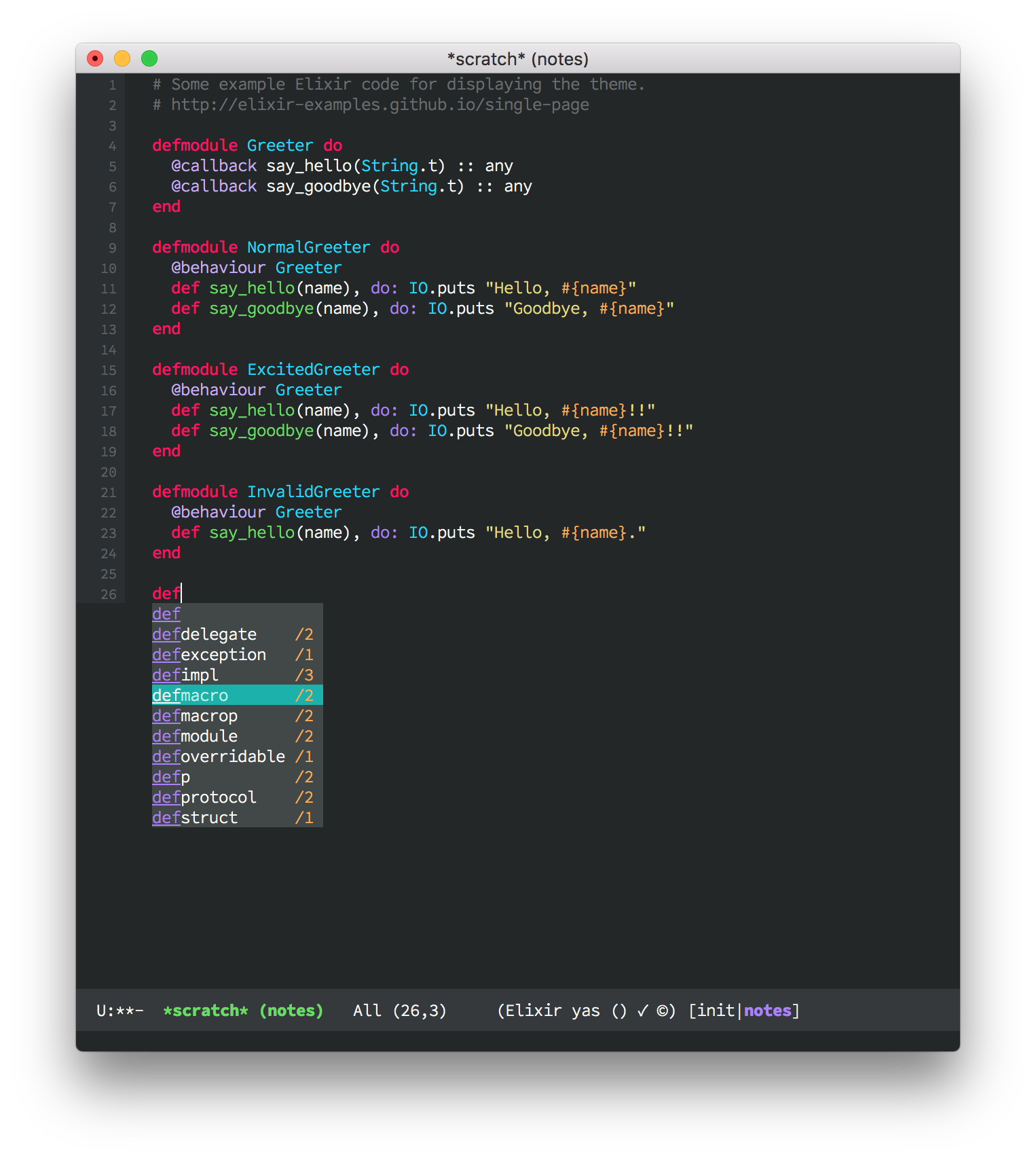
My favourite example and what I use daily, Office Code Pro Light: https://raw.githubusercontent.com/sjrmanning/darkokai/screen...
Re: Go fonts
#23Yuck, the monospace font feels too dense, and dislike the serifs.
I think the rendering is horrible too, with plenty of colour fringing and unevenness. The monospace font reminds me of the generic "Asian product manual font" - although the individual shapes are slightly different, it has a similar feeling to MS Mincho: http://lists.w3.org/Archives/Public/www-archive/2013Jul/att-...
I found the proportional font really hard to read.
It's not as if Google can't do good typography:
https://fonts.google.com/about
So this seems like a rather self-indulgent and not wholly successful side project.
Re: Go fonts
#24Re: Go fonts
#25Why wouldn't they just use Google Droid? Strange.
Re: Go fonts
#26Why does a programming language need its own font?
Re: Go fonts
#27Re: Go fonts
#28Elements of the proportional font, like the little foot on the 'a' remind me of Lucida Grande. Lucida Grade was the original OS X system font, which B & H also developed. This is not their first rodeo, its all about licensing.
I'll give it a red hot go and develop in it for a day, but those chunky slab serifs are much busier than the Menlo I've preferred since 2009.
Re: Go fonts
#29Re: Go fonts
#30Yuck, the monospace font feels too dense, and dislike the serifs.
It's a pity when newer typefaces don't have lighter weights — they look far better on high resolution displays than normal/regular weights, which look almost bold. My favourite example and what I use daily, Office Code Pro Light: https://raw.githubusercontent.com/sjrmanning/darkokai/screen...