Live data from Hacker News

The Apple Goes Mushy Part I: OS X's Interface Decline

nicholaswindsorhoward.com

31–40 of 440 posts

Re: The Apple Goes Mushy Part I: OS X's Interface Decline

#31

I like the minimalistic UI of El Capitan. It gets out of the way, and puts in focus what I really want to look at: the content, Web pages, my code, my photos. My computer is a tool, it's not an artwork I turn on to look at. Buttons still look pushable, input fields still look editable. The Dock didn't lose any functionality whatsoever by having the 3D effect removed. In my opinion, the El Cap UI requires just as much…

> My computer is a tool, it's not an artwork I turn on to look at Things looking better actually has a positive effect on usability.

Yes but a flatter look doesn't necessarily look worse.

Re: The Apple Goes Mushy Part I: OS X's Interface Decline

#32

I like the minimalistic UI of El Capitan. It gets out of the way, and puts in focus what I really want to look at: the content, Web pages, my code, my photos. My computer is a tool, it's not an artwork I turn on to look at. Buttons still look pushable, input fields still look editable. The Dock didn't lose any functionality whatsoever by having the 3D effect removed. In my opinion, the El Cap UI requires just as much…

> My computer is a tool, it's not an artwork I turn on to look at Things looking better actually has a positive effect on usability.

Does it? I'm more productive in the command line than I could ever be in a GUI.

Re: The Apple Goes Mushy Part I: OS X's Interface Decline

#33
post #28

This article doesn't make any sense. The use of metaphors worked when people didn't know what a computer was, and the only way to make its UI make sense was to mimic real-world objects. Now, this is no longer necessary. It's been 40 years. While I agree that new macOS icons aren't great (see the Game Center icon), the old ones were silly. I'm 35 and I have probably seen an actual contact book only once when I was lit…

> I'm 35 and I have probably seen an actual contact book once when I was little. It doesn't make sense to have a skeuomorphic contact book as an icon for Contacts.

There was a rhetoric not too long ago where OSx fanboys would make fun of Windows' interfaces for still using the disk icon as the "save" button. Now that guy is complaining that the photos app icon doesn't look like a Point And Shoot camera, when fewer and fewer people use those.

Skeuomorphism doesn't make sense anymore when the real world items it's based on are vanishing.

Case in point – telling a young kid how to answer a call on the iPhone: press the green banana button.

Re: The Apple Goes Mushy Part I: OS X's Interface Decline

#35
post #16

One thing I really dislike about 10.10 is that "maximizing" a window will - with a few exceptions - switch it to fullscreen. To maximize a window I need to press Alt while clicking the maximize-button. And there is not even an option to switch this behavior. On a small laptop screen this behaviour might be preferable, but on a FullHD display, I find it rather annoying.

Double click the title bar then. Still, the maximization in macOS is plainly stupid, as it frequently doesn't do the expected maximization.

Re: The Apple Goes Mushy Part I: OS X's Interface Decline

#36
Note: This is my personal opinion!

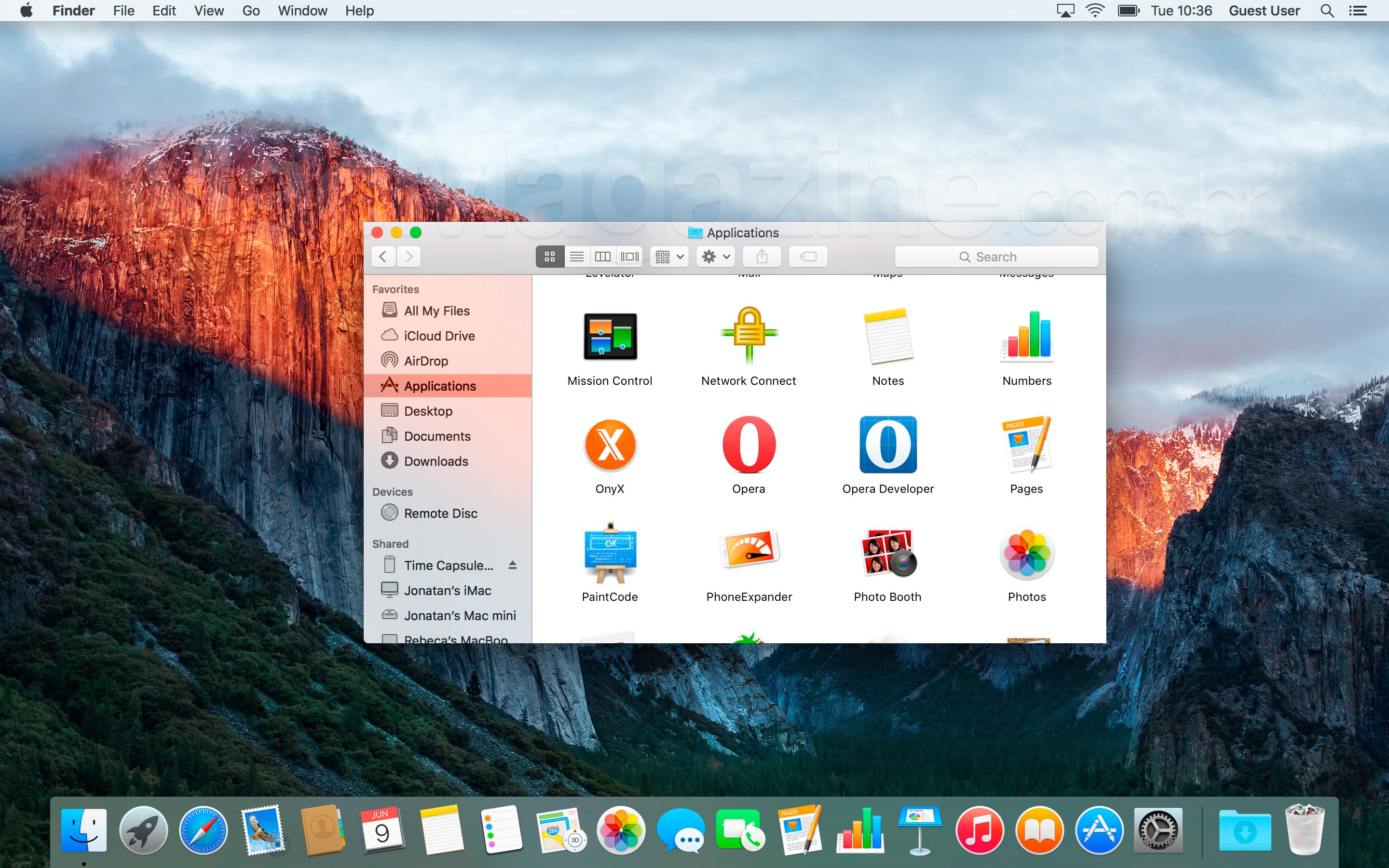
I recently had to use a computer with OS X Mavericks on it (10.9 I think). I was struck by how beautiful the interface was. I'm having trouble finding a good screenshot illustrating this, but compare

http://content.gcflearnfree.org/topics/243/2013_new_desktop....

http://download.softwsp.com/sites/12/2015/11/os-x-el-capitan...

Everything just looks better on Mavericks. The gradients may be over-the-top but they're at least consistent. Transparency on El Capitan is pointless and ugly. Maybe I like the system font a little better.

Firefox is also a really good example; it looked great on Mavericks but has not been able to fit in since.

Usually, I prefer simple UIs: i3, terminals, etc.. But the look they have done for Yosemite/El Capitan just doesn't work.

Re: The Apple Goes Mushy Part I: OS X's Interface Decline

#37

I like the minimalistic UI of El Capitan. It gets out of the way, and puts in focus what I really want to look at: the content, Web pages, my code, my photos. My computer is a tool, it's not an artwork I turn on to look at. Buttons still look pushable, input fields still look editable. The Dock didn't lose any functionality whatsoever by having the 3D effect removed. In my opinion, the El Cap UI requires just as much…

Presumably there's a setting to use the old icons if you prefer them?

Nope. That would be a branding nightmare.

Re: The Apple Goes Mushy Part I: OS X's Interface Decline

#38
I suppose Apple truly intends its MacOS to become more mature and streamlined. I also loved the beauty of Leopard and Lion versions. I don't think that making all icons flat and less colorful makes Apple's products more mature. The decision might have been made as Apple decided to move from glossy devices to mat, so later after that all the icon designs also moved from glossy to flat. It took almost 10 years, btw.

Re: The Apple Goes Mushy Part I: OS X's Interface Decline

#39
OS X looks better than ever. Yeah I agree with Notepad and Photos icons looking not good but everything else is perfect. I'm typing this on an OSX right now and it just looks great.

Worst part of the article by far was

> OS X packaging, once very elegant and eccentric (and printed on a physical box), has become thoroughly unremarkable.

This is 2016, no one uses CD's anymore. And that leopard print box design looks like packaging for some kinky underwear.

Post reply on HN