The removal of colour from the icons in the Finder sidebar is the change that feels the most clearly anti-usability to me. It clearly makes the items harder to distinguish and has no benefits that I can see apart from fitting in with the flat design concept.
The Apple Goes Mushy Part I: OS X's Interface Decline
21–30 of 440 posts
Re: The Apple Goes Mushy Part I: OS X's Interface Decline
#22Get a group of non-Mac users, randomly split them into two groups. Set them a number of basic tasks: writing and sending an email, editing a photo, opening a particular website, etc. Then have one group do it on an older version of OS X, and the other on a new version. Then record how long it takes them, what things they struggle with, etc. Ask them to report their level of frustration and enjoyment.
It wouldn't be a perfect experiment, but it would at least produce some concrete data to discuss.
Re: The Apple Goes Mushy Part I: OS X's Interface Decline
#23I like the minimalistic UI of El Capitan. It gets out of the way, and puts in focus what I really want to look at: the content, Web pages, my code, my photos. My computer is a tool, it's not an artwork I turn on to look at. Buttons still look pushable, input fields still look editable. The Dock didn't lose any functionality whatsoever by having the 3D effect removed. In my opinion, the El Cap UI requires just as much…
Re: The Apple Goes Mushy Part I: OS X's Interface Decline
#24It’s not that important a point, but legal pads are a very US phenomena. I’m German and I have never ever seen a yellow pad like that in person. The current notes icon (with white paper) is much more in line with the note pads you would encounter in Germany. Paper people write on to take notes is typically just white. Maybe bound with a spiral on the left or top (and perforated paper to tear off), maybe glued togethe…
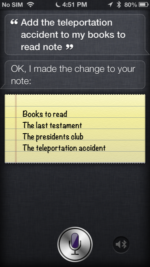
I think the bigger issue with the new Notes icon is the weak branding. Previously, you could tell Notes and Reminders apart by just looking at the colours. This was really important when you told Siri to "remind me to buy milk tomorrow" - you would either see a bright-yellow note[1], or a black-red-white reminder[2]. Now, everything is "almost white", making it really hard to tell what content lives in which app. (Notes and Reminders have a lot of conceptual overlap, especially now that Notes supports checklists.)
[1] http://core0.staticworld.net/images/article/2013/03/siri-not... [2] http://cdn.osxdaily.com/wp-content/uploads/2012/10/location-...
Re: The Apple Goes Mushy Part I: OS X's Interface Decline
#25Re: The Apple Goes Mushy Part I: OS X's Interface Decline
#26Compare it to Atom which I, and I am sure many others here, use every day" syntax highlighting, coloured icons, etc all make navigating code/screen faster.
Re: The Apple Goes Mushy Part I: OS X's Interface Decline
#27The change appears to be a part of the broader trend towards flat design from realistic design in the UI community. A balanced point of view: http://www.webdesignerdepot.com/2013/12/infographic-flat-des...
"Flat design" versus "visual nudging", for want of a better term, is what the debate's really about.
Re: The Apple Goes Mushy Part I: OS X's Interface Decline
#28The use of metaphors worked when people didn't know what a computer was, and the only way to make its UI make sense was to mimic real-world objects. Now, this is no longer necessary. It's been 40 years.
While I agree that new macOS icons aren't great (see the Game Center icon), the old ones were silly. I'm 35 and I have probably seen an actual contact book only once when I was little. It doesn't make sense to have a skeuomorphic contact book as an icon for Contacts. The old icon for Pages? I don't even know what that is, I'm not into calligraphy.
The only thing I'd agree with is hiding UI controls. Apple has been making its apps less usable to make them look pretty, hiding important elements in an attempt to declutter the interface. I hate how Safari hides the full address in the address bar, for instance. Or, how they removed scrollbars and force people to actually scroll every piece of the interface to check if there's something more to see, while before you could tell just by looking at scrollbars. Of course, there are settings to go back to the old behavior for both my examples, so power users are fine, but I fail to see how these moves improve things for regular users.
I also disagree that Steve Job's death was detrimental to macOS's UI. He was the one who kept Apple looking outdated with his obsession for skeuomorphism, I'm glad they went for a flatter look right after his death.
Of course, everyone's taste is different, but I still think this is a bad article.
Re: The Apple Goes Mushy Part I: OS X's Interface Decline
#29I'm glad they removed all the silly shadows, 3d effects and animations and defined more strict UI guidelines.
I don't need my OS to look like a Christmas tree.
Re: The Apple Goes Mushy Part I: OS X's Interface Decline
#30I like the minimalistic UI of El Capitan. It gets out of the way, and puts in focus what I really want to look at: the content, Web pages, my code, my photos. My computer is a tool, it's not an artwork I turn on to look at. Buttons still look pushable, input fields still look editable. The Dock didn't lose any functionality whatsoever by having the 3D effect removed. In my opinion, the El Cap UI requires just as much…
> My computer is a tool, it's not an artwork I turn on to look at Things looking better actually has a positive effect on usability.
I'm a long-term Inkscape user, they recently 'improved' the icons; it all looks wrong (but handsome in a minimalistic, low-visibility of chrome, sort of way) and disturbs my workflow considerably.