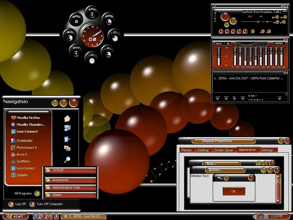
Oh no. It looks like every button and menu is now a translucent layer, so that any noise from the background shows through and muddles the text. This seems like an accessibility nightmare. Translucent layers generally make software unusable for me. In the video, I saw several instances that would be really really bad for me, where I’d be straining to understand the text. Looks really cool and futuristic though. Just…
Apple introduces a universal design across platforms
771–780 of 1001 posts
Re: Apple introduces a universal design across platforms
#772It''s not terrible, but I will avoid it for a while. My biggest issue is the system resources this will require. I just don't care for the pretty, as much as I care for fast UI. Thinks Windows 11 delayed right click context menu.
Unifying their operating system design language makes sense, but ugh do we really need yearly operating system revisions like this. It is obvious that the engineers struggle with the marketing led pace judging by how many issues there are every major release of macOS. I don't upgrade to a new major until a .3 usually because of this.
Re: Apple introduces a universal design across platforms
#773Trying to understand where this is coming from, I guess two sources:
1. It's a fashion update to give GenZ and younger something they haven't seen before. They are too young to remember Windows Vista, and are the most important future target group that spends 12+ hrs / day on their iPhone. Also it is an audience that heavily customizes their UI, and care more for visually communicating cool-ness, than to get work done with efficient UX. Similar to using rainmeter on a desktop PC. Unsurprising, this look a lot like a rainmeter skin.
2. This is a way to communicate unmatched quality. Similar to what AirBnB are doing. When everyone can use icon- and component libraries like material and shadcn to build UI:s, this is a visual language that communicates premium quality is through an interface and iconography that is different and too expensive for others to recreate. Many companies don't have the skill nor the time and money to do custom icons in 3D software, or create elaborate translucent effects. Let's see what multi-plattform apps will look like with this new UI, perhaps the goal is to make them stand out as "outdated"
Re: Apple introduces a universal design across platforms
#774Is it possible to do the same job with same performance on Android? or Windows or any general target OS and software stack?
Seems that shader itself does not costs too much(normal map? lookup table?). What really matters is their UI/Shader job scheduling in realtime constraints on any CPU/GPU load state.
Re: Apple introduces a universal design across platforms
#775Re: Apple introduces a universal design across platforms
#776This looks horrible to be honest. This new liquid glass will lead to liquid brain, because my brain will be melting trying to process all that visual mess daily. Now of course, I'll have to experience this new design in practice to be sure, but judging from the screenshots it looks really hard on the eyes. Hopefully they'll allow the translucency to be customized. Apple had a good run, I've genuinely enjoyed using th…
Even the non transparent stuff looks bad - a plain Finder window: https://forums.macrumors.com/threads/macos-tahoe-26-0-beta-1...
That's worse than I expected.
Re: Apple introduces a universal design across platforms
#777Re: Apple introduces a universal design across platforms
#778https://www.lux.camera/physicality-the-new-age-of-ui/ This blog's prediction got remarkably close. I've been a sucker for glass UI since the first Longhorn (later Vista) screenshots.
I mean, that just blog sums up the whole attitude issue here. "It’s an exciting time to be a designer on iOS. My professional universe is trembling and rumbling with a deep sense of mystery." This person is excited that their job designing iOS apps will be more interesting (and the prospect of plenty of work in the pipeline doesn't hurt either). Fuck the end users who need to adapt to this needless change, suffer new…
In this case I am lucky, as I find glassy UIs visually appealing.
Re: Apple introduces a universal design across platforms
#779everything is mid 2000s again. this really feels anti-apple even though the design polish is top notch, but to just abandon accessibility for shinyness feels like something steve would have obviously been against. but it definitely takes me back to endlessly tweaking with linux mint skins in my college dorm.
The overall bulky style reminds me of the least appealing cosmic-techno-chrome Windows themes that were spawning like rabbits ~20 years ago: https://www.thepcmanwebsite.com/themes/images/themes/bounce_...