it would be interesting to see an overview of the web UI, going from user-centric to ad-centric in 20 years
A version of that exists: https://www.webdesignmuseum.org
thanks, this is great
71–80 of 117 posts
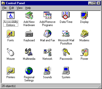
I really miss Windows 95/98 era UIs. They were so much more practical and less noisy than current generation UIs. Opening the start bar on my Windows 11 I literally have no idea what's going on. All the "apps" at the top of my start bar are things I've never used and I don't think I've ever even installed. Stuff like Tiktok and XBox. Then below that I get recommendations, but I don't want recommendations, I just want…
I agree. Win 95/98 UI was pretty ugly, but it was consistent and followed a good design language: eg everything that was clickable looked like a button: buttons, table headers, scroll bars etc. Once you learned the basics of the UI, you could mostly figure things out. Nowadays buttons look like plain text labels half the time and every app has its own inconsistent style and even I, someone who has used computers for…
Windows 95: https://history.user-interface.io/img/windows-95/settings.pn...
Windows 10: https://i.ibb.co/SQkQNJw/Windows10.png
Two things I noticed from looking at the screenshots: 1. The MS Windows 7 Task Manager look very similar to the KDE 1 version (from the late nineties): https://history.user-interface.io/img/kde-1/task-manager.jpe... 2. In 1990, Microsoft referred to plain text files on the local system as “on-line documents”: https://history.user-interface.io/img/windows-3.0/notepad.pn...
The KDE 1 task manager looks _very_ similar to the Windows NT 4 task manager (from the mid nineties): https://guidebookgallery.org/screenshots/winnt40 (scroll down to 'task manager' and click the faint tab control marked '3' in the upper left of the specific screen shot) Until Win10, the NT OSes had that same basic task manager with the cool looking green graphs. WinNT 3.51 had a much more crude looking task manager
Browsing 1992 through 1995 gave me tears. Btw, where is Vista, ME, or Windows 98, or 7 for that matter? Vista had an especially unique UI with Aero and Windows 7 was an adaptation of that I believe.
I concur about Windows Vista. For all the criticism that OS received, it did bring Windows a compositing desktop similar to Mac OS X, which was a crucial milestone to the GUI experience, which brought compositing desktops to more than 90% of personal computer users. I believe Windows 98 and ME were omitted because this is largely a presentation of the evolution of GUIs. Windows 98 and ME did not substantially differ…
The only differences I remember are quick start icons in the taskbar, and gradients in window title bars.
The list is kind of arbitrary. I don't feel the Amiga UI had any influence on anything what so ever. I was a huge Amiga fan and owned an Amiga 1000 the year it launched and then an Amiga 500 later but other than Amiga's unique multi-resolution system, which really was only something that was a product of the limits of old hardware, there was nothing special about its UX. Similarly where's GEM? https://en.wikipedia.or…
Not only did Amiga have preemptive multitasking. The window system ("Intuition") ran behaviour and redraw of apps' widgets in its own task, making them responsive even if the apps owning them were lagging. Compare that to Windows 3.11 of the day, where the entire GUI would hang while waiting for an app to redraw anything in one of its windows.
This is a nice collection of graphical user interfaces. This reminds me of the well known Toasty Tech collection ( http://toastytech.com/guis/ ), but with a narrative tying together the evolution of these GUIs. Some feedback: 1. All interfaces presented were graphical user interfaces for desktop personal computers. However, there's a wide world of user interfaces for computers beyond conventional point-and-click GUIs…
When the NeXT was announced I thought it had been influenced by Randy Smith's (Xerox Parc) ARK (Alternate Reality Kit):
http://worrydream.com/refs/Smith%20-%20Experiences%20With%20...
But it might just have been a coincidence.
This is a quickie, copy-and-paste job from publicly available sources. Mostly accurate, except for calling the Alto keyset "the Alto keyboard." As some of the comments point out, it's quite incomplete.