Maybe I missed it but has this person actually tried the new Safari?
Safari 15 on Mac OS, a user interface mess
301–310 of 374 posts
Re: Safari 15 on Mac OS, a user interface mess
#302I vehemently disagree that vertical space used is negligible. Due to standard aspect ratios, the vertical space of the display is at a premium. 1920*1080 means you have 840 less vertical pixels than horizontal - it makes a lot of sense to me to try to reclaim some of that space for actual content instead of widgets.
Things like the tab bar and the reload button are not mere "widgets"; they are the core UI elements. They are the single most important part of the app. This is simply a bad call. I'm all for saving vertical space whenever possible. But this is a bad call.
I CMD+R every time and I guess for the amount of time people reload it’s not costly to learn it …
Re: Safari 15 on Mac OS, a user interface mess
#303I vehemently disagree that vertical space used is negligible. Due to standard aspect ratios, the vertical space of the display is at a premium. 1920*1080 means you have 840 less vertical pixels than horizontal - it makes a lot of sense to me to try to reclaim some of that space for actual content instead of widgets.
This is basically what I tell people when they ask me why I put my start menu and task bar on the left side of the screen.
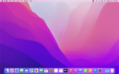
Exactly. Which to me is why the parent complaint is a bit silly. If vertical space is at such a premium on Mac laptops supposedly, why then does the default Apple UI [1] consume such an enormous amount of vertical space? This is many, many pixels more space than on Windows, where you only have the taskbar at the bottom. Apple's dock is much larger than the taskbar, in addition to having a global bar on the top!
So I conclude that Apple's designers are in fact not attempting to maximize vertical space, or at least that to the extent they do care about this, they're willing to make absurd compromises in apps like Safari while not fixing the glaring issue with the overall UI.
[1] https://upload.wikimedia.org/wikipedia/en/9/98/MacOS_Montere...
Re: Safari 15 on Mac OS, a user interface mess
#304Modern UX people are monsters that come out every few months to terrorize me. I’m honestly scared to install MacOS updates. I don’t recall the last time an update made anything better for me. But I’m a “power user” so I guess that means I should expect to re-learn basic navigation endlessly. My computer is a tool. Please stop changing how I use it.
You’re welcome to use Windows XP for that matter … seriously I understand because it’s a tool for me as well but it’s the price to pay when you have a product used by millions / billions of people … there is so much different needs and every user thinks he’s the center which is understandable but Apple and others have to evolve with their vision they can’t stuck themselves in the past because we like things the way they are now.
We have the choice of switching platform, writing our own or not updating software as well but we as individual are not and will never be the center and « majority » use case …
Re: Safari 15 on Mac OS, a user interface mess
#305Browser makers are always doing aggressive (and thus questionable) things with the UX, partly because the chrome is the only part which is under their control (and not the content).
The two most questionable decisions I find in the latest Safari UX are:
- A focused tab goes from the title to the address: this means you cannot see the title of the page you are on, and that tabs change relative positions depending on focus. This is unfortunately a hard problem, because users/designers expect a signal that you are on the correct site to prevent phishing - adding a disclosure field for viewing/entering the address anchored to the left is insufficient.
- Tab Pinning is still not supported on ios/iPadOS, and since tab groups are synchronized they cannot be pinned. Pinning adds some really nice behaviors for curation, so the whole tab group feature feels less useful than it could be.
Re: Safari 15 on Mac OS, a user interface mess
#306I’m very concerned about Apple's direction in UX. Big Sur’s dialog boxes, menus, notifications are a mess. And now this Safari comical UI. Every single change has been for the worse. Whoever is in charge of this, please, listen to feedback and change course. This is a disaster.
I actually like this change. I’ve been using software for more than 25 years so I’ve lived the evolution of UI a bit and sometimes we feel that it’s a regression. But after a period of transition every time I liked the product more.
« The familiar is comfortable; change is upsetting ».
I can’t imagine being stuck with a Windows XP style for ever I can’t even believe having used it so many years and looking back it’s a disaster but back then people loved it and complained on every single update.
So nothing new here …
Re: Safari 15 on Mac OS, a user interface mess
#307To get the full picture: Rationale behind the Safari 15 design https://developer.apple.com/videos/play/wwdc2021/10029/
Relevant transcript from the first two minutes of the video:
> Since very early in the evolution of the web browser, most of the browsers we've used have had a few fundamental thing in common. There's a very tall toolbar at the top with a slot for the URL that's on it's own line. And the website stays inside this space, this portal to the web, the viewport. Of course, as users, we've trained ourselves to put all of our focus on the website that we're using, but for years, the browser itself has maintained a strong visual presence. No matter how a website is designed to look and feel, the browser interface framed that design and dominated it. What if we could get rid of that frame and extend the design of the website to every edge of the window? Well, that's what we've done in Safari 15. This year we've reimagined the browsing experience as we know it. We're putting all the focus on the web content. The new Safari blends the tab bar into each website by changing its background color. The entire interface is on one line, and things naturally appear when needed. This makes your content feel more expansive. Each web page or web app takes over, extending to all four edges of the window. The browser interface yields to the content.
Re: Safari 15 on Mac OS, a user interface mess
#308Earlier quoted context omitted.
> …yet they're presented as if they're objective truths. Readability is objective. It can be measured. They keep bending themselves backwards to get out of a problem they inflicted upon themselves. A web browser should be readable first.
Someone's casual opinion about "readability" is not objective. It is the very definition of subjective. I mean, if you've been on HN at all you've seen massive debates about fonts, colors, contrast, and so on, where people have profoundly different opinions about readability. Run a study and then talk. Otherwise it's just subjective observations. Further, we're talking about page theme spreading to the chrome of the…
> Run a study and then talk.
It has been running for centuries. It’s called typography. Its rules are not arbitrary and legibility is the most important one.
No need for scare quotes around readability. It’s a science.
There’s a latitude of contrast ratio between which human eyes can comfortably withstand and discern tones. It varies across individuals, of course, but not as much as you might think. No human sees ultraviolet, for example. And even if you have 20/20 eyesight, you need to design for a much wider spectrum of the Bell curve if you care at all about accessibility.
You might be interested in checking the history and methods behind CIE 1931. Also, “The Elements of Typographic Style” is a deep but fascinating book.
Re: Safari 15 on Mac OS, a user interface mess
#309Earlier quoted context omitted.
UI changes are only good if they improve usability. By far most UI changes these days are only done for the sake of looking different and "fresh", UI design has become purely fashion driven. Where's the scientific research and white papers going along with the Safari UI changes which clearly justify point by point why every single change makes sense, all backed by user studies? All I usually see is "emotional bullshi…
Mozilla was doing exactly this with their Firefox redesign and everyone on HN hated it because stuff was different. I think the problem is everyone on here hates it when stuff they use changes and that’s all.
I think very generally speaking, you have a point. But there are genuinely changes which make things worse.
For example, in Firefox 89 the contrast between the active tab and the inactive tab is so low that they are not distinguishable when the viewing angle to the screen or the lighting isn't perfect - looks fancy, but is not even acceptable by their accessibility standards. On top of that they removed the blue bar that - as a crutch - indicated the active tab ?
I don't understand being this invested in such an obiously bad design decision - contrast is just neccessary.
All that being said, I found a bug report from 19 years ago, when Firefox was still called Phoenix, that complained about almost the exact same issue (sans the blue bar), and it got fixed.
I don't think "UX crisis" is neccessarily too strong a word.
Re: Safari 15 on Mac OS, a user interface mess
#310I think it’s strange that browsers, routinely displaying responsive design layouts , have never tried this for their own window chrome. They keep trying to shoehorn all screen sizes and space savings into one layout, when the web itself does a wiser thing: it adapts and makes better use of space if available .
But that’s not true? Safari for iPad has two very distinct layouts. The tough part is making sure it doesn’t get confusing.