Live data from Hacker News

Safari 15 on Mac OS, a user interface mess

morrick.me

291–300 of 374 posts

Re: Safari 15 on Mac OS, a user interface mess

#291
post #250

I vehemently disagree that vertical space used is negligible. Due to standard aspect ratios, the vertical space of the display is at a premium. 1920*1080 means you have 840 less vertical pixels than horizontal - it makes a lot of sense to me to try to reclaim some of that space for actual content instead of widgets.

Things like the tab bar and the reload button are not mere "widgets"; they are the core UI elements. They are the single most important part of the app. This is simply a bad call. I'm all for saving vertical space whenever possible. But this is a bad call.

Can’t remember the Mac OS X Release when Apple removed the dedicated reload button from Safari. Was it 10.6?
Re: Safari 15 on Mac OS, a user interface mess

#293

Earlier quoted context omitted.

Tab groups are Apple’s solution to having less space for tabs. As a casual Tree Style Tabs user I can see them really working better than one giant mess of tabs.

Honest question. How are people using tabs such that they would want to organise them? Most of my tabs have lifetimes of seconds to minutes and there is no order in the chaos to be found.

I keep 2 browser windows, each with 10+ tabs. One is those with short lifetimes, as you mention. The other is a "reminder list" of things I want to defer for a few hours.

Re: Safari 15 on Mac OS, a user interface mess

#294

Earlier quoted context omitted.

Tab groups are Apple’s solution to having less space for tabs. As a casual Tree Style Tabs user I can see them really working better than one giant mess of tabs.

Honest question. How are people using tabs such that they would want to organise them? Most of my tabs have lifetimes of seconds to minutes and there is no order in the chaos to be found.

I find how people use tabs a lot like how people use Excel. Excel is super flexible with thousands of features, but people only use a few of them. The rub is each person uses a different few. Tabs are similar. They are a flexible tool and people design personal workflows around them.

How I use tabs is probably nothing like how you use tabs or another random person uses them. I’m actually fascinated how people design their own workflows in this way. Anytime I see someone’s screen I end up with a ton of questions asking ‘why’.

Re: Safari 15 on Mac OS, a user interface mess

#295

Earlier quoted context omitted.

Tab groups are Apple’s solution to having less space for tabs. As a casual Tree Style Tabs user I can see them really working better than one giant mess of tabs.

Honest question. How are people using tabs such that they would want to organise them? Most of my tabs have lifetimes of seconds to minutes and there is no order in the chaos to be found.

I’m on chrome, but I’m using them through a simple development extension I wrote which examines the url of ungrouped tabs and adds matching tabs to a few predetermined groups that I’ve hard-coded into the JavaScript. It was a quick and dirty hack that took me about 30 min to setup, but it’s made the tab grouping functionality so much more useful.

I’m toying with the idea of adding an options page so that I could release it to the chrome store, but I hate UI work, so I haven’t gotten around to that yet.

Re: Safari 15 on Mac OS, a user interface mess

#296

> It seems as if the people in the design team are all working exclusively on 32-inch Apple XDR Pro Displays. Makes me think of the complaints in video game text over the past few years and how it had become so small as to be nearly unreadable on normal TVs at normal viewing distances. The natural assumption here is that the game devs were doing all their work inches away from large fancy monitors not thinking of the…

The majority of these are better explained as "PC game ported to console". The same problem has long existed in reverse, console game ported to PC with enormous UI. There are a vanishingly small number of games that actually do this properly - a scalable UI that has some good default assumption for the platform it is currently on. Of course games rarely make significantly more money because the text is perfectly size…

Nah. Console exclusives have had this problem for a while too. It was really dreadful on 360 where some devs assumed everybody played on HDTVs despite the console supposed to be SD friendly as well. Some text was literally unreadable in Mass Effect on my 20" CRT TV at ANY distance and was just barely readable on the 20" 480p LCD I was able to upgrade to a little later.

Re: Safari 15 on Mac OS, a user interface mess

#297

Why do browser updates keep fucking with the basic interface design? None of these changes are ever necessary. If designers need to justify their jobs, fine. They should design the interface layout with modular components that can be entirely customized by the user. IMO no user should ever be forced to use designs that are the product of meaningless fads in the design world.

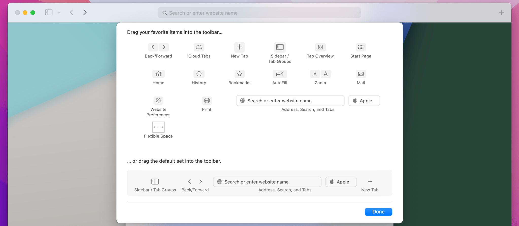
Toolbars in mac apps tend to be really good about this. I didn't realize (coming from Windows) that many apps (Notes, Safari, Mail, Finder, others) are using the built-in toolbar system, which gives you a very large degree of customization. That experience seems to be the default, and even third-party apps like Fork often use it.

You can see it in this article: https://9to5mac.com/2021/06/16/safari-in-macos-monterey-what... (image: https://9to5mac.com/wp-content/uploads/sites/6/2021/06/how-s...)

Hopefully, they add back some of the missing customization options in a later release.

Re: Safari 15 on Mac OS, a user interface mess

#298
post #250

Earlier quoted context omitted.

Things like the tab bar and the reload button are not mere "widgets"; they are the core UI elements. They are the single most important part of the app. This is simply a bad call. I'm all for saving vertical space whenever possible. But this is a bad call.

Can’t remember the Mac OS X Release when Apple removed the dedicated reload button from Safari. Was it 10.6?

I'm on Big Sur and have it on my Safari?

Re: Safari 15 on Mac OS, a user interface mess

#299

Earlier quoted context omitted.

Who really needs an address bar spanning the entire width of their screen? If you run into an URL that long then it's highly unlikely to contain useful information anyway. Or do you regularly notice yourself scanning through 400 characters of query string gibberish and thinking "that information was so useful that I always need all of it on screen"?

You don't. But why use that space to put the tab bar which DOES require the entire width? Chrome's and Firefox's compromise seems good enough where they stuff everything else to the right and left of the address bar except tabs. This Safari change is just awful

Chrome is horrible when you’ve got more then a few tabs since each tab just shrinks to a tiny unrecognizable notch, Safaris approach of scrolling in the tab bar is vastly superior in my opinion and makes the area much more useful even if it’s smaller. And this is without considering the new tab groups. I never really liked chromes tab-bar.

Re: Safari 15 on Mac OS, a user interface mess

#300
post #132

Earlier quoted context omitted.

But the tradeoff here isn't between a few dozen pixels vertically and a few dozen horizontally. It's 28 vertical pixels in exchange for cutting the horizontal space for the address bar and tab bar each in half , roughly.

Who really needs an address bar spanning the entire width of their screen? If you run into an URL that long then it's highly unlikely to contain useful information anyway. Or do you regularly notice yourself scanning through 400 characters of query string gibberish and thinking "that information was so useful that I always need all of it on screen"?

I agree, even in dev situation I copy paste the url elsewhere to read/work on it. It’s a smart move to shrink the address bar like that.
Post reply on HN