Live data from Hacker News

Lying with pictures: Smartphone manufacturer share by OS

andrewducker.livejournal.com

21–30 of 75 posts

Re: Lying with pictures: Smartphone manufacturer share by OS

#21
post #10
post #7

The original person who noticed this was a writer from 9to5mac and he made his own more accurate graphic a few days before this post was written. http://9to5mac.com/2012/07/13/nielsen-needs-to-work-on-their...

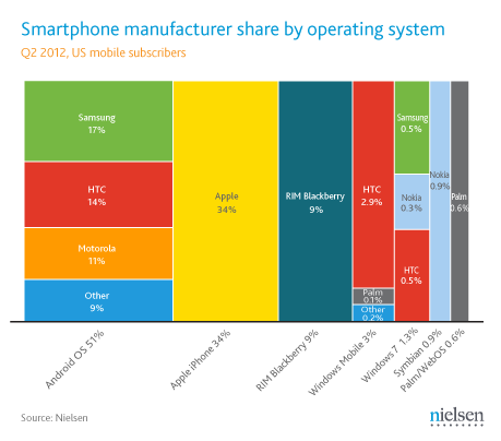
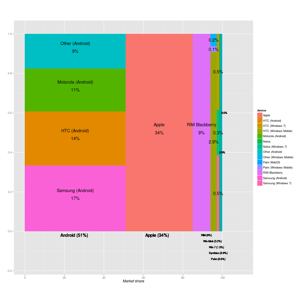
and I was having a hard time telling what % HTC for WinPhone 7 had in the OP. Again, this version might be proportionally more accurate, but it drastically reduces the amount of information. Nielsen's is the best so far, by far.

Hardly! The point of the graph is to show at a glance who has the most market share. Neilsen's graph doesn't do that at all.

If the problem is not showing all the information, then find a totally different type of graph. Or put them into multiple graphs, one showing the 4 biggest players, then an "other" segment. Then show another graph of the "Other" segment and show the proportions in that graph.
Re: Lying with pictures: Smartphone manufacturer share by OS

#22
Apologies for the fact that the legend on the second photo isn't as legible as it could be. My fault for resizing it to the same size as the original Nielsen image for easy comparison.

I've now updated it so that you can click through to a larger version of the image.

Also, since Livejournal seems to be having a go-slow, here's a link to the two images:

http://i207.photobucket.com/albums/bb317/AndrewDucker/12.png

http://www.richardclegg.org/graphics/phoneshare.png

http://www.richardclegg.org/graphics/phoneshare.pdf (less jaggy)

And here is 9to5Mac with an even better one:

http://9to5mac.com/2012/07/13/nielsen-needs-to-work-on-their...

Re: Lying with pictures: Smartphone manufacturer share by OS

#23

Apologies for the fact that the legend on the second photo isn't as legible as it could be. My fault for resizing it to the same size as the original Nielsen image for easy comparison. I've now updated it so that you can click through to a larger version of the image. Also, since Livejournal seems to be having a go-slow, here's a link to the two images: http://i207.photobucket.com/albums/bb317/AndrewDucker/12.png htt…

Yow! Can you do something about those fonts? So many jaggies... can barely read them :(

Update: any chance you could get two graphs made up? The first only showing the biggest six players, and an "Other" that is the rest of the market share, and then another which then takes the "Other" results and plots the market share again in a totally seperate graph?

Re: Lying with pictures: Smartphone manufacturer share by OS

#24
I would suggest that they are using the wrong type of diagram to represent the data that they have. Clearly its messed up because of labelling. If the data is such that labelling causes misrepresentation, it has to be the wrong diagram.

The whole point of these diagrams is that one can look at it and immediately get a feel for the proportions dictated by the data. If is look like a third, it should be a third. If you have to change that, then its the wrong diagram. Or a deliberate attempt to misrepresent.

I'm betting that some one wanted to use the new funky type of diagram because its new and funky, instead of an appropriate one.

Re: Lying with pictures: Smartphone manufacturer share by OS

#25
It’s quite astonishing that so many people here prefer readability over correctness. What is wrong with you? Readability is optional. Correctness is not.

That’s obviously the wrong tradeoff. Never outright manipulate your data to make it more readable! If you can’t make your data readable enough without manipulating it you just can’t present your data that way. Period. Find a better way.

(I do not think there is any malice involved, though. Just pure stupidity. I mean, look at the amount of people around here arguing for readability over correctness. If they are out here, some are also working for Nielsen.)

Re: Lying with pictures: Smartphone manufacturer share by OS

#26
post #10

Earlier quoted context omitted.

and I was having a hard time telling what % HTC for WinPhone 7 had in the OP. Again, this version might be proportionally more accurate, but it drastically reduces the amount of information. Nielsen's is the best so far, by far.

Hardly! The point of the graph is to show at a glance who has the most market share. Neilsen's graph doesn't do that at all. If the problem is not showing all the information, then find a totally different type of graph. Or put them into multiple graphs, one showing the 4 biggest players, then an "other" segment. Then show another graph of the "Other" segment and show the proportions in that graph.

Agreed. The "manufacturer" dimension given that 4 of the 7 OS's only have a single manufacture. Pull out the manufacturer data, size the blocks properly and you have a very informative chart.

Re: Lying with pictures: Smartphone manufacturer share by OS

#28
post #16

This looks suspiciously like logarithmic scaling which, as XKCD readers will attest, is a pretty typical technique for representing statistics which have differences measured in orders-of-magnitude. I'm not sure what all the panic on here is for, it's not as if Nielson only bumped Nokia, RIM and Microsoft's column widths.

Why use a logarithmic scaling for an area chart? Given the data it's presenting, a logarithmic chart is completely inappropriate. If I take the rectangle of "HTC / Android" and add it to the rectangle of "HTC / Windows", what do I get?

Re: Lying with pictures: Smartphone manufacturer share by OS

#29

It’s quite astonishing that so many people here prefer readability over correctness. What is wrong with you? Readability is optional. Correctness is not. That’s obviously the wrong tradeoff. Never outright manipulate your data to make it more readable! If you can’t make your data readable enough without manipulating it you just can’t present your data that way. Period. Find a better way. (I do not think there is any…

There's more at stake than that -- malice or not, a simple, tidy diagram can bypass a human's critical faculties and increase the feeling that the false data (and whatever it's conclusion) are more true. For a statistical research organisation, this is straight up neglect!

Part of my job involves electrical drafting, and though I'm positively anal about my drawings, if I manipulate the design to make the drawing more clear and presentable, it's a snowball's chance I'd ever be excused.

In my case, the risk is starting a fire in a power supply; in theirs, manipulating the market death of a product, however many dollars that might entail. Professionals have higher standards in their field, precisely because we trust them with expert information and give more weight to their decisions. Stupidity is no excuse in this case.

Re: Lying with pictures: Smartphone manufacturer share by OS

#30
post #29

It’s quite astonishing that so many people here prefer readability over correctness. What is wrong with you? Readability is optional. Correctness is not. That’s obviously the wrong tradeoff. Never outright manipulate your data to make it more readable! If you can’t make your data readable enough without manipulating it you just can’t present your data that way. Period. Find a better way. (I do not think there is any…

There's more at stake than that -- malice or not, a simple, tidy diagram can bypass a human's critical faculties and increase the feeling that the false data (and whatever it's conclusion) are more true. For a statistical research organisation, this is straight up neglect! Part of my job involves electrical drafting, and though I'm positively anal about my drawings, if I manipulate the design to make the drawing more…

How much does it matter, though? A pie chart would paint a very different picture, with iOS as a clear minority.
Post reply on HN