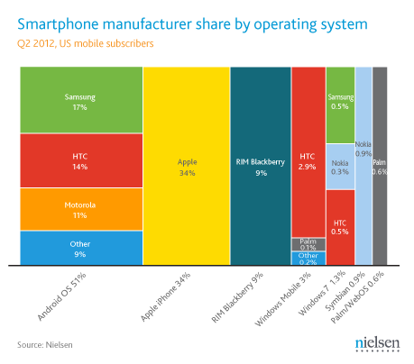
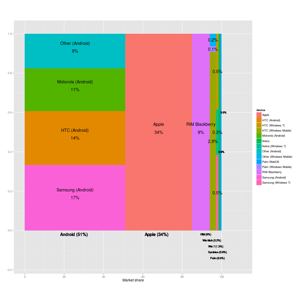
The original person who noticed this was a writer from 9to5mac and he made his own more accurate graphic a few days before this post was written. http://9to5mac.com/2012/07/13/nielsen-needs-to-work-on-their...
and I was having a hard time telling what % HTC for WinPhone 7 had in the OP. Again, this version might be proportionally more accurate, but it drastically reduces the amount of information. Nielsen's is the best so far, by far.
Hardly! The point of the graph is to show at a glance who has the most market share. Neilsen's graph doesn't do that at all.
If the problem is not showing all the information, then find a totally different type of graph. Or put them into multiple graphs, one showing the 4 biggest players, then an "other" segment. Then show another graph of the "Other" segment and show the proportions in that graph.