Earlier quoted context omitted.
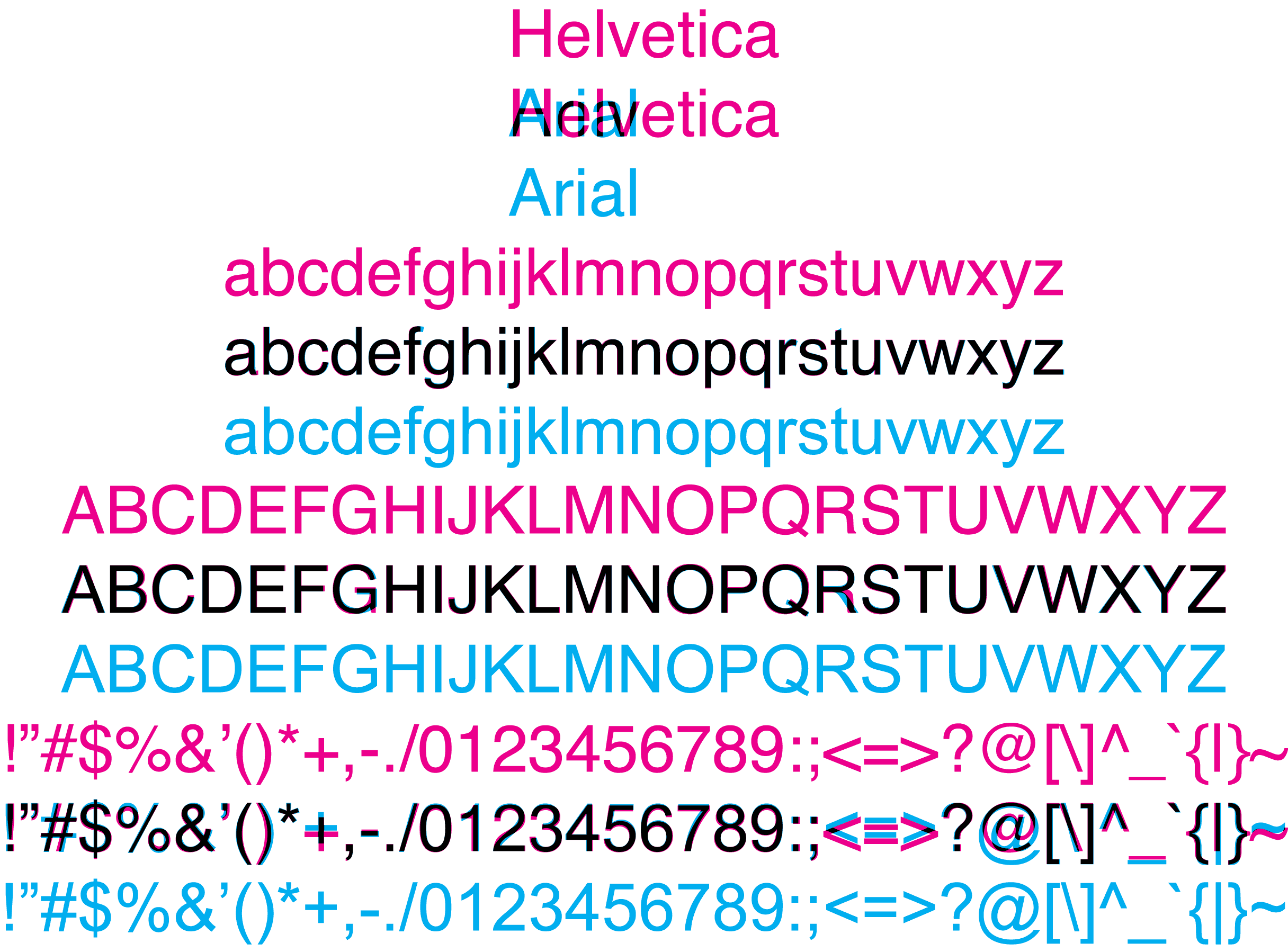
The perfectly round Os in toyota are the giveaways. I got them all correctly, except for MATTEL for which the only difference is the stroke width; and which I ended up flipping a coin for (incorrectly). That said, I did get a degree in graphic design, so I may not be typical when it comes to this.
In MATTEL, the crossbar of the E is placed in the exact center.
I picked the one with the longest distance between the T and the E. That was the wrong answer.
This quizz is an excellent training though. I didn't know anything at all about typography prior to taking the test (never bothered to learn the names of the fonts or their shapes), ended up scoring 17/20.